Posted on 09/05/2026 8:07:18 AM PDT by yesthatjallen
The United Nations General Assembly on Friday endorsed a new world map that represents Africa more accurately in its larger size, a culmination of a recent campaign led by African countries and advocacy groups.
Friday’s resolution, which was sponsored by Togo and backed by members of the African Union, was passed with 164 member states voting in favor.
Only the US voted against it while six other countries — Serbia, Estonia, Georgia, Lithuania, Moldova and Ukraine — abstained.
The vote encourages governments and institutions around the world to replace the traditional Mercator map, commonly used since the 16th Century, with the Equal Earth projection that advocates and geographers say shows locations more accurately.
The Mercator projection shows Greenland and Africa as appearing to be about the same size whereas in the Equal Earth projection that shows continents in their true proportions, Africa is 14 times larger than Greenland.
SNIP
(Excerpt) Read more at nypost.com ...
So, more of the Earth’s surface is a horror show than we thought.
How will this affect google earth??
It’s not the size that matters but how you use it.
Regardless as to size, similar to a book, one should absolutely judge a continent by its contents. It is a huge game preserve and dump.
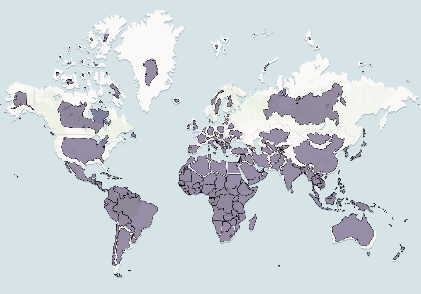
The article contains a picture that more accurately depicts Africa’s larger size. And some guy is standing directly in front of Africa. Well done.
brilliant!
On balance, shrinking the apparent size of Greenland and Canada is probably a slight positive for Trump. Diminishes Canada’s only claim to relevance (lots of vacant land) and makes Greenland look a bit less formidable.
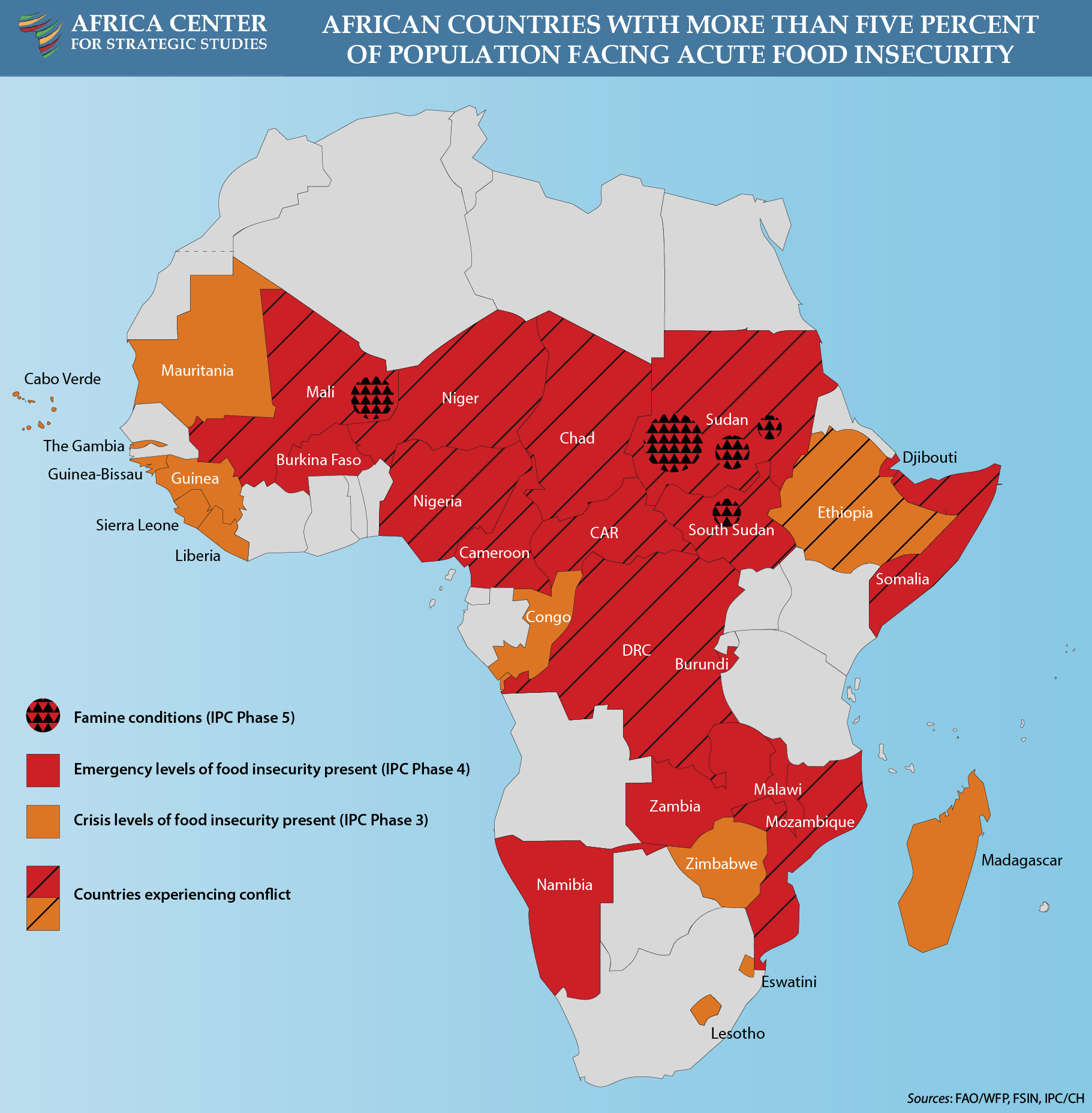
On a continent where you have wide spread food shortages in 12 countries, where you have no less than 6 armed conflicts, where corruption is rampant and human rights are ignored, true democracy and modern basic infrastructure are scarce, where diseases like Ebola and AIDS run rampant, THEY WORRY ABOUT HOW LARGE AFRICA IS DEPICTED ON A MAP?
https://africacenter.org/wp-content/uploads/2024/10/food-security-map-2024-conflict.png
Is this a new Monty Python news channel?
You know what I think? They should create a map which shows a nations size by IQ: https://www.datapandas.org/ranking/average-iq-by-country The smaller the IQ, the smaller on the map.
These folks make it hard not to fall into a racist cliche of them.
You win.
L
The Mercator projection is essential in practical navigation. Any projection from a spherical body such as a globe to a two dimension chart will result in distortions such as areas.
However, the Mercator projection has one feature that none of the other projections have and the reason that it has been used by navigators at sea for hundreds of years.
The feature is that say one inch equals ten miles at the middle of the vertical axis. Then everywhere else on the chart, one inch equals ten miles. One can plot courses, distances etc without changing the length of ten miles.
The Mercator projection has nothing to do with racism, colonialism, fascism, Trumpism, etc. but rather the safety for all ships at sea.
That’s cool.
Saved the image.
The article doesn’t show what the “Equal Earth” projection looks like. Having Geography/Cartography degree, I was curious because it’s been 30 some odd years since studying it and I’ve never heard of it before. Equal Earth looks like a Sinusoidal Projection. The problem with this projection is that it now “distorts” the view of the two poles. Now they have a beef with the map. For Africa’s information-all countries along the equator on a Mercator projection, are more true to form than those not along the equator. The middle of their country sits smack dab on the equator. I guess they were just concerned about the size of Greenland. Maybe because of PDJT’s desire for it?
How nice - now the worthless self-important grifters at the UN will feel so good about themselves.
That picture in the article is a Mercator Projection, not the “Equal Earth Projection”.
That’s basically what the article says. The Mercator is good for navigation and not much else. There’s no reason for that to be the “default” world map, something more accurate would be good, especially used in school texts.
Equal treatment starts to seem like oppression. Or something.
Disclaimer: Opinions posted on Free Republic are those of the individual posters and do not necessarily represent the opinion of Free Republic or its management. All materials posted herein are protected by copyright law and the exemption for fair use of copyrighted works.