So, more of the Earth’s surface is a horror show than we thought.
How will this affect google earth??
It’s not the size that matters but how you use it.
Regardless as to size, similar to a book, one should absolutely judge a continent by its contents. It is a huge game preserve and dump.
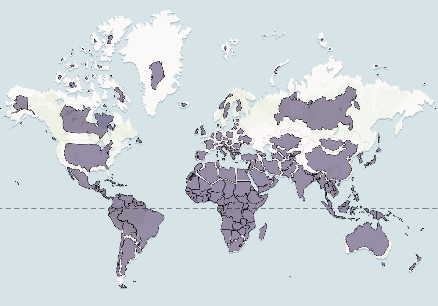
The article contains a picture that more accurately depicts Africa’s larger size. And some guy is standing directly in front of Africa. Well done.
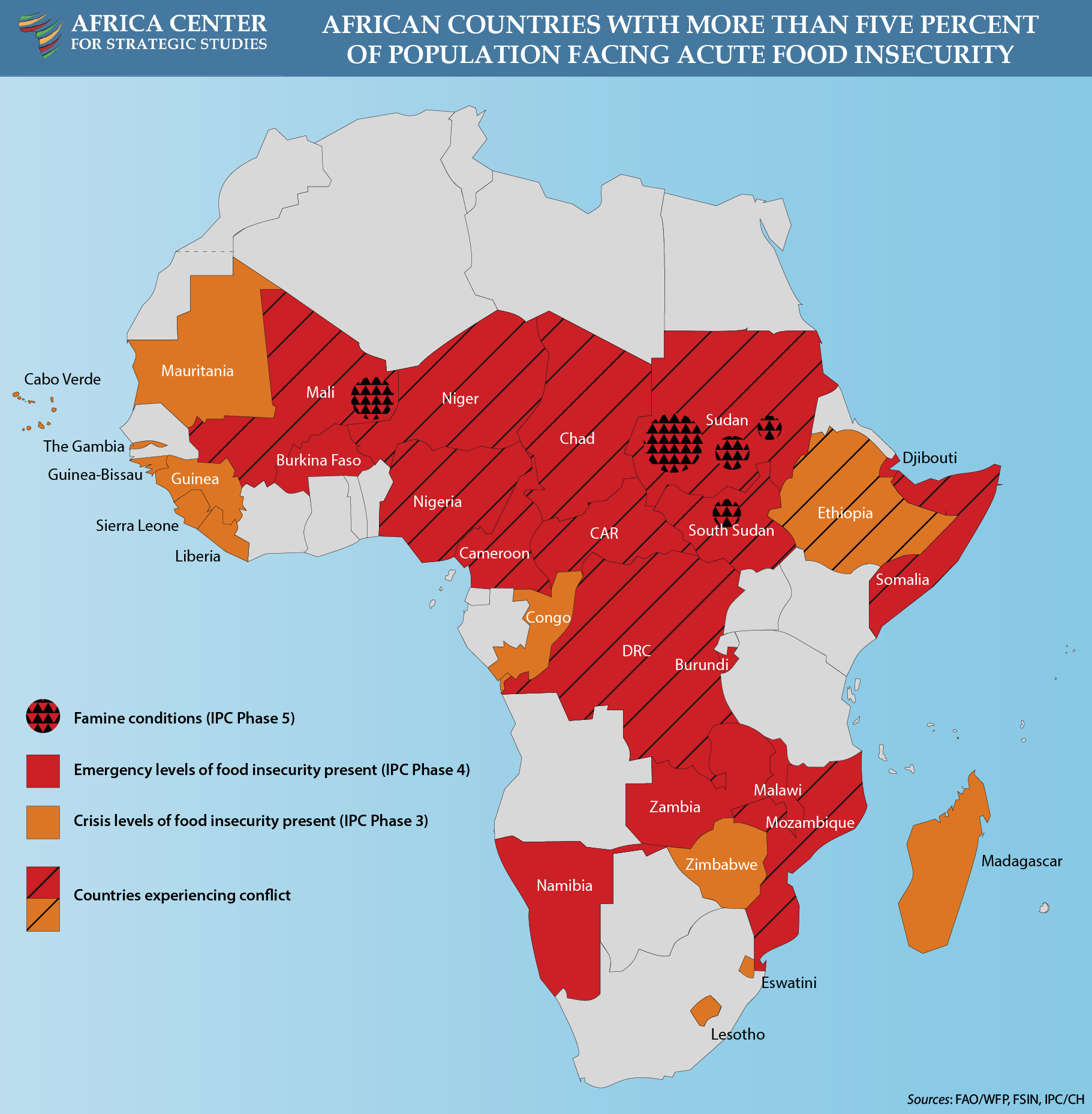
On a continent where you have wide spread food shortages in 12 countries, where you have no less than 6 armed conflicts, where corruption is rampant and human rights are ignored, true democracy and modern basic infrastructure are scarce, where diseases like Ebola and AIDS run rampant, THEY WORRY ABOUT HOW LARGE AFRICA IS DEPICTED ON A MAP?
https://africacenter.org/wp-content/uploads/2024/10/food-security-map-2024-conflict.png
Is this a new Monty Python news channel?
You know what I think? They should create a map which shows a nations size by IQ: https://www.datapandas.org/ranking/average-iq-by-country The smaller the IQ, the smaller on the map.
These folks make it hard not to fall into a racist cliche of them.
The Mercator projection is essential in practical navigation. Any projection from a spherical body such as a globe to a two dimension chart will result in distortions such as areas.
However, the Mercator projection has one feature that none of the other projections have and the reason that it has been used by navigators at sea for hundreds of years.
The feature is that say one inch equals ten miles at the middle of the vertical axis. Then everywhere else on the chart, one inch equals ten miles. One can plot courses, distances etc without changing the length of ten miles.
The Mercator projection has nothing to do with racism, colonialism, fascism, Trumpism, etc. but rather the safety for all ships at sea.
The article doesn’t show what the “Equal Earth” projection looks like. Having Geography/Cartography degree, I was curious because it’s been 30 some odd years since studying it and I’ve never heard of it before. Equal Earth looks like a Sinusoidal Projection. The problem with this projection is that it now “distorts” the view of the two poles. Now they have a beef with the map. For Africa’s information-all countries along the equator on a Mercator projection, are more true to form than those not along the equator. The middle of their country sits smack dab on the equator. I guess they were just concerned about the size of Greenland. Maybe because of PDJT’s desire for it?
How nice - now the worthless self-important grifters at the UN will feel so good about themselves.
If it’s bigger, it’s bigger. It’s not like we don’t know how to use numbers.
Why would anyone get worked up about this?
Looks like Antarctica is a continent no more, nor even a land mass.
That explains it. If Africa is bigger, then Door Dash can charge more for delivery to the other countries in the continent.
Because the purpose of a map is propaganda not navigation.
Oh no! There are continents bigger than us? How will my delicate narcissistic American mind ever deal with this?
Wouldn't an inaccurate map not be useful for navigation? This feels like more BS from the UN.
More room for Africans. Now kick them out of Europe, Australia, the UK, and the USA. Heck. There are videos all over from Japan now that their imported ferals are tormenting the locals and tourists. So far the African imports in China have been beaten by the locals are the Chinese have no “Chinese guilt” and allow the Africans to get away with their dysfunction.
That’s not the first time the earth has been mapped like this.
Wow. Until now maps have been racist. Who knew. Glad we’re solving the big problems now.