Skip to comments.
Marco Rubio instructs diplomats to use Times New Roman font, eliminating Biden-era DEI initiative
New York Post ^
| December 10, 2025
| Ryan King
Posted on 12/10/2025 1:19:10 PM PST by Labyrinthos
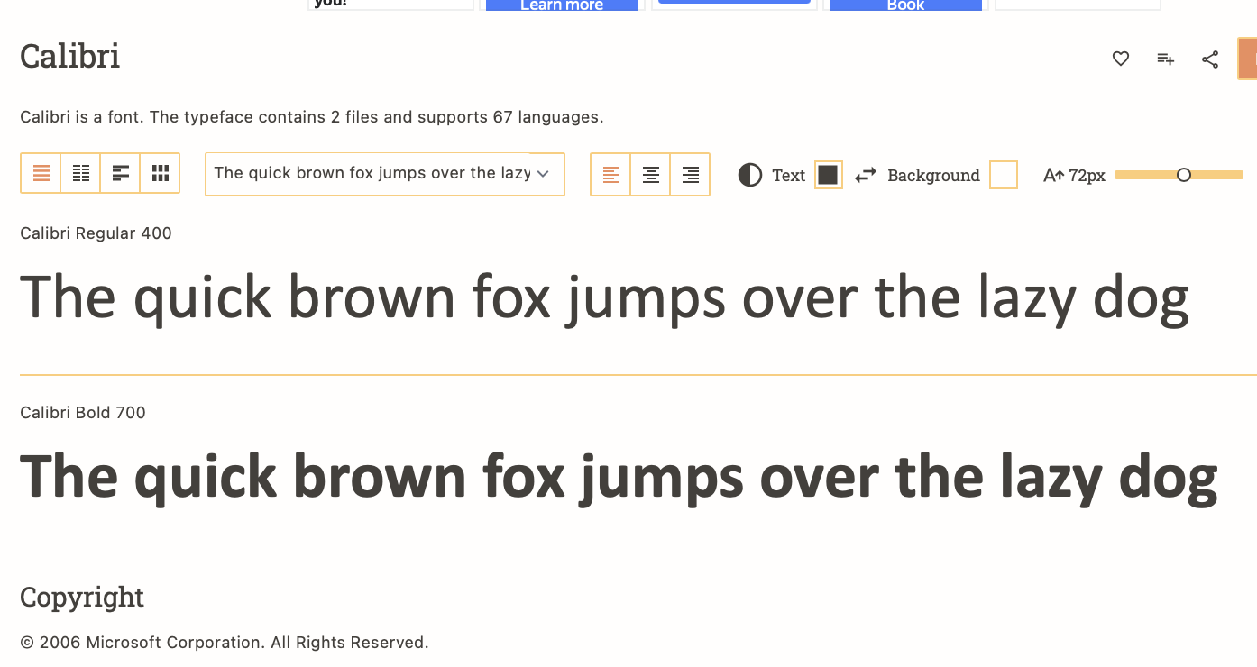
Secretary of State Marco Rubio directed all diplomats to revert to using the Times New Roman typeface in official communications and criticized his predecessor for shifting to Calibri, a font deemed too woke for the Trump administration.
Two years ago, Rubio’s predecessor, Antony Blinken, switched to Calibri, a softer, simpler-shaped, and wider font than Times New Roman, in part to assist individuals with certain visual disabilities such as low vision and dyslexia.
(Excerpt) Read more at nypost.com ...
TOPICS: Government; News/Current Events
KEYWORDS: dukeywordtroll; fonts; getridofwoke; microsoft; microsoftfont; nevertrumpkywrdtroll; nonotpetty; pettytroll; ryanking; sopetty; triggeredbyafont; woke; wokefreepers
Navigation: use the links below to view more comments.
first 1-20, 21-40, 41-60, 61-67 next last
This is the first I have heard that Calibri is "woke." As a lawyer, I only use Times New Roman for formal documents or when communicating with opposing counsel by letter. For me, the font is smaller and more difficult to visually process compared to other fonts of the same size. When drafting documents and spreadsheets, I use Calibri. For emails, I use Segoe UI. My least favorite font is Aptos, which is the new Microsoft default font.
To: Labyrinthos
More to the point, Calibri is actually harder for OCR software to parse than the evergreen Times New Roman.
2
posted on
12/10/2025 1:20:32 PM PST
by
Spktyr
(Overwhelmingly superior firepower and the willingness to use it is the only proven peace solution.)
To: Labyrinthos
3
posted on
12/10/2025 1:22:35 PM PST
by
Gasshog
(the amazing disappearing tag)
To: Labyrinthos
4
posted on
12/10/2025 1:23:00 PM PST
by
Jim W N
(MAGA by restoring the Gospel of the Grace of Christ (Jude 3) and our Free Constitutional Republic!)
To: Labyrinthos
Newspapers usually have the best fonts for reading.. of course that came about because newsprint bleeds...
5
posted on
12/10/2025 1:23:20 PM PST
by
GOPJ
(Soros & democrats back criminals, dope dealers, illegals & terrorists. <P><I><B><big><center></B>)
To: Jim W N
It’s supposed to be more readable for dyslexics and people with poor vision.
6
posted on
12/10/2025 1:25:25 PM PST
by
Kleon
To: Labyrinthos
I would have figured the Biden regime to use Comic Sans.
7
posted on
12/10/2025 1:25:39 PM PST
by
Flag_This
(They're lying.)
To: Jim W N
The Biden regime liked it, so that certainly lends an element of wokeness. Also, the non-serif style looks very informal and unserious.
8
posted on
12/10/2025 1:26:24 PM PST
by
Olog-hai
("No Republican, no matter how liberal, is goings to woo a Democratic vote." -- Ronald Reagan, 1960)
To: Jim W N
“Why is Calibri ‘woke’?”
I don’t know if it’s woke, but it’s sans-serif, and it is harder to read than fonts with serif. The serif fonts move you eye along better than the stark sans-serif.
I like Garamond myself, but Times New Romans is an old traditional font that makes sense.
9
posted on
12/10/2025 1:26:39 PM PST
by
MayflowerMadam
( "Trouble knocked at the door, but, hearing laughter, hurried away". - B. Franklin)
To: Flag_This
"I'm Joe Biden. People call me Joe Biden."
10
posted on
12/10/2025 1:29:35 PM PST
by
Flag_This
(They're lying.)
To: Flag_This
To: Hyman Roth
I wish I’d thought of that!
12
posted on
12/10/2025 1:32:13 PM PST
by
Flag_This
(They're lying.)
To: Flag_This
That was my first thought. I am glad someone else thought it as well.
I used Calabri for a while, not thinking twice about it. I found it easier to read.
The good thing about the internet is you can set your own favorite typeface and most sites will roll with it. Putting out a release about what typeface is being used seems like an indicator of a slow news day.
To: Labyrinthos
My, aren’t you a font of information.
14
posted on
12/10/2025 1:32:47 PM PST
by
Jeff Chandler
(The issue is never the issue. The issue is always the revolution.)
To: Labyrinthos
Two years ago, Rubio’s predecessor, Antony Blinken, switched to Calibri, a softer, simpler-shaped sans serif, and wider font typeface than Times New Roman,... There I fixed it as a former professionl typesetter in the 1970s.
To: Labyrinthos
"I always sent correspondence in Arial."
16
posted on
12/10/2025 1:34:19 PM PST
by
Cletus.D.Yokel
(The Democrats' official policy is now, “Hate, Violence and Murder". Change my mind.)
To: Labyrinthos
“For me, the font is smaller and more difficult to visually process compared to other fonts of the same size. When drafting documents and spreadsheets, I use Calibri.”
Ditto. The goal should be to pick styles based on ease of reading. Of course these things are subjective with personal preferences etc.
To: Spktyr
how many angels could dance....
What a waste of time.
To: Labyrinthos
Publishers have tested readability many times. Serif faces (such as Times) are more readable than Sans Serif faces (such as Calibri).
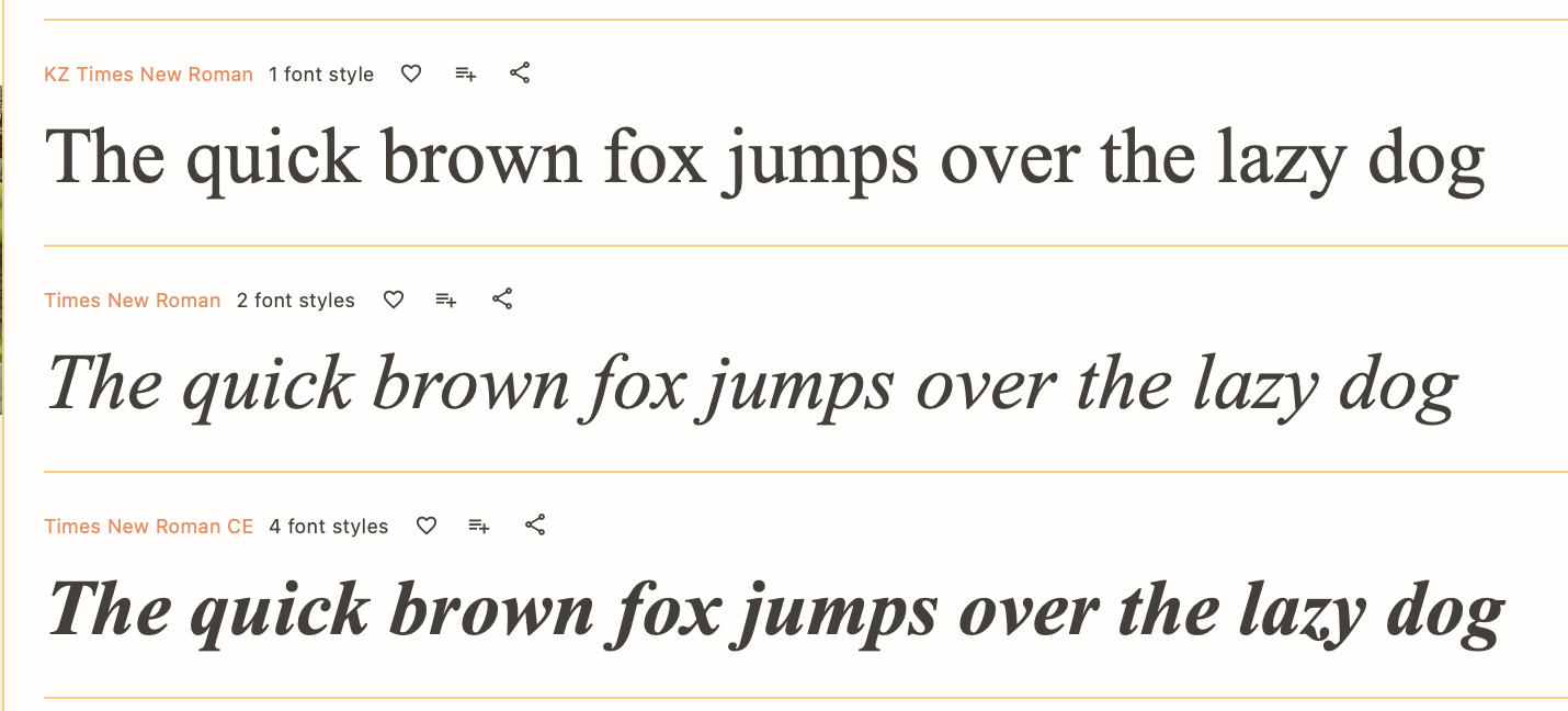
Times New Roman:
19
posted on
12/10/2025 1:45:29 PM PST
by
Albion Wilde
(To live free is the greatest gift; to die free is the greatest victory. —Erica Kirk)
To: Labyrinthos
I agree that Calibri is "woke".
It is a sans serif font that is ambiguous. You (and OCR) can distinguish between the numeral "1", the lower case "l", and the capital "I". There are other examples.
It's a PITA for human eyes to read, trying to rebuild meaning from context.
20
posted on
12/10/2025 1:45:36 PM PST
by
meadsjn
Navigation: use the links below to view more comments.
first 1-20, 21-40, 41-60, 61-67 next last
Disclaimer:
Opinions posted on Free Republic are those of the individual
posters and do not necessarily represent the opinion of Free Republic or its
management. All materials posted herein are protected by copyright law and the
exemption for fair use of copyrighted works.
FreeRepublic.com is powered by software copyright 2000-2008 John Robinson