Posted on 09/05/2026 8:07:18 AM PDT by yesthatjallen
The United Nations General Assembly on Friday endorsed a new world map that represents Africa more accurately in its larger size, a culmination of a recent campaign led by African countries and advocacy groups.
Friday’s resolution, which was sponsored by Togo and backed by members of the African Union, was passed with 164 member states voting in favor.
Only the US voted against it while six other countries — Serbia, Estonia, Georgia, Lithuania, Moldova and Ukraine — abstained.
The vote encourages governments and institutions around the world to replace the traditional Mercator map, commonly used since the 16th Century, with the Equal Earth projection that advocates and geographers say shows locations more accurately.
The Mercator projection shows Greenland and Africa as appearing to be about the same size whereas in the Equal Earth projection that shows continents in their true proportions, Africa is 14 times larger than Greenland.
SNIP
(Excerpt) Read more at nypost.com ...
Dear FRiends,
We need your continuing support to keep FR funded. Your donations are our sole source of funding. No sugar daddies, no advertisers, no paid memberships, no commercial sales, no gimmicks, no tax subsidies. No spam, no pop-ups, no ad trackers.
If you enjoy using FR and agree it's a worthwhile endeavor, please consider making a contribution today:
Click here: to donate by Credit Card
Or here: to donate by PayPal
Or by mail to: Free Republic, LLC - PO Box 9771 - Fresno, CA 93794
Thank you very much and God bless you,
Jim
I don’t know why the US voted against it, unless it’s based on economics. That is, maybe a positive vote will lead to zillions of dollars wasted to replace perfectly fine Mercator Projection maps (which everyone knows has a scale in it).
When I was a kid, we had globes in class. We got it. We didn’t need the UN to tell us how to think.
It IS a cool map.
If it’s bigger, it’s bigger. It’s not like we don’t know how to use numbers.
Why would anyone get worked up about this?
Looks like Antarctica is a continent no more, nor even a land mass.
Except we don’t know how to use numbers. That’s always been the beef with the Mercator, people think that’s actually what the world looks like. Not even noticing that the usual cut off (dropping most of Antarctica) puts the equator 2/3 of the way down. There’s really no good reason not to default to a more accurate version.
And map nerds have been worked up about this for decades.
“Maybe because of PDJT’s desire for it?”
The “proper size” map people have been around my entire life. They come across as “it’s a conspiracy” types. I remember a hippie girl in college going over all the conspiracies and, as I recall, it was aliens, chem trails, the map and a few others I don’t recall. I came to associate the proper size map people with the chem trails and area 51 nut cases.
I can’t understand how this came up in the UN. It’s not like there aren’t real problems they could occupy their time with. What would be the practical change if the world adopted their map? Maybe it’s something like gay marriage, or could it be a power thing like, “Now you have to bake the cake?” What would the proper map people then be able to force down our throats?
That explains it. If Africa is bigger, then Door Dash can charge more for delivery to the other countries in the continent.
Africa is doing it for grift. This is about the Benjamins.
How come it’s impossible to find what this map looks like without it superimposed on the normal map?
Because the purpose of a map is propaganda not navigation.
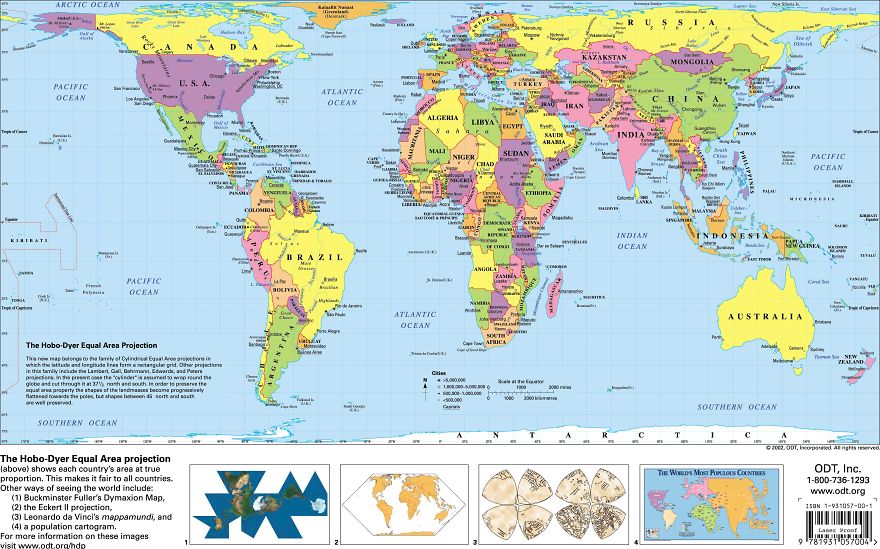
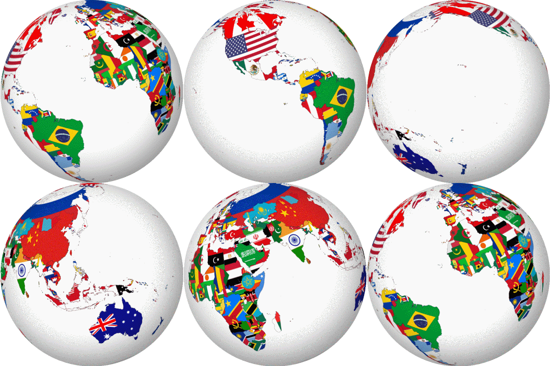
The projection of a sphere onto a flat surface has been a problem for centuries.
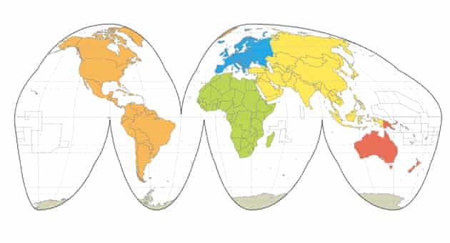
Goode is an interrupted, equal-area, composite projection composed of 12 regions that form six lobes, each the top section of a Mollweide projection, carefully grafted on to six interior regions along the equator. Provides an effective alternative to portraying global area relationships on the Mercator map. This projection was quite common in the 1960's, when it gained the nickname “the orange-peel map". (Source)
Oh no! There are continents bigger than us? How will my delicate narcissistic American mind ever deal with this?
Wouldn't an inaccurate map not be useful for navigation? This feels like more BS from the UN.
More room for Africans. Now kick them out of Europe, Australia, the UK, and the USA. Heck. There are videos all over from Japan now that their imported ferals are tormenting the locals and tourists. So far the African imports in China have been beaten by the locals are the Chinese have no “Chinese guilt” and allow the Africans to get away with their dysfunction.
Honey, I shrunk the 51st State!
Best to teach kids using a globe.
That’s not the first time the earth has been mapped like this.
Disclaimer: Opinions posted on Free Republic are those of the individual posters and do not necessarily represent the opinion of Free Republic or its management. All materials posted herein are protected by copyright law and the exemption for fair use of copyrighted works.