Posted on 02/03/2025 6:36:50 PM PST by Red Badger
There is something unique about the color purple: Our brain makes it up. So you might just call purple a pigment of our imagination.
It’s also a fascinating example of how the brain creates something beautiful when faced with a systems error.
To understand where purple comes from, we need to know how our eyes and brain work together to perceive color. And that all begins with light.
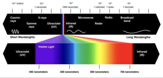
Light is another term for electromagnetic radiation. Most comes from the sun and travels to Earth in waves. There are many different types of light, which scientists group based on the lengths of those waves. (The wavelength is the distance between one wave peak and the next.) Together, all of those wavelengths make up the electromagnetic spectrum.
Our eyes can’t see most wavelengths, such as the microwaves used to cook food or the ultraviolet light that can burn our skin when we don’t wear sunscreen. We can directly see only a teeny, tiny sliver of the spectrum — just 0.0035 percent! This slice is known as the visible-light spectrum. It spans wavelengths between roughly 350 and 700 nanometers.
The acronym ROYGBIV (pronounced Roy-gee-biv) can be used to remember the order of colors in that visible spectrum: red, orange, yellow, green, blue, indigo and violet. You can see these colors in a rainbow stretching across the sky after a rainstorm or when light shines through a prism. In the visible spectrum, red light has the longest wavelength. Blue and violet are the shortest. Green and yellow sit toward the middle.
Although violet is in the visible spectrum, purple is not. Indeed, violet and purple are not the same color. They look similar, but the way our brain perceives them is very different.
How we see color
Color perception starts in our eyes. The backs of our eyes contain light-sensitive cells called cones. Most people have three types. They’re sometimes called red, green and blue cones because each is most sensitive to one of those colors.
But cones don’t “see” color, notes Zab Johnson. Instead, they detect certain wavelengths of light.
Johnson works at the University of Pennsylvania in Philadelphia. She and other scientists who study how we perceive color prefer to classify cones based on the range of wavelengths they detect: long, mid or short.
So-called red cones detect long wavelengths of light. Green cones respond most strongly to light in the middle of the visible spectrum. Blue cones best detect wavelengths toward the shorter end of the visible spectrum.
When light enters our eyes, the specific combination of cones it activates is like a code. Our brain deciphers that code and then translates it into a color.
Consider light that stimulates long- and mid-wavelength cones but few, if any, short-wavelength cones. Our brain interprets this as orange. When light triggers mostly short-wavelength cones, we see blue or violet. A combination of mid- and short-wavelength cones looks green. Any color within the visible rainbow can be created by a single wavelength of light stimulating a specific combination of cones.
:max_bytes(150000):strip_icc():format(webp)/the-visible-light-spectrum-2699036_FINAL2-c0b0ee6f82764efdb62a1af9b9525050.png)
Notice that the visible spectrum is a gradient. One color gradually shifts into the next. The activity of cones activated by the light also gradually shifts from one type to the next. At the red end of the spectrum, for instance, long-wavelength cones do most of the work. As you move from red to orange, the mid-wavelength cones help more and the long-wavelength cones do less.
In the middle of the rainbow — colors like green and yellow — the mid-wavelength cones are busiest, with help from both long- and short-wavelength cones. At the blue end of the spectrum, short-wavelength cones do most of the work.
But there is no color on the spectrum that’s created by combining long- and short-wavelength cones.
This makes purple a puzzle.
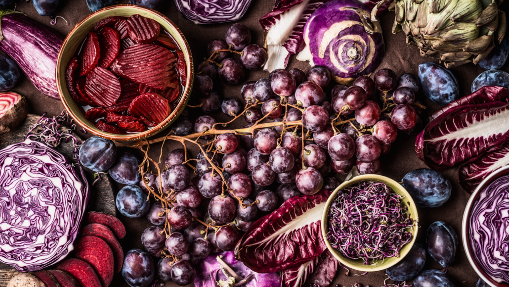
Purple is a mix of red (long) and blue (short) wavelengths. Seeing something that’s purple, such as eggplants or lilacs, stimulates both short- and long-wavelength cones. This confuses the brain. If long-wavelength cones are excited, the color should be red or near to that. If short-wavelength cones are excited, the color should be near to blue.
The problem: Those colors are on opposite ends of the spectrum. How can a color be close to both ends at once?
To cope, the brain improvises. It takes the visible spectrum — usually a straight line — and bends it into a circle. This puts blue and red next to each other.
“Blue and red should be on opposite ends of that linear scale,” Johnson explains. “Yet at some point, blue and red start to come together. And that coming-together point is called purple.”
Our brain now remodels the visible spectrum into a color wheel and pops in a palette of purples — which don’t exist — as a solution to why it’s receiving information from opposite ends of the visible spectrum.
Colors that are part of the visible spectrum are known as spectral colors. It only takes one wavelength of light for our brain to perceive shades of each color. Purple, however, is a nonspectral color. That means it’s made of two wavelengths of light (one long and one short).
This is the difference between violet and purple. Violet is a spectral color — part of the visible spectrum. Purple is a nonspectral color that the brain creates to make sense of confusing information.
Purple thus arises from a unique quirk of how we process light. And it’s a beautiful example of how our brains respond when faced with something out of the norm. But it’s not the only color that deserves our admiration, says Anya Hurlbert.
“All colors are made up by the brain. Full stop,” says this visual scientist at Newcastle University in England. They’re our brain’s way of interpreting signals from our eyes. And they add so much meaning to things we perceive, she says.
“The color of a bruise tells me how old it is. The color of a fruit tells me how ripe it is. The color of a piece of fabric tells me whether it’s been washed many times or it’s fresh off the factory line,” she says. “There’s almost nothing else that starts with something so simple [like a wavelength of light] and ends with something so deep and rich.”
More than you ever wanted to know about the color brown.
https://www.youtube.com/watch?v=wh4aWZRtTwU
Oops, overlooked something. Pantone is more generally associated with the CMYK printing process than the RGB transmitting process. But (at least according to my artist friends who also work with computers), one must become conversant in both systems to be able to do anything productive these days. :-)
I paint for enjoyment and to give to friends and family, so I have no trek with T.V. nor computers. Okay, I sometimes take pictures of the different cards I make ( which are on my phone and sometimes on my laptop ), but that's only because I like to have a personal record of things I no longer have. Hence I have no worries about how they will look on some machine.
Like many artists, yes, I do watch others on YouTube, to see what's new ( products ), get ideas from, and maybe learn a new technique. Does their works look different in person? I have no way of knowing that. And in the long run, it doesn't matter to me or others watching them.
What I can tell you, is that IF a new line of paint is reviewed and I buy it ( the "want monster" is pretty BIG with most of us who watch these videos ), it DOES look the same as it did on line. And I'm not just taking about the paint itself, but also the swatches.
Oh gee, thankfully THAT is nothing that I have to be concerned about; I’m just NOT very tech savvy!
Yep..... doesn’t happen as often as before though I have come across some things that have given me pause. I suspect that various life changing events “scramble” things in the ol brainpan. Thanks for the book tip.
In some circumstances, it is critically important that colors appear identically in two different environments (say, on a computer screen vs. when that same image is printed on a color printer). Whole businesses and people's careers are based on working that out.
But most of the time, in real life ("IRL"), we can live just fine with "close-enough" approximations, because nobody cares to get that picky about it. Especially with something aesthetically pleasing like a painting -- who really cares if a photo of the painting doesn't exactly reproduce the pigment colors when the photo is displayed on a monitor? The important thing is, does the painting, or the image of the painting, convey a reasonably accurate expression of the artist's intent, and does it evoke emotions or other reactions in the viewer that are something like what the artist intended. Art is not RGB, or CMYK, or wavelengths.
Of course, wearing my (50-yr old) physics hat, all those technical things are of compelling importance. So it all depends on the context.
“White pigment paint absorbs no visible wavelengths “
Since we are nit-picking ...
The photon excites electrons (is absorbed) and if not in resonance another photon is emitted.
OTOH, no pigment is a perfect reflector.
“I paint ( I’m a watercolorist and also know about pigments ), so I’m very atuned to colors, shades, and variations of colors. Violet is a shade of PURPLE ( there are many different shades of all colors! )”
I don’t think you know what a shade is ...
I was making a somewhat inexact generalization in the service of a much larger, broader point. Nevertheless your nit-pick is appreciated.
Geez, grammar-check, you let me down.....
ROYGBIV - The colors of the actual rainbow. How long before trans activists demand this article be pulled?
But there are probably many more people for whom this is a hobby, have no intent of ever selling their work, and for them, there shan't be any reason to worry, nor even think about such things as how anything is going to look on any kind of screen.
I paint because I enjoy painting.
Yes, I have taken requests from family and friends, but they don't get to see anything in progress. They know my work ( have seen a lot of it in person ), and I don't mind doing something for them gratis. I get to enjoy painting whatever it is and they get to have it mounted and framed. It's a win win for everyone.
Yet funnily enough, I never have framed and hung any of my own work. As the old saying goes: "The cobbler's children go without shoes."! In this instance it's the painter has hung other artists' work. ;^)
“The colors are the same.”
Impossible.
Inline color filters. They aren't exactly reflective per se, since they accept light from a source and pass it forward to the object or sensor. Yet they're subtractive, i.e. when you combine them the output tends to black just like pigments.
All this really says is that "reflective" is not a comprehensive descriptor for the subtractive process. You must also include "pass-through". Any other categorically distinct things come to mind?
“Do you guys know any optical physics at all,”
What havd I posted that is incorrect that makes you post that?
MY WHOLE WORLD IS SHATTERED!!!!
You know, all colors are in our minds, not in things that we see.
If I had to choose one that was faked, I'd say it was indigo.
Unless it was a few of those in the Crayola box or in the J. Crew catalogue.
Cornflower, periwinkle, burnt umber, and burnt sienna ... yeah, right.
Of course I know full well what a "shade" is. And it's NOT something attached to a window frame to keep out the light, in this instance!
Would you have preferred that I say "value" ( which is another word/term artists use to describe a color ) instead? Or how about talking paint consistency, i.e. like heavy cream,milk, or 2% milk, when talking about how much water one uses re watercolor.
"Shade" is also used when talking about many other kinds of things besides paint as well.
If a paint color is known by gamboge, for sake of argument, that's a SHADE of YELLOW, but it's quite different from one called aureoline and both are different from lemon yellow, but they're ALL a SHADE OF YELLOW!
Some paints are considered to be "warm" and some "cool", yet they can all be the in the same "family".
And THAT can be said of just about every single single color you can name, including VIOLET.
You'll note I appended a :-) indicating in this context "Do not take literally, do not take offense".
I am the one who watches those videos, I am also the one who has the same brand of paints. And, I have exceptionally good color sense.
You just want to nit pic, argue, and pretend that YOU know far more about what I have and what I see, as well as, NOW, condemning what I and EVERYONE ELSE calls something.
Don't lie....1)do YOU personally own many different watercolor sets 2) watch many different artists', from many different countries, YouTube tutorials and reviews 3) even paint anything other than a wall, if that?I doubt that you are able to truthfully say "YES" to any of those questions!
Disclaimer: Opinions posted on Free Republic are those of the individual posters and do not necessarily represent the opinion of Free Republic or its management. All materials posted herein are protected by copyright law and the exemption for fair use of copyrighted works.