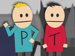
Old logo:

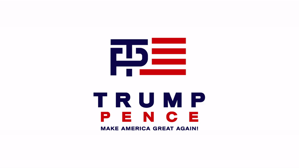
New logo:

I think you have to try really hard to see this as suggestive.
i dont have the cleanest mind and i didn’t notice that at all.
And as a person who did graphics for 20 years, I think both logos suck.
But people dont vote on logos.
Trump should have stayed with the original T-P logo. It was distinctive and iconic.
The new logo is boring.
Why do I have the feeling that somewhere out there, there are now collector items being shredded en mass?
They’ll find anything and everything to talk about but issues. Oh, look at this animated morphing of the logo we did. You should talk about that rather than the family murdered by yet another illegal.
If there’s anything remotely suggestive in any symbol the liberal media will find it first.
Yes! I’m glad they quickly got rid of it. The new one is similar to the Romney layout. It is perfunctory, and will work just fine. Whoever made the first choice should tear up their Graphic Designer card now!
Just as well but come on you have to have a childish filthy mind to think two letters are sexual.
If you want penetration, there is Hillary - Huma. That’s the real unreported story. A Muslim seducer influencing Hillary to bring in millions of Islamists to change America.
I like it. What I see it a T and a P crushing an H. Too bad they bowed to the PC police so soon.
I like new one. Doesn’t stray far from the Trump primary logo. Great contrast. Will fit well on campaign gear and lawn signs.
That’s much better. Sure they’ll come up with something even better in time.
As mild-mannered Michelin chef Gordon Ramsay put it, it doesn’t really matter what you name your restaurant as long as the food and service are good.
Having said that, it’s prolly best not to name it something like `The Mad Cow’ or `The Stomach Churn’.
`The Slow Poke’? Why give them ammo?
I like this one better.
It says much more about the people who see “something” in the logo. I am in my 50s, worked in advertising/marketing for much of my career, even once had Playboy as a client, and yet I did not see it until it hit social media. I also had no clue why the left was getting so excited calling Patriots tea baggers.
I consider my self dirtymainded but this lefties must have a bunch of little vaginas put together as a brian, when I so that logo never ever in may mind thought of what they see.
People who are #nevertrump and for Hillary always have their minds in the cr7pper.
TRUMPUPPENCE
This actually works better than the first one IMHO which was visually cluttered. True, it is not particularly artistic or interesting but who cares. At least it’s not a circle with a swoop in it. Jus’ sayin’..... Let’s hope we make it to the election, the way things seem to be going.
Some one should have caught it before press
Good move... the first (flag) logo is too complex, chaotic, confusing.
“Clean and clear” is always better... and a new design is likely to yet be adopted (there are great designers out there), though not necessary, imo.