Posted on 10/02/2014 11:46:40 AM PDT by SeekAndFind

I switched from Windows 7 to Windows 8 from day one, and although I’ve dabbled with Start buttons, Classic Shell being the preferred choice, I learned to live with the Start screen, something that became easier once Microsoft released Windows 8.1 and 8.1 Update. But now that Windows 10 Technical Preview is here, it’s time to once again embrace the Start menu.
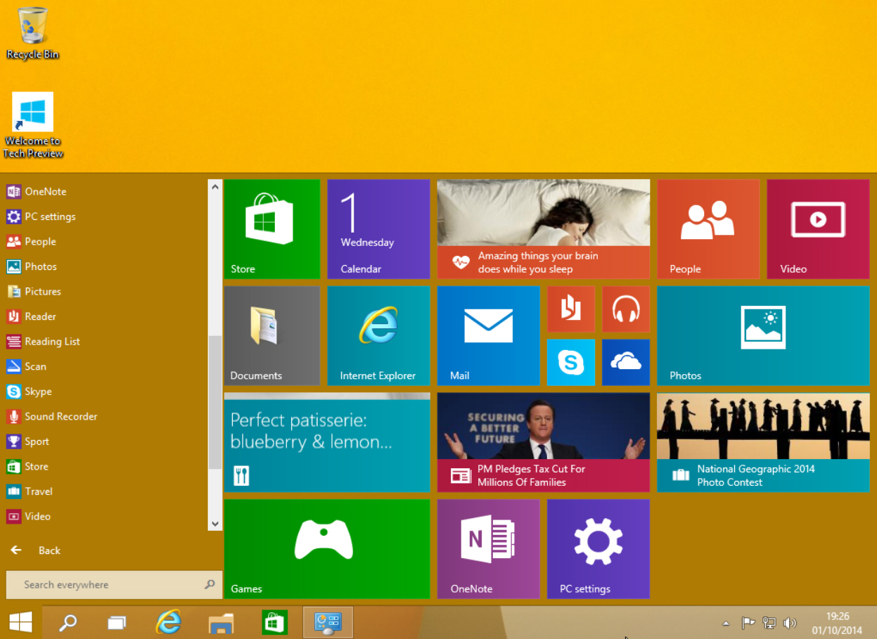
Windows 10’s Start menu is the perfect blend of Windows 7 and Windows 8.x. Click the Start button and the menu appears, displaying icons on the left and tiles on the right.
The top of the Start menu shows your user name and clicking on it will let you change your account picture, lock the computer or sign out. The power button to the right lets you put your PC to sleep, shut it down, or restart.
Underneath that are icons for Documents, Pictures, PC Settings, and File Explorer. Icons for your programs appear below those, and by default you see Snipping Tool, Calculator, Sticky Notes, Paint and Games.
Click on All Apps and you can access the bundled windows apps and any you've installed. The calculator app still fills the screen, but at least it now runs windowed and can be resized. Scroll to the bottom of All Apps and there are folders for Windows Accessories, Windows Ease of Access, and Windows System.
Right-click on an app and you can open it, uninstall it, pin to Start or pin to taskbar.
The Search box at the bottom of the menu lets you search your PC and the web.
The tiles on the right side of the Start menu look and work the same as the tiles on the Windows 8.1 Start screen. You can launch an app, or if you right-click its tile you’ll be able to unpin it from Start, pin it to the taskbar, uninstall it, or resize it. There are small, medium, wide and large sizes available (although not all sizes are available for all tiles). Live tiles can be turned on or off.
In the top right corner of the tiled section is a Windows Feedback app you can use to send feedback regarding the new OS to Microsoft.
The tiled area on the right expands or contracts as you add or remove tiles. So if you like apps, it will spread right across the desktop. If you hate having tiles, just unpin every one and it will change to a standard Start menu. To get the tiled section back, just pin any app to Start.
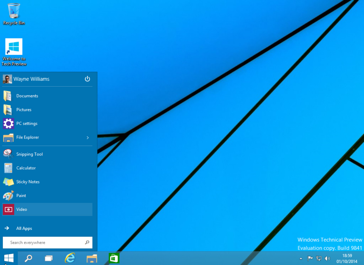
You can resize the menu by clicking and dragging on the top edge. Want a long, squat Start menu? No problem!
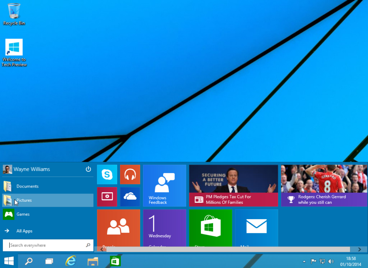
Right-click on a blank area of the tiled section and you can Personalize the menu or access Properties. The Personalize option lets you change the color of the taskbar, window borders and Start menu. The default choice is Automatic -- Windows will choose whatever goes best with your current setup.
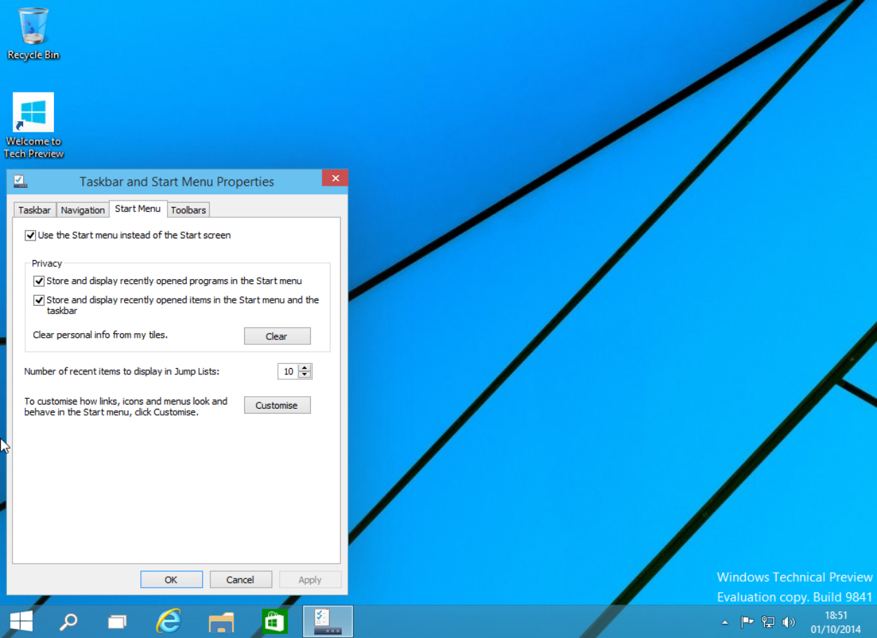
Click Properties and the Taskbar and Start Menu Properties window will open. Click the Start Menu tab and you can turn the menu off and go back to working with a Start screen. You can also manage your privacy and fully customize the menu. This last option will let you choose how links, icons and menus look and behave. You can also choose which items to pin to the Start list here. Should you want to revert to the original selection, click the Use Default Settings button.
Right-clicking the Start button will bring up the same context menu found in Windows 8.1, with some minor changes.
It’s all very intuitive, and Microsoft has done a great job of blending both worlds. Having got used to the Start screen in Windows 8.x I wasn’t sure I wanted to go back to a Start menu, but having spent just a short while with the one in Windows 10 I’m ready to make that change.
The tiles are horrible. I loved the old menu and being able to set things I wanted on it, without those ugly ugly tiles.

I need to win the lottery, I will pay them to port some stuff to Linux if it comes to that.
So true! Heck, I can’t figure out how to answer a another call while talking on my cell phone. I have to put on my glasses so I can see what button to push and by the time I find them, they have hung up!
RE: Wait, 10?? What’d they do, just decide to skip 9 since the odd-numbered ones are the ones that work?
Who knows? Maybe to distance themselves from the bad experience people are getting with 8?
Actually, I am REALLY happy it's 10... I have 20 years of code, some of which differentiates between Win9x, WinXP, and etc... Probably quite a bit of it does something different if it finds 'windows 9' in the version. Especially batches... Hunnerts of them. That may well be why they skipped Win9, and I thank them for it!
lmao!
Thank you for the laugh!
It took me three YEARS to convince my mom and my aunt that turning off the monitor wasn’t turning off the computer. And then I had to convince them that turning off the computer wasn’t going to ‘break’ it.
The only rest that poor machine had was when the power went out. And every FREAKING time that happened, they were freaking out, convinced that it was finally dead forever. (My mom would call me to coach her through turning it back on. “Press the button on the front of the tower... the big box sitting on the floor... and turn on the monitor... yes, the TV thing...”)
They make great keyboards and mice. They had the number 1 mobile OS outside of Nokia until the iPhone came out. People who say they havent innovated in the OS space are likely only looking on the outside not realizing the numerous chqnges that have made Windows faster and more stable, among other things. Basically people are stuck with a XP sp1 mindset when it has advanced so much more. Not to mention the Windows ecosystem supports far mor jobs than any other OS does, especially stateside. Its easy to hate and be ignorant though.
Bingo. Linux fans will never see it though.
Actually I did pay someone to do it. But that was mostly laziness on my part.
In my case I just backed up my files and forgot about all the applications that had I installed most of which I don't use. And I added a solid-state C:/ drive, moved my old C:/ to F:/ and installed 8.1. I re-installed the Apps that I actually use - mostly Office and some video editing programs like Sony Vegas.
Boot up is about 30 seconds. Sleep mode works like a champ and turns on in 2-3 seconds. I love the tile based Start Screen. I'm happy. My next upgrade will probably be Windows 12.
Not following why 10 would be different from 9 in that respect.
I gave up on my mom with windows98 ,, she had learned how to do some things with DOS2.1 and had 3*5 cards she made with cookbook style instructions for WordPerfect...
Because if one queries the version of Windows 10 it will return 'Windows 10', rather than 'Windows 9'...
If one parses that return, taking the first 11 chars (or just the 11th char), 'Windows 9' and 'Windows 98', and 'Windows 95' would all return 'Windows 9' (or '9'). Thus a batch made to work in Win9x-Win7 will think it is on a Win9x box, not a Windows 9 box, and do stuff that may not be good.
10 seems to make more sense than 8 and 8.1. No stupid tile menu to switch back-and-forth from that confuses a lot of older folks. The Start Menu was back to normal.
The Tech Preview looks promising, it integrates all the decent stuff from 8 and brings back the classic 7 features that are intuitive to most.
Micro$oft has a tendency to go good OS, bad OS in their releases, so hopefully the Windows 8 “alpha testers” will get a free upgrade to 10 when given the chance next year.

They've sure jazzed up the BSOD, I'll give them that.
Where did 9 go????
Interesting. Why would people have written it to look at only the first character of the version in the first place? 98 vs. 95 would have hosed that already, wouldn’t it? Plus, why are people not using the decimal version number (2K = 5.0; XP = 5.1, Vista = 6.0, W7 = 6.1, etc.)? Why the heck would they go with the alpha name?
Installed it???? Where did you get it? Is the Beta out now?
Hard to believe that Microsoft made the mixed UI paradigms worse -- but they did! By putting them both in the SAME INTERFACE now - the Start Menu.
Yes, I know you can remove the tiles from the start menu -- you have to remove them ALL which is really kind of stupid on Microsoft's part.
Been running the Windows 10 Tech Preview since last night - honestly NOT impressed. The "start" menu that Microsoft "put back" smacks of the Metro UI including using the flat tiles as menu icons, and the "start" button itself being the Metro icon.
Honest to God it's like Microsoft's trying to slap their user base and call them stupid AGAIN.
What Microsoft really needs to do is remove every bit of the Metro UI from the desktop, period. Remove the tiles from the Start Menu, no "tiles" in the Apps view, and for heaven's sake GET RID OF THE METRO APPS.
There is NOTHING UGLIER (except for Helen Thomas) than looking at a Metro app and a Windows App running side by side. That in itself is a complete cluster-fuck that Microsoft should've looked at and said "maybe that's not such a good idea."
DUMB, DUMB, DUMB,DUMB! It's like Microsoft flat out ignored all the feedback they received about how horrible the Metro UI and Metro apps are on the desktop.
No compelling reason to change for Windows 7 users, and no compelling reason for any 8.x users who've figured out how to put a REAL start menu back in v. 8.x and made their Windows 8 look/feel like Windows 7 again.
If Microsoft keeps going down this path mixing Metro and "Classic" apps in menu's and desktop applications they'll have two horrible releases of Windows in a row.
Change Course Microsoft! DUMP EVERY BIT OF METRO OUT OF THE DESKTOP.
Disclaimer: Opinions posted on Free Republic are those of the individual posters and do not necessarily represent the opinion of Free Republic or its management. All materials posted herein are protected by copyright law and the exemption for fair use of copyrighted works.