Posted on 10/02/2014 11:46:40 AM PDT by SeekAndFind

I switched from Windows 7 to Windows 8 from day one, and although I’ve dabbled with Start buttons, Classic Shell being the preferred choice, I learned to live with the Start screen, something that became easier once Microsoft released Windows 8.1 and 8.1 Update. But now that Windows 10 Technical Preview is here, it’s time to once again embrace the Start menu.
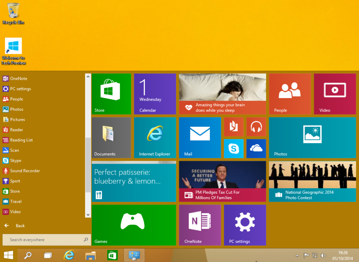
Windows 10’s Start menu is the perfect blend of Windows 7 and Windows 8.x. Click the Start button and the menu appears, displaying icons on the left and tiles on the right.
The top of the Start menu shows your user name and clicking on it will let you change your account picture, lock the computer or sign out. The power button to the right lets you put your PC to sleep, shut it down, or restart.
Underneath that are icons for Documents, Pictures, PC Settings, and File Explorer. Icons for your programs appear below those, and by default you see Snipping Tool, Calculator, Sticky Notes, Paint and Games.
Click on All Apps and you can access the bundled windows apps and any you've installed. The calculator app still fills the screen, but at least it now runs windowed and can be resized. Scroll to the bottom of All Apps and there are folders for Windows Accessories, Windows Ease of Access, and Windows System.
Right-click on an app and you can open it, uninstall it, pin to Start or pin to taskbar.
The Search box at the bottom of the menu lets you search your PC and the web.
The tiles on the right side of the Start menu look and work the same as the tiles on the Windows 8.1 Start screen. You can launch an app, or if you right-click its tile you’ll be able to unpin it from Start, pin it to the taskbar, uninstall it, or resize it. There are small, medium, wide and large sizes available (although not all sizes are available for all tiles). Live tiles can be turned on or off.
In the top right corner of the tiled section is a Windows Feedback app you can use to send feedback regarding the new OS to Microsoft.
The tiled area on the right expands or contracts as you add or remove tiles. So if you like apps, it will spread right across the desktop. If you hate having tiles, just unpin every one and it will change to a standard Start menu. To get the tiled section back, just pin any app to Start.
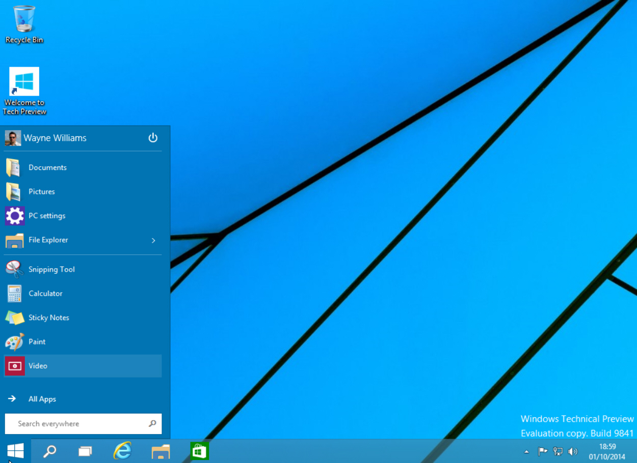
You can resize the menu by clicking and dragging on the top edge. Want a long, squat Start menu? No problem!
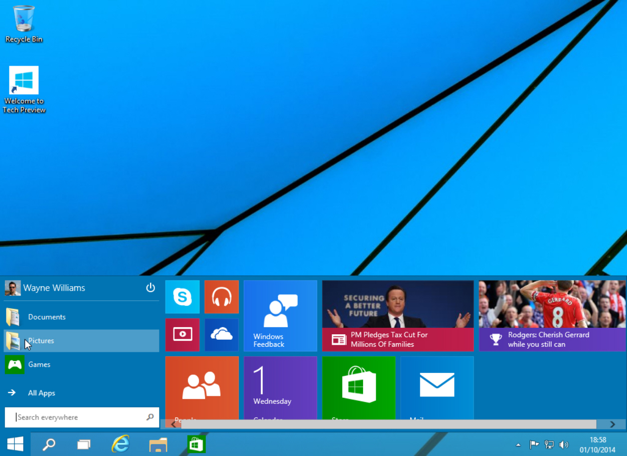
Right-click on a blank area of the tiled section and you can Personalize the menu or access Properties. The Personalize option lets you change the color of the taskbar, window borders and Start menu. The default choice is Automatic -- Windows will choose whatever goes best with your current setup.
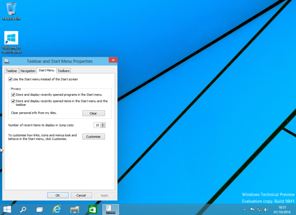
Click Properties and the Taskbar and Start Menu Properties window will open. Click the Start Menu tab and you can turn the menu off and go back to working with a Start screen. You can also manage your privacy and fully customize the menu. This last option will let you choose how links, icons and menus look and behave. You can also choose which items to pin to the Start list here. Should you want to revert to the original selection, click the Use Default Settings button.
Right-clicking the Start button will bring up the same context menu found in Windows 8.1, with some minor changes.
It’s all very intuitive, and Microsoft has done a great job of blending both worlds. Having got used to the Start screen in Windows 8.x I wasn’t sure I wanted to go back to a Start menu, but having spent just a short while with the one in Windows 10 I’m ready to make that change.
I figure Linux will be a lot like it is now, a beta quality desktop OS with about 1% market share.
Well, 789.

I went from Vista to Winows 8.1 so I really cannot comment on how 10 compares to 7.
But I can make a judgement on 10 vs. 8.1 and it looks like a step backwards to me. I am, apparently, the only inhabitant of the universe of Happy Windows 8 Users. I really, really like the full screen tile-based Start Menu. It is one mouse click to toggle back and forth between Desktop and my Apps.
Full screen leaves lots of room for lots of Apps. Version 10 cuts down on that Real Estate.
No thanks.
touch screens are what is driving the app based screens.
If you have a touchscreen flip around laptop.. basically a tablet with the computing power and peripherals of a computer .. then you will appreciate the win8 win10 GUI a lot more.
If you prefer a mouse and keyboard.. you probably like the win7 GUI better.
Hence the win10 customizable hybrid.
One GUI capable of working in both environments...
My win8 boots to desktop without add ons.
Don’t remember what I did to make it happen, but it’s been possible from day 1.
I think that’s very reasonable, but they should have made sure it works first. Their base is business users, who are generally on a desktop, and probably the fact that businesses have refused to adopt Win8 is what has made them jump to 10. Hope it works better!
Blending windows 8 with anything is a fail....
Metro .. turn your brand new PC into a ZUNE...
What the hell were they thinking.
Mrs p6 and I are fine with W8.1. W8 came the HP laptop she bought last year and I upgraded for free.
It’s fine. Works as good or better that the XP we had been using at home and at work.
The learning curve took a couple of weeks but wasn’t anything like rabid howling from the Apple/Linux fanboys.
I d/loaded the W10 Tech preview but plan on installing it on another machine...after all it is not a release version.
M4L
"You can fool..."
I REALLY don’t understand the problem with 8’s menu. It takes a couple of hours to get used to it.
Wow...that Windows 9 was quite a flop, wasn’t it?
Well. That’s it. I’m dead.
It took me five years to teach my mother the very basics of windows 7 after she’d adapted to windows 98.
This is going to confuse the crap out out of her.
She still can’t run a cellphone. She *just* figured out call waiting on the house phone a couple months ago and she still panics when she gets a call interrupt.
“Oh dear! I have a call! The thingy says that it’s from a number in Arizona that I don’t know!”
“So take the call mom.”
“Okay. But don’t hang up. If I loose you, I’ll call you back when I can.”
“That’s fine.”
[click]...
[click]
“Hello? HELLO?! Did I loose you?”
“I’m here mom.”
“Oh. Okay. I don’t know who it was. They hung up.”
I'm a Linux geek, but I really do wish you luck with the new OS, whenevet it's finally released. To me though, it just seems like throwing good money after bad.
RE: I REALLY don’t understand the problem with 8’s menu. It takes a couple of hours to get used to it.
1) People are resistant to change
2) People are impatient
wish I could figure out how to do that. 8.1 took away 'easy transfer'. did you pay someone to do it?
Basically the fanboys who don’t like the W8 interface claim it stinks because it isn’t Apple or Linux.
Linux is OK...I use it but the big problem I have is that it changes versions worse than MS. I had been using an Ubuntu version for maybe 3 years. Now it’s not supported and since it’s on a dual boot machine I can’t easily update.
Why Dual boot? Because Linux can’t run the software I need for my personal weather station or webcam.
And Apple???? Good grief people who are Apple fanatics remind me of the blond driver who says...”I put the key in the ignition, gas in the tank and step on the gas.” No idea of how her car works, she just wan’ts it to work.
I fall between those groups but like to do a lot of things...build and tweak my machines...by myself.
Which reminds me. I think my Raspberry Pi is bricked. Not sure what I did. Might have been that Linux thing.

Tech Bookmark
Disclaimer: Opinions posted on Free Republic are those of the individual posters and do not necessarily represent the opinion of Free Republic or its management. All materials posted herein are protected by copyright law and the exemption for fair use of copyrighted works.