Posted on 10/02/2014 11:46:40 AM PDT by SeekAndFind

I switched from Windows 7 to Windows 8 from day one, and although I’ve dabbled with Start buttons, Classic Shell being the preferred choice, I learned to live with the Start screen, something that became easier once Microsoft released Windows 8.1 and 8.1 Update. But now that Windows 10 Technical Preview is here, it’s time to once again embrace the Start menu.
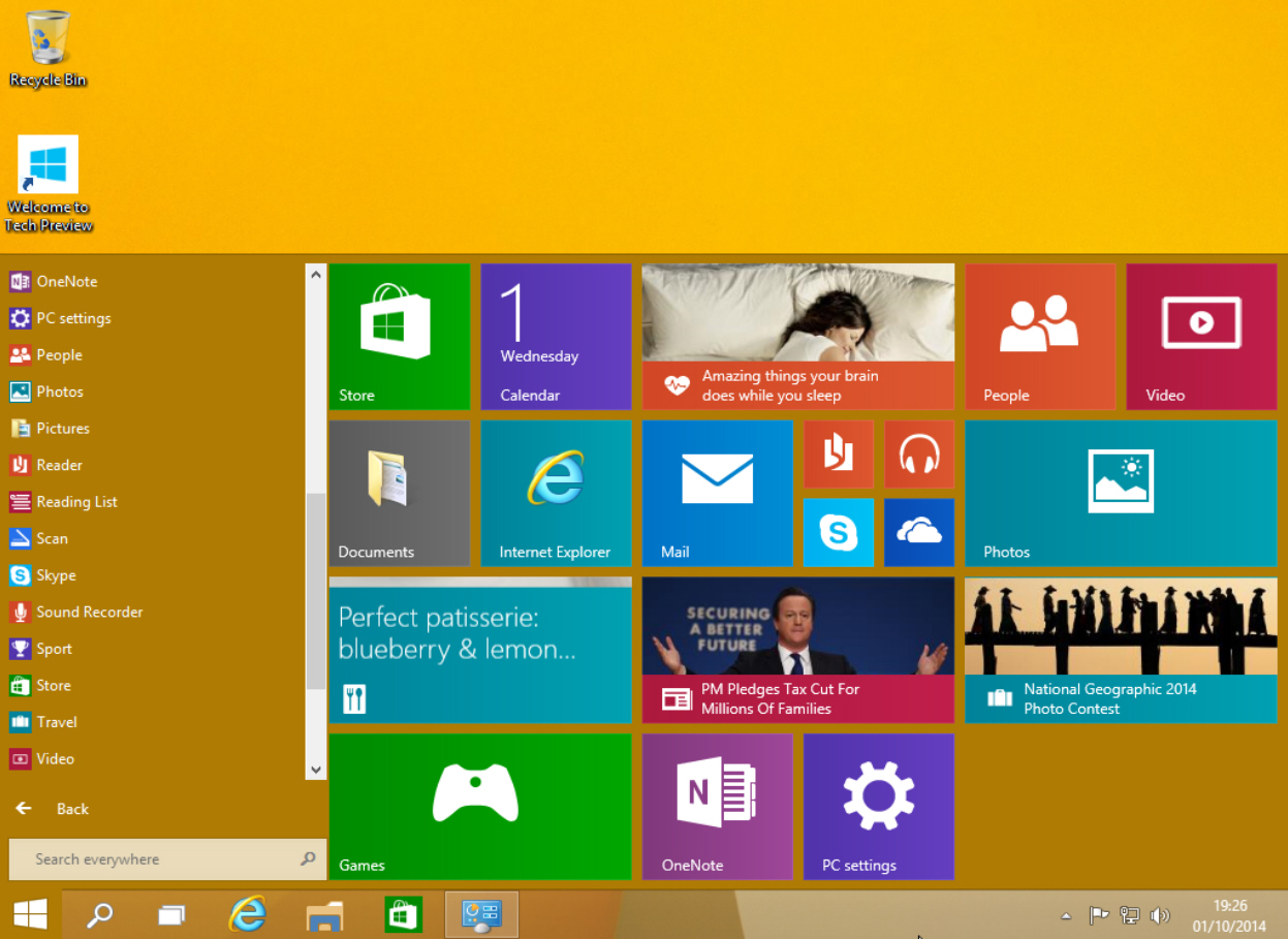
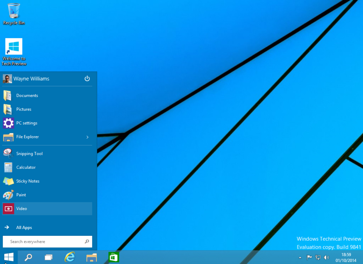
Windows 10’s Start menu is the perfect blend of Windows 7 and Windows 8.x. Click the Start button and the menu appears, displaying icons on the left and tiles on the right.
The top of the Start menu shows your user name and clicking on it will let you change your account picture, lock the computer or sign out. The power button to the right lets you put your PC to sleep, shut it down, or restart.
Underneath that are icons for Documents, Pictures, PC Settings, and File Explorer. Icons for your programs appear below those, and by default you see Snipping Tool, Calculator, Sticky Notes, Paint and Games.
Click on All Apps and you can access the bundled windows apps and any you've installed. The calculator app still fills the screen, but at least it now runs windowed and can be resized. Scroll to the bottom of All Apps and there are folders for Windows Accessories, Windows Ease of Access, and Windows System.
Right-click on an app and you can open it, uninstall it, pin to Start or pin to taskbar.
The Search box at the bottom of the menu lets you search your PC and the web.
The tiles on the right side of the Start menu look and work the same as the tiles on the Windows 8.1 Start screen. You can launch an app, or if you right-click its tile you’ll be able to unpin it from Start, pin it to the taskbar, uninstall it, or resize it. There are small, medium, wide and large sizes available (although not all sizes are available for all tiles). Live tiles can be turned on or off.
In the top right corner of the tiled section is a Windows Feedback app you can use to send feedback regarding the new OS to Microsoft.
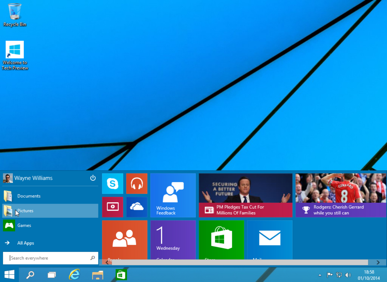
The tiled area on the right expands or contracts as you add or remove tiles. So if you like apps, it will spread right across the desktop. If you hate having tiles, just unpin every one and it will change to a standard Start menu. To get the tiled section back, just pin any app to Start.
You can resize the menu by clicking and dragging on the top edge. Want a long, squat Start menu? No problem!
Right-click on a blank area of the tiled section and you can Personalize the menu or access Properties. The Personalize option lets you change the color of the taskbar, window borders and Start menu. The default choice is Automatic -- Windows will choose whatever goes best with your current setup.
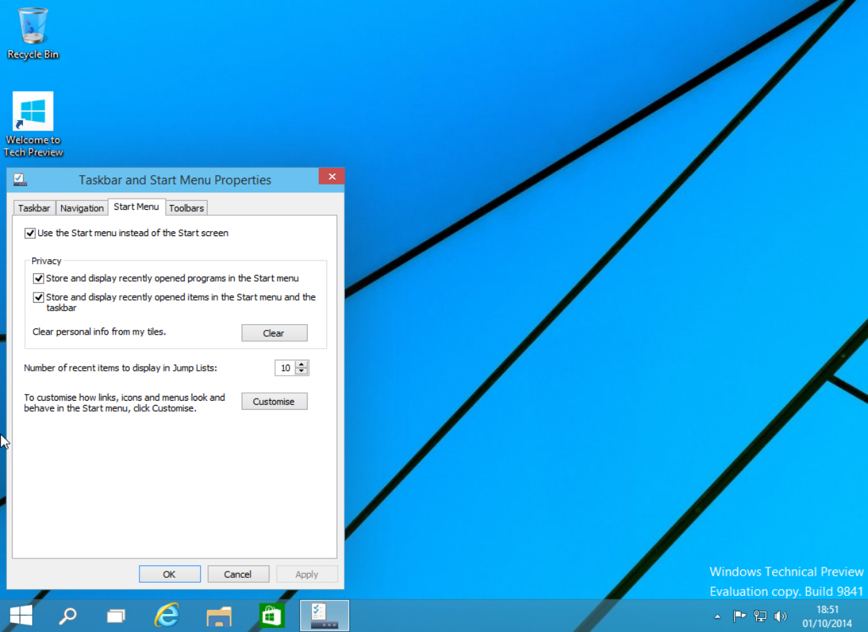
Click Properties and the Taskbar and Start Menu Properties window will open. Click the Start Menu tab and you can turn the menu off and go back to working with a Start screen. You can also manage your privacy and fully customize the menu. This last option will let you choose how links, icons and menus look and behave. You can also choose which items to pin to the Start list here. Should you want to revert to the original selection, click the Use Default Settings button.
Right-clicking the Start button will bring up the same context menu found in Windows 8.1, with some minor changes.
It’s all very intuitive, and Microsoft has done a great job of blending both worlds. Having got used to the Start screen in Windows 8.x I wasn’t sure I wanted to go back to a Start menu, but having spent just a short while with the one in Windows 10 I’m ready to make that change.
ULTIMATE
No.. Windows 7 is the PERFECT blend of windows 7 and 8 ;)
So, really, what’s the point of Windows 10? What does upgrading to Windows 10 do - other than enrich Microsoft - that Windows 7 doesn’t currently do?

That actually looks like it could be a reasonable balance.
Not sure I’ll give up Win 7 for it, but it’s DEFINITELY an improvement over Win 8x. That HAD to be the WORST excuse for an OS I’ve ever seen in my life, even worse than Windows ME!!
Winning!
I like Windows 7 specifically because it doesn’t have any craps... er, apps. If I want something that takes over my whole screen I’ll install Desqview.
Where’d 10 come from? I thought they were doing 9 - or some unnumbered version?
In any case, the current one is so horrible I’ll gladly change to anything else.
Fixed that for ya!
huh? where’s windows 9? i didn’t get that memo.
BFL
I was just about to say, Windows 10 looks just like Windows 7, but with a ‘Start Menu’ with a Win8 ‘look’. lol
Microsoft seriously needs to find a different vision. I’m frankly astounded that no one has come along and wiped them off the face of the Earth. They’ve been basically sitting there for years, just waiting to be replaced. They have had NO innovations in over a DECADE. They’ve tried things outside of Operating systems, and aside from gaming consoles, everything they’ve done has been a money losing failure. Even now, the Playstation 4 is cleaning their clock in gaming console sales.
The only thing that can be really keeping them going forward has to be in the corporate world, where their Server OS and Office/Email software is a HUGE revenue generator for them. Their corp software licensing is a money SPONGE. It just sucks up the money from your budget into their banks accounts, and it’s so complex, I’m not sure any one person understands ALL of it. They just say, “Pay us”, and people just do it.
Sadly, spot on.
For less than $3, I purchased a tiny start button app called StartisBack froma web site off the same name. It is bettet than the win 7 start menu, but looks identical. The best thing is, with it, I can boot automatically into desktop mode and never fool with Metro.
Win 8 with this tiny app is better than win 7, as it is faster and seeems to behave better. Never thought I would ever say that. Best 3 bucks I have ever spent.
Given that Windows 7 support ends something aroung 2019, I figure by then that the few programs I run that require Windows will be ported to Linux.
I think MS has been doing discreet updates (you know, the things that happen in the dead of the night) to make 8.x ready for this new version. I have noticed some unaccountable changes in things but fortunately, they’re changes for the better. Almost nothing could be worse.
The best way I could describe my experience with Window's ME is, it is like paying to install a virus into your computer.
I guess Windows 8x was a real disaster. -tom
Disclaimer: Opinions posted on Free Republic are those of the individual posters and do not necessarily represent the opinion of Free Republic or its management. All materials posted herein are protected by copyright law and the exemption for fair use of copyrighted works.