

Posted on 06/16/2005 8:02:07 AM PDT by Republicanprofessor
Okay, today our theme, for this fourth "class," is emotional expressionism. This developed in the first decade of the twentieth century and features Matisse, as a French Expressionist (or Fauvist, if you want to get really picky) and the two branches of German Expressionism: the Bridge and the Blue Rider. They are all inspired by the work of van Gogh and Cezanne which we saw in the last “lesson”: the emotional power of van Gogh and the strong composition of Cezanne.
Henri Matisse (1869-1954) dropped out of a career as a lawyer. He became a leader of the Fauves (which also included Derain, Braque and many other more minor artists). His Joy of Life is the quintessential Fauve painting. (This was posted earlier on a thread dealing with the Barnes Foundation, which is where the painting is located, and for many years it was only reproducible in black and white, a very frustrating fact for the art historian.)
What parallels do you see between the works below? What values do they show? How does Matisse’s use of brighter colors, simplified line and shape exaggerate his meaning?
Joy of Life 1905 by Matisse vs. Titian’s Bacchanal of the Andrians from 1522.
Note the flat women in the middle. Matisse’s contemporaries (including Seurat, whose pointilistic--or dotted--paintings were very much on the cutting edge) were shocked at the flat treatment. Seurat was not shocked at the fact that nudes were in the picture, because nudes in these suggestive pose go back to Titian, Giorgione and others of the Renaissance in Venice, as in that right painting. But the fact that Matisse chose to exclude modeling (or shading) of the bodies to make them “flat” is what appalled Seurat. But does Matisse still convey their curvilinear and seductive shapes? Surely, with that wonderful, sensuous line around them. Matisse is an expert at line. He is also a master of color: notice the wonderful bright colors, popping out and celebrating everywhere. And what is going on? Have you ever enjoyed music and dance at a picnic? That’s what we see. And a rapturous kiss in the lower right, with figures absorbed into one (like Klimt’s Kiss that Liz posted a few weeks ago.)
And for those who would say that he can’t draw, let me enlighten you. Matisse would draw from the live model for several hours every morning. But then he would go into his studio and extract the essence of certain poses to emphasize the joy he wanted to convey. Look at all the steps he went through to create Le Luxe I and Le Luxe II below. This example is not as good as the 20-30 steps he went through to develop his Pink Nude on the far right below, but I don’t have that slide here. Matisse’s work must be the most deceptively simple in art history.


I could go on and on about Matisse, but let’s jump to Germany (and let FReepers add which are their favorite Matisses on the thread below). There were two movements of Expressionism in Germany: the Bridge (Die Brucke) which included Kirchner, Nolde and others in the cities; and the Blue Rider (Der Blaue Reiter) which included Marc and Kandinsky in the country. What comparison of values and forms can you see below? Do they use different shapes and colors to convey their meaning?

I am a country person, so you have to take what I say with a great deal of salt. But I always find the city images by Ernst Ludwig Kirchner (1880-1938) racked with tension. These ladies are crowding me out of the street and remind me of the adage that “You can’t be too rich nor too thin.” (Say that in a really high and snotty voice). The bright red-pink background presses forward to make the space even more claustrophobic. Nearly all of Kirchner’s work has these angled shapes and tension throughout. And he did have a mental breakdown of sorts after being in WWI, and he retired to Switzerland to paint and to get his act back together again. But even those paintings in Switzerland have his tell-tale angles and tension.
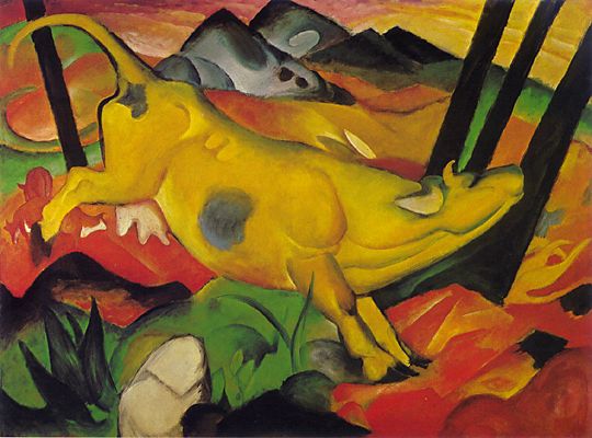
But Franz Marc(1880-1916) has such a sense of joy and peace in his work. Like Matisse, his colors are bright and appealing. He wanted to see nature from the perspective of the animals. Have you ever seen a yellow cow dance? The curves of the Blue Horses are also the essence of “horsehood,” if there is such a word.
One other Bridge artist is Emil Nolde (1867-1956). He was actually very religious and tried to bring that emotionally into his works. I love his dance around the golden calf, below, because it really captures that cravenness that drove Moses to break the commandments. See the golden calf in the central background? Nolde also did some touching images, such as letting the children come to Christ (below, right).


Now to the most difficult artists of this section. Open your minds for a new concept of art, because we are definitely moving into non-objective art. The cool thing is that in four different countries in 1911, four artists were independently working towards art that was no longer based in the real world (as in no-objects). These included the Russian Kasimir Malevich, the Dutch Piet Mondrian, the American Arthur Dove and the German Wassily Kandinsky (1866-1944).
One evening Kandinsky came home to his studio and had a new vision. As it turns out, one of his abstract (but recognizable) early paintings was on its side, so he saw it through completely new eyes. He didn’t see clouds, a hill, or whatever. He saw that puffy shapes of white, textured greens and independent lines could create feelings without having to represent anything in this world. At nearly the same time, he went to a concert by an avant-garde composer called Arnold Schoenberg. This music did not use the normal traditions of music: there was no major or minor key (any note could be used), no traditional use of theme or harmony, etc. (I think early atonal music is much more difficult to “get” than the paintings.) Kandinsky did some paintings of this concert and he and Schoenberg began a long correspondence about modernism that is fascinating. See the yellow piece below. (The Jewish Museum in NYC had a great exhibition on this a year or two ago, and the catalogue, complete with CD, is awesome.)
So, here are four works by Kandinsky. Can you tell the earliest work? It’s the first one. Imagine it on its side and the liberating effect this had on him. Now see if you can discern a difference in mood between the other pieces? How is he using color, line and shape differently? Now don’t just dismiss it as a bunch of “squiggles a kindergartner could do.” Look carefully.


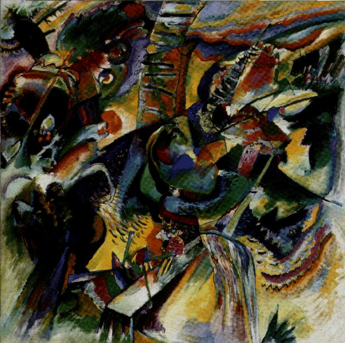
Kandinsky’s early work (I don’t know this title: train perhaps?) c. 1911 1911 Black Spot 1912 Ravine 1914
Now, what Kandinsky did (in more intellectual terms) is the following: he freed color and line from each other (as Pollock would do so even more later on). Up until now, line has always defined the outer border of a form, be it a flower, a nude, or whatever. But now the line can do its own thing in a corner, and the color can flow freely. Kandinsky said that he did not really paint music, but to emphasize the musical connection in class, I ask if one can perhaps “hear” different instruments. Does that huge “black spot” perhaps remind one of cymbals crashing, drums or low bass? Or maybe a tuba. The ravine image, on the far right, is really dark and scary. Was he communicating an experience during a walk? I see a “waterfall” in the lower right.
At this time, the “meaning” in these paintings is often the joy of discovering abstraction and non-objective art. Different people might see different things: a mountain or a body or a waterfall. But you can’t go off into a long story about this mountain or person climbing it. These paintings are meant to be enjoyed for their visual pleasure: the contrast of line against color, very much like the sound of a clarinet with a violin. Music is not “representational.” Mozart did not write with a little story in mind (although later composers did write “program” music about the course of a river or whatever). Kandinsky wanted to create this same, absolute pleasure that we feel in music: one theme against another, the pure sound of instrument against another instrument, color against line.
This stuff is not easy to get; but this is (again) a short introduction to some of these wonderful ideas. I love Kandinsky, but he is not easy to understand.
By the way, a few images by the other non-objective artists.

![]()

Malevich Compressed 6 Mondrian and Dove Nature Symbolized all about 1911 or soon thereafter. Notice how Dove is a bit different? What has he added to his works that the other Europeans don’t have?
Instead, criticize because you don't like what the artist did to the tree, the nude, the flute, the waterfall because......
Ooops, pushed that Post button a wee bit too early. The earliest Kandinsky did not come through, so here we try again. Sorry for the confusion.
Art Appreciation/Education ping list.
Let me know if you want on or off the ping list.
I love Franz Marc and have a Kandinsky (just a framed poster) in my livingroom.
Leni
I am bookmarking it. Will be returning later when I have more time.
Bump for later.
Thanks again for posting these threads - they're like an oasis - very refreshing.
Art appreciation bump. Thanks again Republicanprofessor.
Ah Hah - now I know where the monopoly game people got the idea for the design of the board game in that second from last painting in your post #1.


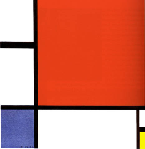
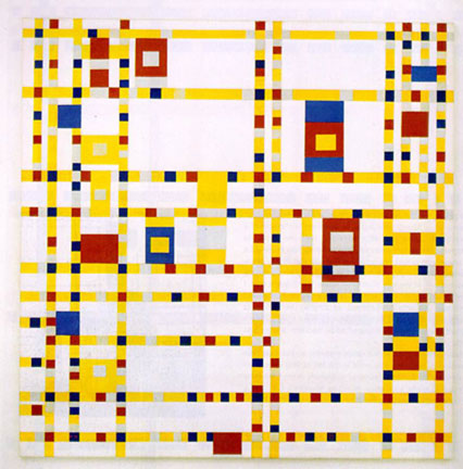
Mondrian: Gray Tree, Apple Tree, Line and Color, Composition and Broadway Boogie-Woogie (which may look the most like that Monopoly board). Some love the energy in this one, inspired by a move to NYC in the late 1930s. But I don't like the yellow lines as well as the black ones.
MOndrian has written quite a bit about the theory behind these paintings. But the reading is difficult. Essentially, he is interested in a stable balance of forms, thus no diagonals (which add dynamism and energy). Each shape is different and there is such a subtle balance between the lines, white, and colors that curators can spot a fake immediately.
While these might be easy to copy now, remember he is one of the first to create such new works in the 1910-20s.
Just in case anyone wants to see any previous "classes" in this vein, the posts are:
class 3 http://www.freerepublic.com/focus/f-chat/1419876/posts
class 2 http://www.freerepublic.com/focus/f-chat/1414727/posts
class 1 http://www.freerepublic.com/focus/f-news/1410117/posts
RP
They look like any grade school child who was strung out on LSD could do them.
Instead, criticize because you don't like what the artist did to the tree, the nude, the flute, the waterfall because
All of these have the same features and characteristics (with the exception of the Titian which, while not exactly my style is infinitely better than the rest). They all seem to have fallen out of a drug induced haze. The mind rebells at the loudness and unreality of the colors, shapes etc.
These paintings are meant to be enjoyed for their visual pleasure: the contrast of line against color, very much like the sound of a clarinet with a violin. Music is not “representational.”
That's just it, they give no visual pleasure. While music is not necessarily representational (Although the best music is) it does have harmony and structure and flow. Else it is not music.
These paintings have no structure. They are just seemingly random splashes of paint on canvas. (This applies mostly to the later pictures in the post) They have no harmony, the colors and shapes clash more than fit. Compare the Titian where everything seems to fit together with the Matisse where nothing seems to fit (even though all the 'people' are nude). Matisse was obviously tripped out when he painted this and it was a bad trip.
All of these fail the sofa test. In fact, if it were not for the fact that some sucker would pay big bucks for them I'd burn the lot to make the world a better place by removing the ugliness. (get the feeling I don't care for these at all?)
BTW. In all fairness the tree lined street is the only one of the non-Titian paitings that's not a total waste. (although I'd bet the artist was still wasted when he painted it)
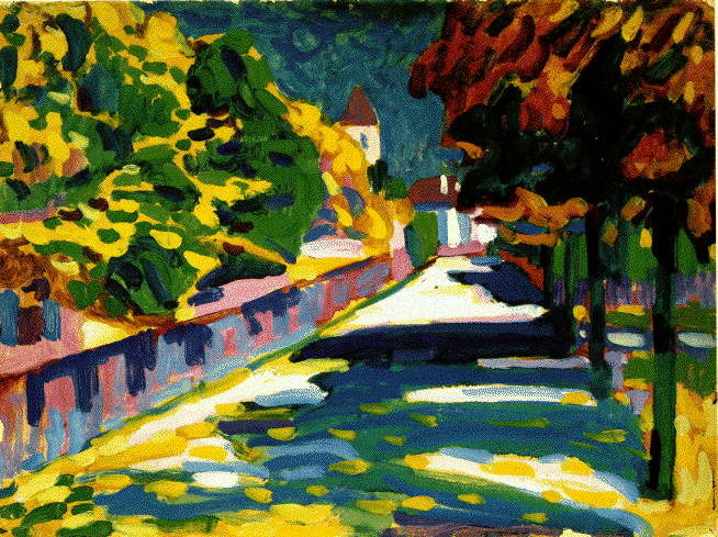
I didn't realize Kandinsky painted landscapes like the one posted of the street in a village. I like this and I like his later work that use a lot of white for negative space between shapes.
I am so glad that there are so many types of art--classical, abstract etc, because losing one would devalue the whole. The abstracts make the realism so much more sweet where the realistic can where on me the abstracts I can look at and appreciate for the moment.
I'd like to post a section of an email that I sent to another freeper:
"I have been fairly careful to say on these threads that theoretically, there is no reason I see that abstract art cannot be great art. I say this because representational art is abstract in itself, being nothing more than compositions of color shapes (painting). And it follows that the way in which the shapes are arranged (the "abstract" part of the art) is more important to the "art" of the thing than the accuracy of representation."
I mean to say that even with great representational art, it must be the abstract qualities which contribute most to that greatness.
Having said that, it is representational art which is my personal love, has been since I was a child. The artist I am currently enthralled with is Edward Hopper (Thanks to seeing his painting "Groundswell" on one of your threads, Professor). Who freely takes license with reality.
As for the Matisses and the others, it is hard not to like them...even so, I am not yet convinced that they go beyond good art to being great art.
Well, I agree that his figures, abstract as they are, are wonderfully lifelike. Full of movement and charm. I'm glad to know he can draw, it gives me assurance that he made things happen on purpose without total reliance on style. Whether or not he could draw accurately, he was surely successful in his purpose.
I think it very possible that Haals, Velasquez and others would take issue with the assertion that line and color were not freed from each other until the 20th century.
My painting instructor, while no particular fan of modern art, particularly dislikes Matisse's use of color, which he refers to as being "acid."
While I personally am inclined to like and enjoy all of the artists in this thread, I can't get over the feeling that they are almost more like fabric designers.
The Matisse paintings would make wonderful "tropical" Hawaiian type shirts (wouldn't surprise me if you can actually buy a Matisse shirt) while Kandinsky's stuff would look nice on a couch or drapes.
I think you're right. They do remind me of the cheap and gaudy upholstery fabrics one sees on poorly reconditioned antiques
Disclaimer: Opinions posted on Free Republic are those of the individual posters and do not necessarily represent the opinion of Free Republic or its management. All materials posted herein are protected by copyright law and the exemption for fair use of copyrighted works.