Ooops, pushed that Post button a wee bit too early. The earliest Kandinsky did not come through, so here we try again. Sorry for the confusion.
Posted on 06/16/2005 8:02:07 AM PDT by Republicanprofessor
Instead, criticize because you don't like what the artist did to the tree, the nude, the flute, the waterfall because......
Ooops, pushed that Post button a wee bit too early. The earliest Kandinsky did not come through, so here we try again. Sorry for the confusion.
Art Appreciation/Education ping list.
Let me know if you want on or off the ping list.
I love Franz Marc and have a Kandinsky (just a framed poster) in my livingroom.
Leni
I am bookmarking it. Will be returning later when I have more time.
Bump for later.
Thanks again for posting these threads - they're like an oasis - very refreshing.
Art appreciation bump. Thanks again Republicanprofessor.
Ah Hah - now I know where the monopoly game people got the idea for the design of the board game in that second from last painting in your post #1.


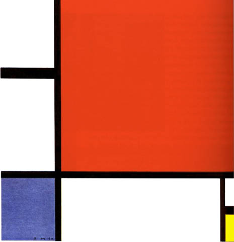
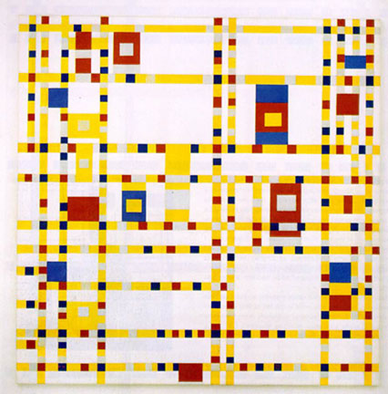
Mondrian: Gray Tree, Apple Tree, Line and Color, Composition and Broadway Boogie-Woogie (which may look the most like that Monopoly board). Some love the energy in this one, inspired by a move to NYC in the late 1930s. But I don't like the yellow lines as well as the black ones.
MOndrian has written quite a bit about the theory behind these paintings. But the reading is difficult. Essentially, he is interested in a stable balance of forms, thus no diagonals (which add dynamism and energy). Each shape is different and there is such a subtle balance between the lines, white, and colors that curators can spot a fake immediately.
While these might be easy to copy now, remember he is one of the first to create such new works in the 1910-20s.
Just in case anyone wants to see any previous "classes" in this vein, the posts are:
class 3 http://www.freerepublic.com/focus/f-chat/1419876/posts
class 2 http://www.freerepublic.com/focus/f-chat/1414727/posts
class 1 http://www.freerepublic.com/focus/f-news/1410117/posts
RP
They look like any grade school child who was strung out on LSD could do them.
Instead, criticize because you don't like what the artist did to the tree, the nude, the flute, the waterfall because
All of these have the same features and characteristics (with the exception of the Titian which, while not exactly my style is infinitely better than the rest). They all seem to have fallen out of a drug induced haze. The mind rebells at the loudness and unreality of the colors, shapes etc.
These paintings are meant to be enjoyed for their visual pleasure: the contrast of line against color, very much like the sound of a clarinet with a violin. Music is not “representational.”
That's just it, they give no visual pleasure. While music is not necessarily representational (Although the best music is) it does have harmony and structure and flow. Else it is not music.
These paintings have no structure. They are just seemingly random splashes of paint on canvas. (This applies mostly to the later pictures in the post) They have no harmony, the colors and shapes clash more than fit. Compare the Titian where everything seems to fit together with the Matisse where nothing seems to fit (even though all the 'people' are nude). Matisse was obviously tripped out when he painted this and it was a bad trip.
All of these fail the sofa test. In fact, if it were not for the fact that some sucker would pay big bucks for them I'd burn the lot to make the world a better place by removing the ugliness. (get the feeling I don't care for these at all?)
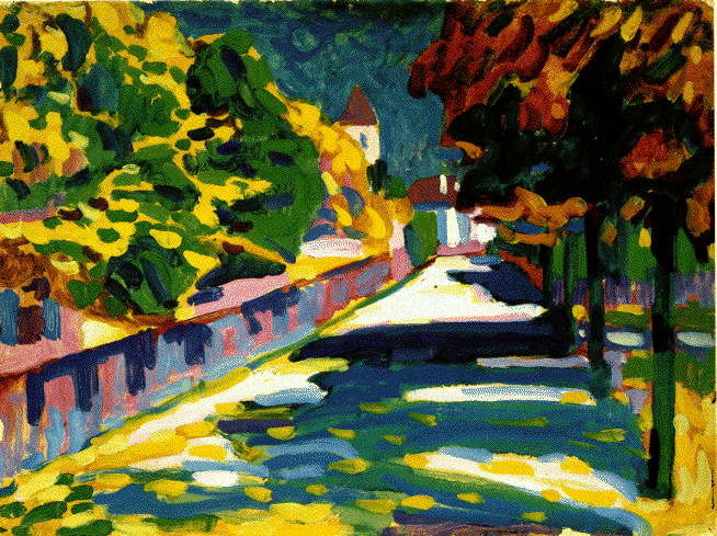
BTW. In all fairness the tree lined street is the only one of the non-Titian paitings that's not a total waste. (although I'd bet the artist was still wasted when he painted it)
I didn't realize Kandinsky painted landscapes like the one posted of the street in a village. I like this and I like his later work that use a lot of white for negative space between shapes.
I am so glad that there are so many types of art--classical, abstract etc, because losing one would devalue the whole. The abstracts make the realism so much more sweet where the realistic can where on me the abstracts I can look at and appreciate for the moment.
I'd like to post a section of an email that I sent to another freeper:
"I have been fairly careful to say on these threads that theoretically, there is no reason I see that abstract art cannot be great art. I say this because representational art is abstract in itself, being nothing more than compositions of color shapes (painting). And it follows that the way in which the shapes are arranged (the "abstract" part of the art) is more important to the "art" of the thing than the accuracy of representation."
I mean to say that even with great representational art, it must be the abstract qualities which contribute most to that greatness.
Having said that, it is representational art which is my personal love, has been since I was a child. The artist I am currently enthralled with is Edward Hopper (Thanks to seeing his painting "Groundswell" on one of your threads, Professor). Who freely takes license with reality.
As for the Matisses and the others, it is hard not to like them...even so, I am not yet convinced that they go beyond good art to being great art.
Well, I agree that his figures, abstract as they are, are wonderfully lifelike. Full of movement and charm. I'm glad to know he can draw, it gives me assurance that he made things happen on purpose without total reliance on style. Whether or not he could draw accurately, he was surely successful in his purpose.
I think it very possible that Haals, Velasquez and others would take issue with the assertion that line and color were not freed from each other until the 20th century.
My painting instructor, while no particular fan of modern art, particularly dislikes Matisse's use of color, which he refers to as being "acid."
While I personally am inclined to like and enjoy all of the artists in this thread, I can't get over the feeling that they are almost more like fabric designers.
The Matisse paintings would make wonderful "tropical" Hawaiian type shirts (wouldn't surprise me if you can actually buy a Matisse shirt) while Kandinsky's stuff would look nice on a couch or drapes.
I think you're right. They do remind me of the cheap and gaudy upholstery fabrics one sees on poorly reconditioned antiques
Disclaimer: Opinions posted on Free Republic are those of the individual posters and do not necessarily represent the opinion of Free Republic or its management. All materials posted herein are protected by copyright law and the exemption for fair use of copyrighted works.