Posted on 02/08/2024 9:39:22 AM PST by Red Badger
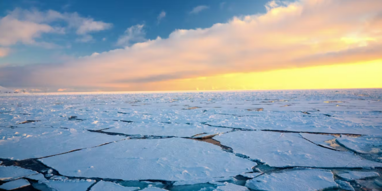
Arctic sea ice continued its stonking recovery last month, recording its 24th highest level in the 45-year modern satellite record. As reported previously in the Daily Sceptic, the ice climbed to a 21-year high on January 8th. Good news, of course, for ice fans and polar bears, but frankly a bit of a disaster if you are forecasting future summer swimming galas at the North Pole to promote a collectivist Net Zero agenda. Live by the sword, die by the sword – if you cherry-pick the scientific record to state the climate is collapsing, it might be thought you have some explaining to do when the trend reverts to the norm. Just ask coral alarmists about two years of record growth on the Great Barrier Reef. Sadly, explanations there are none, just a deafening, stunned silence.
Arctic sea ice has long been a poster scare for climate Armageddon. But science tells us that it is cyclical and is heavily influenced by ocean currents and atmospheric heat exchanges. It would appear that these chaotic changes are beyond the ability of any computer to process, although a large, well-funded model industry begs to differ. The recovery in Arctic sea ice has been steady if slow and this has enabled the alarums to hang on in the mainstream headlines. Of course it could go into reverse, nobody really knows, least of all Sir David Attenborough who told BBC viewers in 2022 that the summer ice could all be gone by 2035. He relied, needless to say, on a computer model.
Most mainstream climate journalists just print what they are told without looking too closely at the source of the information. The U.S.-based National Snow and Ice Data Centre (NSIDC) is a source of interpretation for trends in polar ice, but care needs to be taken when reading its often gloomy monthly summaries. According to the NSIDC, January sea ice growth was “lower than average” throughout most of the month. It headlined its report: ‘Nothing swift about January sea ice.’ Other interpretations are available. Consider the graph below tracking the ice extent for January over the satellite record.
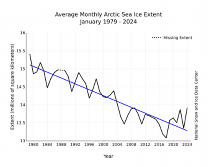
Statisticians can argue over when the sea ice started to recover but there has not been much decline going back to around 2007. In this case January shows a similar trend to that seen in September, the month with the lowest sea ice extent. A moving average line from around the middle of the last decade would show an obvious increase. But the NSIDC reproduces this graph for every individual month and year with a downward linear trend from 1979, a noted high point for recent sea ice. The graph is widely used on social media to counter any suggestion that the ice is recovering.
Note also that the NSIDC claims the January growth extent was “below average”. Well it depends on what average you are using. The NSIDC uses a comparative average from 1981-2010, despite a more recent decade of data being available. It is not hard to see why it prefers 1981-2010 since it includes the higher levels of the 1980s and excludes the lower levels of the 2010s. Taking a 1991-2020 average would likely lead to many more ‘above average’ observations. Data before 1979 is not as accurate, but levels going back to the 1950s suggest much lower sea ice extents. Perish the thought that comparisons should be made with these data or observations made about an obvious cyclical trend seen here and in the historical record going back to the early 1800s.
The NSIDC can spin its figures as much as it likes knowing that in the era of ‘settled’ climate science it is unlikely to be widely challenged. On a more serious note, this unwillingness to question perceived authority and engage in the scientific process gave us Michael E. Mann’s infamous 1998 ‘hockey stick’ graph. This purported to show declining temperatures for 1,000 years followed by a sharp recent uptick caused by human-caused burning of hydrocarbons. The unquestioning acceptance in mainstream media, science and politics can be said to have removed the concept of natural climate variability for a generation and put many Western countries on the road to Net Zero insanity. Now the hockey stick is centre stage in a Washington D.C. libel trial brought by Mann complaining that the journalist Mark Steyn branded his work a fraud. By some accounts, the hockey stick does not seem to be having a great time in the dock.
Professor Abraham Wyner is a distinguished statistician at Mann’s own University of Pennsylvania. Asked on the court stand whether Mann’s hockey stick used manipulative techniques, he replied “yes”. He suggested it was possible that if you knew where you wanted to get to, you can lead yourself into a conclusion different from someone who walked down a different set of paths.
In earlier court documents, Mann claimed wrongly that he was a Nobel laureate, a fact noted during the trial. His hockey stick abolished the Medieval Warming Period, while subsequent leaked Climategate emails referred to “Mike Nature Trick”. This was a practice of using the most convenient proxy or temperature measurements to fit the desired narrative.
In the course of his testimony, Dr. Wyner made comments that strike at the heart of so much that is wrong with the ‘settled’ science pronouncements that seemingly cannot be disputed or even discussed.
And so what happens is, and what is happening today in statistical analysis… we’re in a crisis. A crisis of trust and replication because so many results that were thought to be true turned out not to be true and correct have now gone back and looked at or attempted to be replicated and they didn’t work. Lots of things we thought were true turned out not to be true. It’s a crisis. A problem [my colleague] has identified is due to really bad statistical sets of methods that allow you to get away with choices that would produce a very different result if you did it differently.
What the last two decades or so have shown us is that activists will use any weather outlier or natural disaster to claim the climate is collapsing, or the Earth is “boiling” in the odd universe occupied by UN Secretary-General Antonio Guterres. Statistics are bent to fit the desired narrative whether it be natural waxing and waning of ice levels or typhoon jets landing near a measuring device showing a 60-second 40.3°C temperature blip ‘record’ at RAF Coningsby. Net Zero is starting to unravel thread by thread, and it is time the spotlight was amped up to maximum to shine a light on all the dodgy science used to promote this horrendous reset of human society.
Chris Morrison is the Daily Sceptic’s Environment Editor.
Recovery?? We don’t need no stonking recovery or badges either for that matter.
Stonking. I knew it would be a British thing.
stonk·ing
/ˈstôNGkiNG,ˈstäNGkiNG/
adjectiveINFORMAL•BRITISH
used to emphasize something remarkable, exciting, or very large.
“a stonking 207 mph maximum speed”
Every day is the hottest day on record.
And, on top of that, the arctic sea ice is growing at a frightening pace.
To a liberal, history began at breakfast this morning..................
“the arctic sea ice is growing at a frightening pace.”
Not only that, it’s shrinking at a record rate at the same time.
In WWII, the US and Britain soldiers had a difficult time communicating because of the slang difference between the two versions of English.
To which Churchill quipped: “Two great nations separated by a common language!”..............
Too true. It's like their brains cold-boot at 2 AM.
Best I ever heard was the British phrase “I’ll knock you up in the morning”, said to an American female officer.
(Means “I’ll knock on your hotel room door to wake you”)
Stonking?
Arctic sea ice continued its stonking recovery last month,
What is that, like astonishing? Surprising? I can glean the meaning by the context, but truly the first time I’ve ever seen “stonking” as a word.
Datrn! I’m going to have to cancel the order for the dozen palm trees I ordered for my new beachfront property on Hudson Bay.
It’s going to get dumber... We still have two more years until the end of the current solar maximum cycle...
It’s Brit speak.................
Going by the chart, despite recent gains it looks like there is still about 1.5 million square kilometers less Arctic sea ice than in 1980. Hopefully, the recent trend will continue, but there have been a couple of dips even since the rise began.
Is that like “slaking”?
Data from before 1979 are based on airborne and surface measurements. Data from 1979 to the present are additionally based on measurements from sun-synchronous near-polar orbiting satellites, using microwave radiometry. Their approximately 90 minute orbits give them full coverage of the polar regions (both north and south) every day.
Quick, Somebody call Al Gore !
where’s that American leftennant?
he’s outside sucking a fag.
well, perhaps i will join him.
It looks like the turnaround began while Trump was President. But will he get credit?
Disclaimer: Opinions posted on Free Republic are those of the individual posters and do not necessarily represent the opinion of Free Republic or its management. All materials posted herein are protected by copyright law and the exemption for fair use of copyrighted works.