Free Republic
Browse · Search
General/Chat
Topics · Post Article

Skip to comments.

Ten Coronavirus Charts and Graphs You Need to See: Get a balanced picture of the USA’s Coronavirus situation.
PJ Media ^ | 07/28/2020 | Matt Margolis

Posted on 07/28/2020 8:44:30 AM PDT by SeekAndFind

If you listen to the mainstream media (and I don’t recommend it) it’s safe to say you’re probably not getting a balanced picture of the USA’s coronavirus situation. They go for the headlines, the stuff that looks bad, in hopes they can pin everything on Trump, or deflect criticism from Cuomo in New York, and generally make people afraid. But there’s a lot of stuff happening that doesn’t make it into the headlines or is ignored. So, I’ve compiled some graphs, charts, etc., that show you what’s been going on lately that might not be getting the attention it deserves. Some of it is good news, some of it is bad, some just puts things into context, but it all matters.

1. Small businesses are still getting crushed

Have you seen your favorite local restaurant or shop go under? The longer we go without reopening, the harder small businesses are finding it to stay open. Even when this is over (assuming it ever is) your favorite places may no longer be in business.

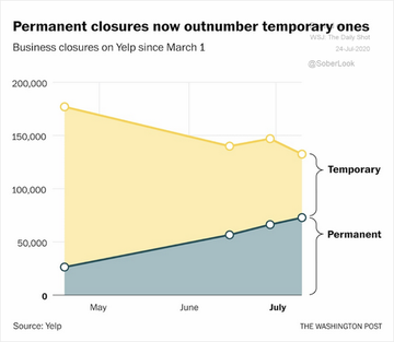
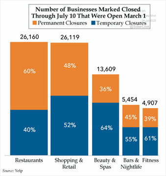
More small businesses are giving up. pic.twitter.com/zcj5klLBOh

— Aaron Ginn (@aginnt) July 25, 2020

2. Testing, testing, testing

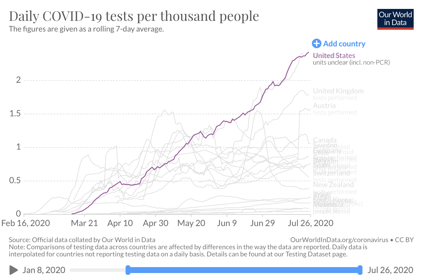
The USA is literally crushing it when it comes to testing compared to other countries. Remember when testing was hyped as the most important thing?

Daily COVID-19 tests per thousand people. pic.twitter.com/VVQMJhBBO2

— Matt Margolis 🇺🇸 (@mattmargolis) July 27, 2020

3. Putting COVID-19 cases in perspective

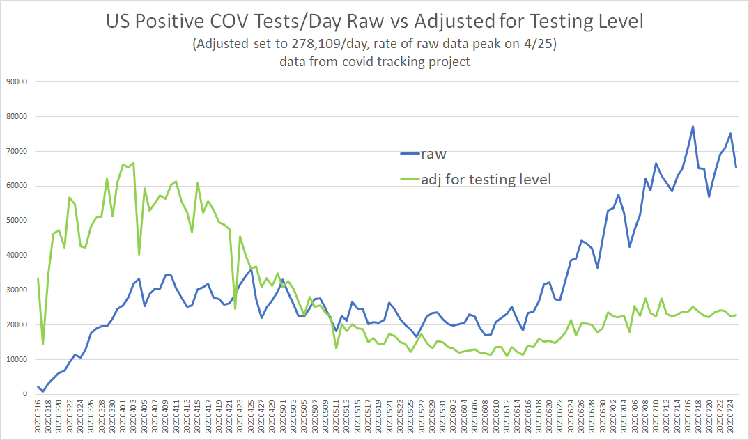
More tests mean more cases. And when you look at the raw numbers, it looks like the United States is experiencing a spike, while other countries are not. But what happens when the data is adjusted to account for the huge increase in U.S. testing?

(Excerpt) Read more at pjmedia.com ...


TOPICS: Health/Medicine; Science; Society
KEYWORDS: charts; chinavirus; coronavirus; graphs


1 posted on 07/28/2020 8:44:30 AM PDT by SeekAndFind
[ Post Reply | Private Reply | View Replies]

To: SeekAndFind
it appears we must say this yet again:

"discussing case counts in covid without reference to testing levels is tantamount to lying."

it ignores sampling rate. test any given population twice as much as you find twice as many cases.

it does not make disease more prevalent.


2 posted on 07/28/2020 8:45:27 AM PDT by SeekAndFind
[ Post Reply | Private Reply | To 1 | View Replies]

To: SeekAndFind

The media wants you to believe that Florida is the new COVID-19 hotspot. Is it really?


3 posted on 07/28/2020 8:47:03 AM PDT by SeekAndFind
[ Post Reply | Private Reply | To 2 | View Replies]

To: SeekAndFind
TX Border vs. Non-Border chart thru 7/26: Several things notable.

1. Border has peaked?! First time I've made this chart where that may be case.
2. Non-border: Deaths slight uptick, but cases solidly past peak.
3. Mexico may have peaked 2 weeks ago - provides greater confidence.


4 posted on 07/28/2020 8:48:22 AM PDT by SeekAndFind
[ Post Reply | Private Reply | To 3 | View Replies]

To: SeekAndFind

The case fatality rate for people in Florida who tested positive in June or early July was MUCH lower than it was in April. The overall death rate has dropped by 75%, over 65 dropped by half, and under 65 dropped by 71%.


5 posted on 07/28/2020 8:49:35 AM PDT by SeekAndFind
[ Post Reply | Private Reply | To 4 | View Replies]

To: SeekAndFind

6 posted on 07/28/2020 8:51:26 AM PDT by SeekAndFind
[ Post Reply | Private Reply | To 5 | View Replies]

To: SeekAndFind

bkmk


7 posted on 07/28/2020 8:52:52 AM PDT by God luvs America (63.5 million pay no income tax and vote for DemoKrats...)
[ Post Reply | Private Reply | To 1 | View Replies]

To: SeekAndFind; ExTexasRedhead

Thank you for posting all of these graphics.

Everyone...share this info w/your email contacts.


8 posted on 07/28/2020 8:54:32 AM PDT by Jane Long (Praise God, from whom ALL blessings flow.)
[ Post Reply | Private Reply | To 5 | View Replies]

To: Jane Long
Someone asked how it would look just doing the 50 states and DC. I ran the numbers with California counting as N. Tropical (under 35 N). Check out the correlation to the same flu pattern.


Seasonal pattern of Covid-19 deaths compared to embedded chart of 1964-75 flu outbreak by four seasons. Countries & states split into 35+ N. Lat, 0-35 N, 0-30 S and 30+ S. Flu is the same except 0-30 and 30+ North. This is a striking similarity. Match this with left half of Flu.

9 posted on 07/28/2020 9:14:05 AM PDT by SeekAndFind
[ Post Reply | Private Reply | To 8 | View Replies]

To: SeekAndFind

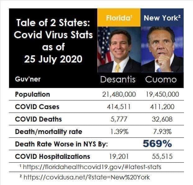
The 569% worse figure should be 469%. This is a common error by the innumerate.

Example: If your house is twice as expensive as mine, it is 100% more expensive.
If it is 5 times as expensive, it is 400% more expensive.


10 posted on 07/28/2020 10:50:21 AM PDT by The people have spoken (Proud member of Hillary's basket of deplorables)
[ Post Reply | Private Reply | To 3 | View Replies]

To: The people have spoken

I always wondered about that!

‘Guess I’m innumerate...

:(


11 posted on 07/28/2020 11:45:55 AM PDT by Does so (Neo-Venezuelans = Democrats = Rioters = Looters)
[ Post Reply | Private Reply | To 10 | View Replies]

To: Jane Long

I don’t need graphics, I knew early on this Covid flu was a political hoax from day one. It will go down as the biggest hoax in history....that said, it has given us guidelines on NOT what to do with the next “ plague”.


12 posted on 07/28/2020 11:56:22 AM PDT by delta7
[ Post Reply | Private Reply | To 8 | View Replies]

To: SeekAndFind

What time will show is that Sweden will be a margin off the world average for death rates. The USA will come in as one of the best Western nations as far as death rates. Of course we will continue to be puzzled why Taiwan, South Korea and Japan did so well in combating the virus.


13 posted on 07/28/2020 12:00:32 PM PDT by Sam Gamgee
[ Post Reply | Private Reply | To 1 | View Replies]

To: SeekAndFind

Sorry, I DON’T BELIEVE ANY OF IT. Whether the CV stats are good or bad, they are ALL FILLED WITH LIES. It is utterly IMPOSSIBLE to know how many false positives are in the “cases.” It is utterly IMPOSSIBLE to know how many “deaths” were completely non-related. Therefore, the data is BULL, and NO CONCLUSIONS can be drawn from it.


14 posted on 07/28/2020 1:22:06 PM PDT by backwoods-engineer (Politics is the continuation of war by other means. --Clausewitz)
[ Post Reply | Private Reply | To 1 | View Replies]

To: delta7

YOU don’t need graphics, but for redpilling others (sheeple), sometimes graphics work well.


15 posted on 07/28/2020 1:25:43 PM PDT by Jane Long (Praise God, from whom ALL blessings flow.)
[ Post Reply | Private Reply | To 12 | View Replies]

To: SeekAndFind

I would guess that Florida also has a more vulnerable population, if geezers are in fact more at risk than others.

ML/NJ


16 posted on 07/29/2020 6:51:38 AM PDT by ml/nj
[ Post Reply | Private Reply | To 3 | View Replies]

Disclaimer: Opinions posted on Free Republic are those of the individual posters and do not necessarily represent the opinion of Free Republic or its management. All materials posted herein are protected by copyright law and the exemption for fair use of copyrighted works.

Free Republic
Browse · Search
General/Chat
Topics · Post Article

FreeRepublic, LLC, PO BOX 9771, FRESNO, CA 93794
FreeRepublic.com is powered by software copyright 2000-2008 John Robinson