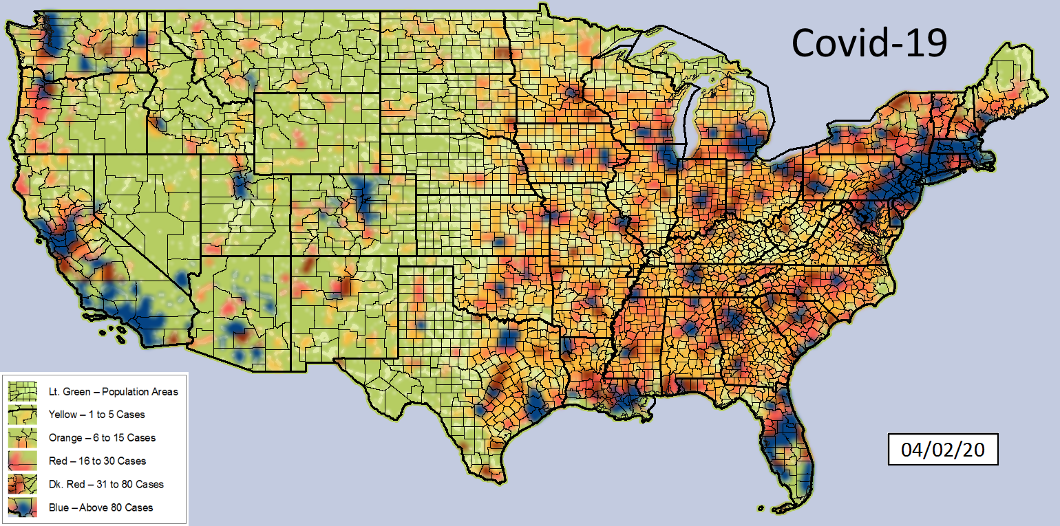
Purple - national daily reported cases
Red - counties that voted red in 2016 - daily cases
Blue - counties that voted blue in 2016 - daily cases

I'm sure yall got a lot of theories why.
Posted on 05/13/2020 10:23:43 AM PDT by loucon
Everyone says my covid-19 map looks like 2016 election results map and here's why.
Purple - national daily reported cases
Red - counties that voted red in 2016 - daily cases
Blue - counties that voted blue in 2016 - daily cases
I'm sure yall got a lot of theories why.
Rural America is red, and has wide open spaces. Crowded metropolitan areas are blue and people are stacked together. Also, if you deduct New York metropolitan area, the difference between the lines would decrease.
ShowMeStateGirl,
You may well be right about the reasons and observations. But, also, the facts are facts, no matter the reasons. One thing the graphs make clear, is that one size does not fit all when it comes to reopenings.
(Plus, it is arguable, that Blue State covidis policies, may be a significant contributing factor to the high numbers of cases in the states, e.g. NY/Cuomo’s nursing home policy vs. WV’s very proactive nursing home policies.)
map? what map? I don’t see any map. I see a line graph.
New York metropolitan area is huge in population.
But their cases far exceed most other places even when normalized to population.
Not all red counties are in Red States. Many red counties are in Blue States.
Where’s the map?
Urban squalor.
“Not all red counties are in Red States.”
_________________________________________
True enough. States that have a lot of each, need to create smart targeted re-openings. My state (Oklahoma) has two large metro areas comprising over 1/2 the population of the state, while the rest is pretty rural to VERY rural.
(BTW, the red counties in blue states have my sincere sympathy.)
Trump is unforgivable. He should have fired Fauci quietly.
See a county-by-county red/blue map of the 2016 election and realize the tiny geographical area won by the Democrats, so the graph is not at all surprising.
You don’t know what a map is so you’re not starting off well
The meaning of the curves got distorted when the CDC changed COVID-19 death methodologies on 4/13/20 (or 4/14/20)+.
“Yes, that is the subject of speculation. Might be interesting to plot cities with subway systems (NY, Chicago) against more spread out metro areas like LA. Exclude all comorbidities and look at occupation, type of residence or other demographics. See if anything really pops out.”
FYI
The Subways Seeded the Massive Coronavirus Epidemic in New York City
http://web.mit.edu/jeffrey/harris/HarrisJE_WP2_COVID19_NYC_13-Apr-2020.pdf
It’s mapped out down to the neighborhood.
The blue state v red state thing is a huge talking point for the left. Breaking states down is far more complex at so many levels.
One thing is see is CURVE HAS FLATTENED! OPEN UP!!!!
Disclaimer: Opinions posted on Free Republic are those of the individual posters and do not necessarily represent the opinion of Free Republic or its management. All materials posted herein are protected by copyright law and the exemption for fair use of copyrighted works.