Free Republic
Browse · Search
General/Chat
Topics · Post Article

Skip to comments.

Maps of Seven Deadly Sins in America
Memolition ^ | ca. 12/10/13

Posted on 12/24/2013 12:28:24 AM PST by Slings and Arrows

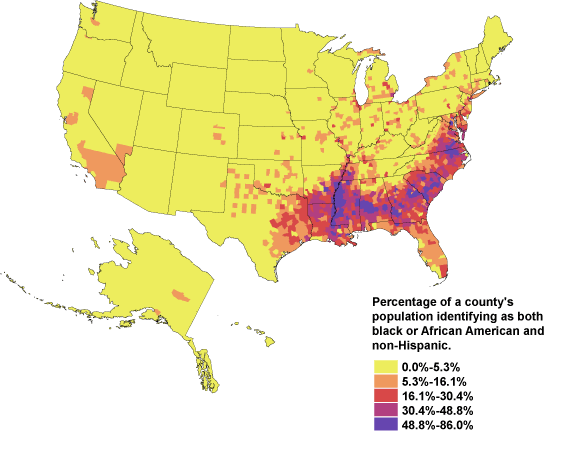
Geographers from Kansas State University have created a map of the spatial distribution of the Seven Deadly Sins across the United States. How? By mapping demographic data related to each of the Sins.

Below are screenshots of the maps in standard deviation units; red naturally is more sinful, blue less sinful.

(Excerpt) Read more at memolition.com ...


TOPICS: Society
KEYWORDS: anotherstudy; flawedmethod; junkscience; napl; pseudoscience; reasearchers; revisionisthistory; sevendeadlysins; sin
I'm not really sure about the methodology on this one.
1 posted on 12/24/2013 12:28:24 AM PST by Slings and Arrows
[ Post Reply | Private Reply | View Replies]

To: Slings and Arrows; MeekOneGOP; Conspiracy Guy; DocRock; King Prout; Darksheare; OSHA; ...
To my lack of surprise, Washington, DC, maxes all seven sins.


2 posted on 12/24/2013 12:30:20 AM PST by Slings and Arrows (You can't have Ingsoc without an Emmanuel Goldstein.)
[ Post Reply | Private Reply | To 1 | View Replies]

To: Slings and Arrows

3 posted on 12/24/2013 12:33:55 AM PST by shibumi (Cover it with gas and set it on fire.)
[ Post Reply | Private Reply | To 1 | View Replies]

To: Slings and Arrows
Gluttony was calculated by counting the number of fast food restaurants per capita.

I guess the Epicureans get a free pass. I wonder what the map would look like if they counted the number of restaurants charging more than $40 a meal? Fast Food restaurants are more an indicator of private car use, workers having multiple jobs and families with children than they are of Gluttony.

4 posted on 12/24/2013 12:45:16 AM PST by BwanaNdege (Those who make peaceful revolution impossible will make violent revolution inevitable. J.F. Kennedy)
[ Post Reply | Private Reply | To 1 | View Replies]

To: Slings and Arrows

I agree. Fast food restaurants may correlate to many things besides gluttony and the parameters they used for sloth are both ambiguous and hard to justify. I might want to factor in welfare expenditures rather than spending on the arts for a measure of sloth.


5 posted on 12/24/2013 12:47:40 AM PST by muir_redwoods (When I first read it, " Atlas Shrugged" was fiction)
[ Post Reply | Private Reply | To 1 | View Replies]

To: BwanaNdege
Greed was calculated by comparing average incomes with the total number of inhabitants living beneath the poverty line.

A better indicator would have been to compare percentage of income donated to charitable causes. Use a sliding scale: 10% of a family income below, say $50,000, counts as 25% of a family income of greater than $100,000.

6 posted on 12/24/2013 12:52:36 AM PST by BwanaNdege (Those who make peaceful revolution impossible will make violent revolution inevitable. J.F. Kennedy)
[ Post Reply | Private Reply | To 4 | View Replies]

To: muir_redwoods
I might want to factor in welfare expenditures rather than spending on the arts for a measure of sloth.

I don't think that would play too well in the faculty lounge, if you take my meaning.

7 posted on 12/24/2013 12:53:34 AM PST by Slings and Arrows (You can't have Ingsoc without an Emmanuel Goldstein.)
[ Post Reply | Private Reply | To 5 | View Replies]

To: BwanaNdege

That would make the South look good. Whatever would the New York Times say?


8 posted on 12/24/2013 12:54:34 AM PST by Slings and Arrows (You can't have Ingsoc without an Emmanuel Goldstein.)
[ Post Reply | Private Reply | To 6 | View Replies]

To: BwanaNdege

May just be intellectual laziness. Nevertheless, even per-capita rate of all-you-can-eat buffets would be a better metric.


9 posted on 12/24/2013 12:56:13 AM PST by Slings and Arrows (You can't have Ingsoc without an Emmanuel Goldstein.)
[ Post Reply | Private Reply | To 4 | View Replies]

To: Slings and Arrows

There is something fundamentally flawed with this and I can’t pinpoint it.

Don’t we have to see population density? Shouldn’t the statistical analysis be normalized by density or even plotted vs density rather than per-capita.

Everybody knows So Cal is the car theft capitol of the world, yet it doesn’t even register on the charts presented.

+2.6 STd represents about 1.9% — meaning that all those solid red area’s shown, represent the top 1.9% of troublesome areas for that statistic.

Worthless information without density distribution.


10 posted on 12/24/2013 1:55:06 AM PST by Usagi_yo
[ Post Reply | Private Reply | To 1 | View Replies]

To: Usagi_yo

And there are maps that show major variances to the right side of the curve, but nothing to the left? It seems you can’t have one tail of a bell curve without the other tail.


11 posted on 12/24/2013 3:34:31 AM PST by Vermont Lt (If you want to keep your dignity, you can keep it. Period........ Just kidding, you can't keep it.)
[ Post Reply | Private Reply | To 10 | View Replies]

To: Vermont Lt

The other tail is there, it’s just not talked about. The red represents +2.58 STd while the lightest represents -2.58.

So basically, So Cal, with multiple car theft task forces is in the lower 2% of the distribution as compared to say my county where there is only a sheriff’s services ranks in the top 2%.

Look at Detroit. A big black hole should have a appeared and sucked you into oblivion, yet it barely registers.


12 posted on 12/24/2013 3:54:25 AM PST by Usagi_yo
[ Post Reply | Private Reply | To 11 | View Replies]

To: Slings and Arrows

Vast conclusions, based upon a half-vast data base.

As for the methodology and ‘scientific premises’, I’m still looking for them.

No luck so far.

Tomorrow doesn’t look promising, either.


13 posted on 12/24/2013 4:51:46 AM PST by GladesGuru (Islam Delenda Est - Because of what Islam is and because of what Muslims do.)
[ Post Reply | Private Reply | To 1 | View Replies]

To: Slings and Arrows

I wonder if a government research grant paid for this?


14 posted on 12/24/2013 4:58:18 AM PST by Fresh Wind (The last remnants of the Old Republic have been swept away.)
[ Post Reply | Private Reply | To 1 | View Replies]

To: shibumi

Wouldn’t the term “Junk Science” be more apt? The criteria on this is a joke, and I find it hard to believe this was done as anything other than a lark, by some bored undergrads.


15 posted on 12/24/2013 5:08:02 AM PST by Turbo Pig (...to close with and destroy the enemy...)
[ Post Reply | Private Reply | To 3 | View Replies]

To: Slings and Arrows
Racist! The summary map looks too much like a map of Holder's people.


16 posted on 12/24/2013 5:19:25 AM PST by Reeses
[ Post Reply | Private Reply | To 1 | View Replies]

To: Slings and Arrows
May just be intellectual laziness. Nevertheless, even per-capita rate of all-you-can-eat buffets would be a better metric.

I "think" using Excel spreadsheets. One tool I make frequent use of is the scroll bar, which I can slide to easily adjust the value of a cell and thereby other cells whose formulae include the adjusted cell.

A map like this has been linked to various demographic data: Number of Fast Food Restaurants, Robberies per 100K Population, etc. Link a "Slider Control" to choose you data source and then play around with it until the Map gives you what you want, "Trailer Park Rednecks", "Cold Hard Yankees" or "Hedonistic West Coasters".

As to the All-You-Can-Eat buffets, Gluttony comes in two types - Quantity AND Quality. One can produce obesity, the other can produce Epicurean snobs, yet both are Gluttony. Partaking of Quantity for an affordable price is not necessarily Gluttony. Neither does enjoyment of a fine meal. Moderation!

17 posted on 12/24/2013 5:31:50 AM PST by BwanaNdege (Those who make peaceful revolution impossible will make violent revolution inevitable. J.F. Kennedy)
[ Post Reply | Private Reply | To 9 | View Replies]

To: Slings and Arrows
Below are screenshots of the maps in standard deviation units; red naturally is more sinful, blue less sinful.

Shouldn't the Godless Democrats be represented by the blue states?

Oh wait, the Godless Commie rat bastards SWAPPED the color schemes just BEFORE we forever called "territories" RED STATE or BLUE STATE.

The Republicans are in TRUE BLUE land.

And I'm not buying ANY mapping system that doesn't flag ENVY in the regions of Socialist Liberal Dominance.

18 posted on 12/24/2013 9:42:28 AM PST by a fool in paradise (America 2013 - STUCK ON STUPID)
[ Post Reply | Private Reply | To 1 | View Replies]

Disclaimer: Opinions posted on Free Republic are those of the individual posters and do not necessarily represent the opinion of Free Republic or its management. All materials posted herein are protected by copyright law and the exemption for fair use of copyrighted works.

Free Republic
Browse · Search
General/Chat
Topics · Post Article

FreeRepublic, LLC, PO BOX 9771, FRESNO, CA 93794
FreeRepublic.com is powered by software copyright 2000-2008 John Robinson