
Posted on 06/04/2007 6:11:27 AM PDT by yankeedame
Last Updated: Monday, 4 June 2007, 11:33 GMT 12:33 UK
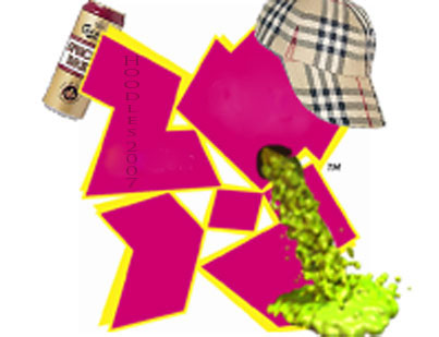
The logo for the 2012 Olympics and Paralympics has been unveiled in a star-studded ceremony in London. The jagged emblem, based on the date 2012, comes in a series of shades of pink, blue, green and orange and will evolve in the run-up to the Games.
The word London and the Olympic rings are included in the first two digits of the new logo.
"This is the vision at the very heart of our brand," said London 2012 organising committee chairman Seb Coe.
Report: London unveils logo of 2012 Games News conference: 2012 organising chief Paul Deighton
"It will define the venues we build and the Games we hold and act as a reminder of our promise to use the Olympic spirit to inspire everyone and reach out to young people around the world.
"It is an invitation to take part and be involved.
"We will host a Games where everyone is invited to join in because they are inspired by the Games to either take part in the many sports, cultural, educational and community events leading up to 2012 or they will be inspired to achieve personal goals."
For the first time the same logo will be used for both the Olympic and Paralympic Games.
"When people see the new brand, we want them to be inspired to make a positive change in their life,"
--Tony Blair
Organisers hope the brand will boost the marketing push to raise £2bn to stage the Games and convey the message that London 2012 will be "Everyone's Games".
Prime Minister Tony Blair said: "We want London 2012 not just to be about elite sporting success.
"When people see the new brand, we want them to be inspired to make a positive change in their life.
"London 2012 will be a great sporting summer but will also allow Britain to showcase itself to the world."
International Olympic Committee President Jacques Rogge said: "This is a truly innovative brand logo that graphically captures the essence of the London 2012 Olympic Games - namely to inspire young people around the world through sport and the Olympic values.

Lord Coe wants the branding to
appeal to young people
"Each edition of the Olympic Games brings its own flavour and touch to what is now well over a century of modern Olympic history; the brand launched today by London 2012 is, I believe, an early indication of the dynamism, modernity and inclusiveness with which London 2012 will leave its Olympic mark."
The brand, designed by Wolff Ollins, has been targeted at the young people the organisers hope to get involved.
That sucks for a logo.
It looks like someone's giving someone else, ahem, a job.
I’m thuper, thankth for athking!
Huh. It’s apparently a very badly stylized “2012.” Fugly. Just stupid and fugly. And some SOB got paid big bucks for it.
In the meantime, here's today's political limerick
And given that the Olympics are to be held in Londonistan, a suggested revised logo:
![]()
Cheers!
It looks like a fractured swastika, with hints of the lightning bolt SS letters.
Mrs VS
Lol! Although, based on the appeasement the Muslims enjoy there, I’d place that demon-flag on the left.
:)


That’s just not going to cut it.
Did you do Photoshop® that? Wow, you’re good!
Looks like a train wreck......
A most excellent point RK. I'd really like to know how much the retard who designed this was paid?
So when do the t-shirts come out?
>>Looks like the islamofascists already blew it up and they tried to piece it back together.<<
Ironic considering that western Europe’s largest mosque (a 40,000-seat capacity) is being constructed next door to London’s Olympic Village.
Will self-detonation be a demostration sport at the London games?
demonstration sport, that is.


Aye thats abou right ! Just sums this country up nowadays.
What winds me up is that this daft emblem cost nearly half a million quid, I mean, the taxpayer all over the land is paying for something in one small area.
Mind you, I have doubts about the Olympics going ahead at all - the site’s contaminated with chemical waste and the industrial buildings haven’t even been purchased yet, let alone demolished. They 4 years and 11 months to construct the whole thing , time is running short.
Blair’s Britain , I’m embarrased.
That’s the ugliest Olympic logo I’ve ever seen. And I thought the Vancouver one was bad...it looks good compared to that one. What’s with the pink??
Disclaimer: Opinions posted on Free Republic are those of the individual posters and do not necessarily represent the opinion of Free Republic or its management. All materials posted herein are protected by copyright law and the exemption for fair use of copyrighted works.