Is the earth getting warmer, or cooler?
Analysis A paper published in scientific journal Nature this week has reignited the debate (http://www.theherald.co.uk/news/news/display.var.2238317.0.Doubt_is_cast_over_global_warming.php) about Global Warming, by predicting that the earth won't be getting any warmer until 2015. Researchers at the Leibniz Institute of Marine Sciences have factored in cyclical oceanic into their climate model, and produced a different forecast to the "consensus" models which don't.
But how will we know whether the earth is warming or cooling? Today, it all depends on the data source.
Two authorities provide us with analysis of long-term surface temperature trends. Both agree on the global temperature trend until 1998, at which time a sharp divergence occurred. The UK Meteorological Office's Hadley Center for Climate Studies Had-Crut data (http://www.cru.uea.ac.uk/cru/climon/data/themi/g17.htm) shows worldwide temperatures declining since 1998. According to Hadley's data, the earth is not much warmer now than it was than it was in 1878 or 1941.

Hadley's data (April 13, 2008)
By contrast, NASA data shows worldwide temperatures increasing at a record pace - and nearly a full degree warmer than 1880.
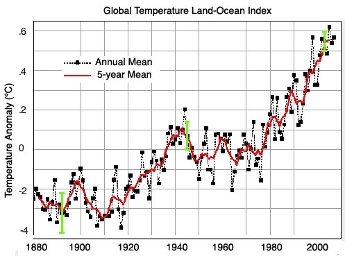
NASA's data (April 13, 2008)
The other two widely used global temperature data sources are from earth-orbiting satellites UAH (http://climate.uah.edu/) (University of Alabama at Huntsville) and RSS (http://www.remss.com/data/msu/graphics/tlt/medium/global/ch_tlt_2008_03_anom_v03_1.png) (Remote Sensing Systems.) Both show decreasing temperatures over the last decade, with present temperatures barely above the 30 year average.
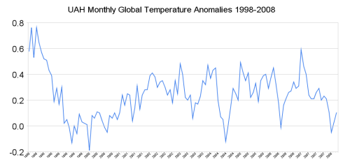
Anomalies 1998-2008; University of Alabama (UAH)
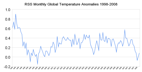
Anomalies 1998-2008; Remote Sensing Systems (RSS)
Confusing? How can scientists who report measurements of the earth's temperature within one one-hundredth of a degree be unable to concur if the temperature is going up or down over a ten year period? Something appears to be inconsistent with the NASA data - but what is it?
One clue we can see is that NASA has been reworking recent temperatures upwards and older temperatures downwards - which creates a greater slope and the appearance of warming. Canadian statistician Steve McIntyre has been tracking the changes closely on his Climate Audit (http://www.climateaudit.org/) site, and reports that NASA is Rewriting History, Time and Time Again (http://www.climateaudit.org/?p=2964). The recent changes can be seen by comparing the NASA 1999 and 2007 US temperature graphs. Below is the 1999 version (http://www.giss.nasa.gov/research/briefs/hansen_07/fig1x.gif), and below that is the reworked 2007 version (http://data.giss.nasa.gov/gistemp/graphs/Fig.D.lrg.gif).
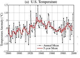
NASA's original data: 1999
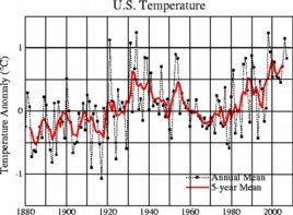
NASA's reworked data: 2007
In order to visualize the changes, I overlaid the 2007 version on top of the 1999 version, above, and a clear pattern emerged. The pre-1970 temperatures have been nearly uniformly adjusted downwards (red below green) - and the post 1970 temperatures have been adjusted upwards (red above green.) Some of the yearly temperatures have been adjusted by as much as 0.5 degrees. That is a huge total change for a country the size of the US with thousands of separate temperature records.
How could it be determined that so many thermometers were wrong by an average of 0.5 degrees in one particular year several decades ago, and an accurate retrofit be made? Why is the adjustment 0.5 degrees one year, and 0.1 degrees the next?
Describing this more succinctly, the 2007 version of the data appears to have been sheared vertically across 1970 to create the appearance of a warming trend. We can approximate shear by applying a small rotation, so I tried "un-rotating" the 2007 graph clockwise around 1970 until I got a reasonably good visual fit at six degrees. (click on link)
http://regmedia.co.uk/2008/04/29/giss_us_overlay_rotated.flv)
What could be the motivation for the recent changes?
Further examination of the NASA site (http://data.giss.nasa.gov/gistemp/station_data/) might give us a clue as to what is happening.
NASA staff have done some recent bookkeeping and refined the data from 1930-1999. The issues has been discussed extensively at science blog Climate Audit (http://www.climateaudit.org/?p=2964). So what is the probability of this effort consistently increasing recent temperatures and decreasing older temperatures? From a statistical viewpoint, data recalculation should cause each year to have a 50/50 probability of going either up or down - thus the odds of all 70 adjusted years working in concert to increase the slope of the graph (as seen in the combined version) are an astronomical 2 raised to the power of 70. That is one-thousand-billion-billion to one. This isn't an exact representation of the odds because for some of the years (less than 15) the revisions went against the trend - but even a 55/15 split is about as likely as a room full of chimpanzees eventually typing Hamlet. That would be equivalent to flipping a penny 70 times and having it come up heads 55 times. It will never happen - one trillion to one odds (2 raised to the power 40.)
Particularly troubling are the years from 1986-1998. In the 2007 version of the graph, the 1986 data was adjusted upwards by 0.4 degrees relative to the 1999 graph. In fact, every year except one from 1986-1998 was adjusted upwards, by an average of 0.2 degrees. If someone wanted to present a case for a lot of recent warming, adjusting data upwards would be an excellent way to do it.
Looking at the NASA website, we can see that the person in charge of the temperature data is the eminent Dr. James Hansen - Al Gore's science advisor and the world's leading long-term advocate of global warming.
Data Sources
NASA and Had-Crut data are largely based on surface measurements, using thermometers. They both face a lot of difficulties due to contaminated data caused by urban heating effects, disproportionate concentration of thermometers in urban areas, changes in thermometer types over time, changes in station locations, loss of stations, changes in the time of day when thermometers are read, and yet more factors.
NASA has a very small number of long-term stations in the Arctic, and even fewer in Africa and South America. The data has been systematically adjusted upwards in recent years - as can be seen in this graph (http://cdiac.ornl.gov/epubs/ndp/ushcn/ts.ushcn_anom25_diffs_urb-raw_pg.gif), reproduced below. Temperatures from the years 1990 to present have more than one-half degree Fahrenheit artificially added on to them - which may account for most of the upwards trend in the NASA temperature set.
 (http://regmedia.co.uk/2008/04/28/ts_anomaly_org.gif)
Official difference between the publicly reported temperature and the original data from USHCN/NASA - click to enlarge
Satellite temperature data (UAH (http://vortex.nsstc.uah.edu/data/msu/t2lt/uahncdc.lt) and RSS (http://www.remss.com/pub/msu/monthly_time_series/RSS_Monthly_MSU_AMSU_Channel_TLT_Anomalies_Land_and_Ocean_v03_1.txt)) is more reliable because it covers the entire earth - with the exception of small regions near the north and south poles. They use the same methodology from year to year, and the two sources tend to agree fairly closely. The downside of satellite data is that it only goes back to 1978.
Now back to the present.
NASA (http://data.giss.nasa.gov/gistemp/tabledata/GLB.Ts+dSST.txt) temperatures for March 2008 indicate that it was the third warmest March in history, but satellite data sources RSS (http://www.remss.com/pub/msu/monthly_time_series/RSS_Monthly_MSU_AMSU_Channel_TLT_Anomalies_Land_and_Ocean_v03_1.txt) and UAH (http://vortex.nsstc.uah.edu/data/msu/t2lt/uahncdc.lt) disagree. They show March as the second coldest ever in the southern hemisphere, and barely above average worldwide. (The northern hemisphere in March was split between a cold North America and a very warm Asia, causing temperatures in the northern hemisphere to be above average.) Data so far for April shows both hemispheres back on the decline, and April is shaping up to be an unusually cool month across most of the globe (Africa, South America, North America and portions of Europe and Asia).
Bottom Line
Both of the satellite data sources, as well as Had-Crut, show worldwide temperatures falling below the IPCC estimates. Satellite data shows temperatures near or below the 30 year average - but NASA data has somehow managed to stay on track towards climate Armageddon. You can draw your own conclusions, but I see a pattern that is troublesome. In science, as with any other endeavour, it is always a good idea to have some separation between the people generating the data and the people interpreting it.
Some good news moving forward was reported this week by Anthony Watts, who blogs at Watt's Up With That? (http://wattsupwiththat.wordpress.com/) USHCN has issued a press release (http://wattsupwiththat.files.wordpress.com/2008/04/press_release_042408_climatereferencenetwork.pdf) indicating that they are upgrading their methodology and ending the practice of adjusting data upwards for future temperature readings. This will make the data more credible, though will not resolve the issues associated with growing urban heat islands or a lack of spatial coverage across the planet.
Bear in mind that warming and cooling concerns are nothing new, as this alarming bulletin reminds us -
The Arctic ocean is warming up, icebergs are growing scarcer and in some places the seals are finding the water too hot, according to a report to the Commerce Department yesterday from Consul Ifft, at Bergen, Norway. Reports from fishermen, seal hunters and explorers, he declared, all point to a radical change in climate conditions and hitherto unheard-of temperatures in the Arctic zone. Exploration expeditions report that scarcely any ice has been met with as far north as 81 degrees 29 minutes. Soundings to a depth of 3,100 meters showed the gulf stream still very warm. Great masses of ice have been replaced by moraines of earth and stones, the report continued, while at many points well known glaciers have entirely disappeared. Very few seals and no white fish are found in the eastern Arctic, while vast shoals of herring and smelts, which have never before ventured so far north, are being encountered in the old seal fishing grounds.
A RealClimate blogger? No, that was the US Weather Bureau in 1922.
We saw a global cooling scare in 1924, a global warming scare in 1933, another global cooling in the early 1970s, and another warming scare today. The changes the USHCN promised Watts won't help resolve anything for another decade or so, but perhaps future generations will be able to reduce the alarming increase in the number of climate alarms.®

