Posted on 04/17/2020 6:46:39 AM PDT by loucon
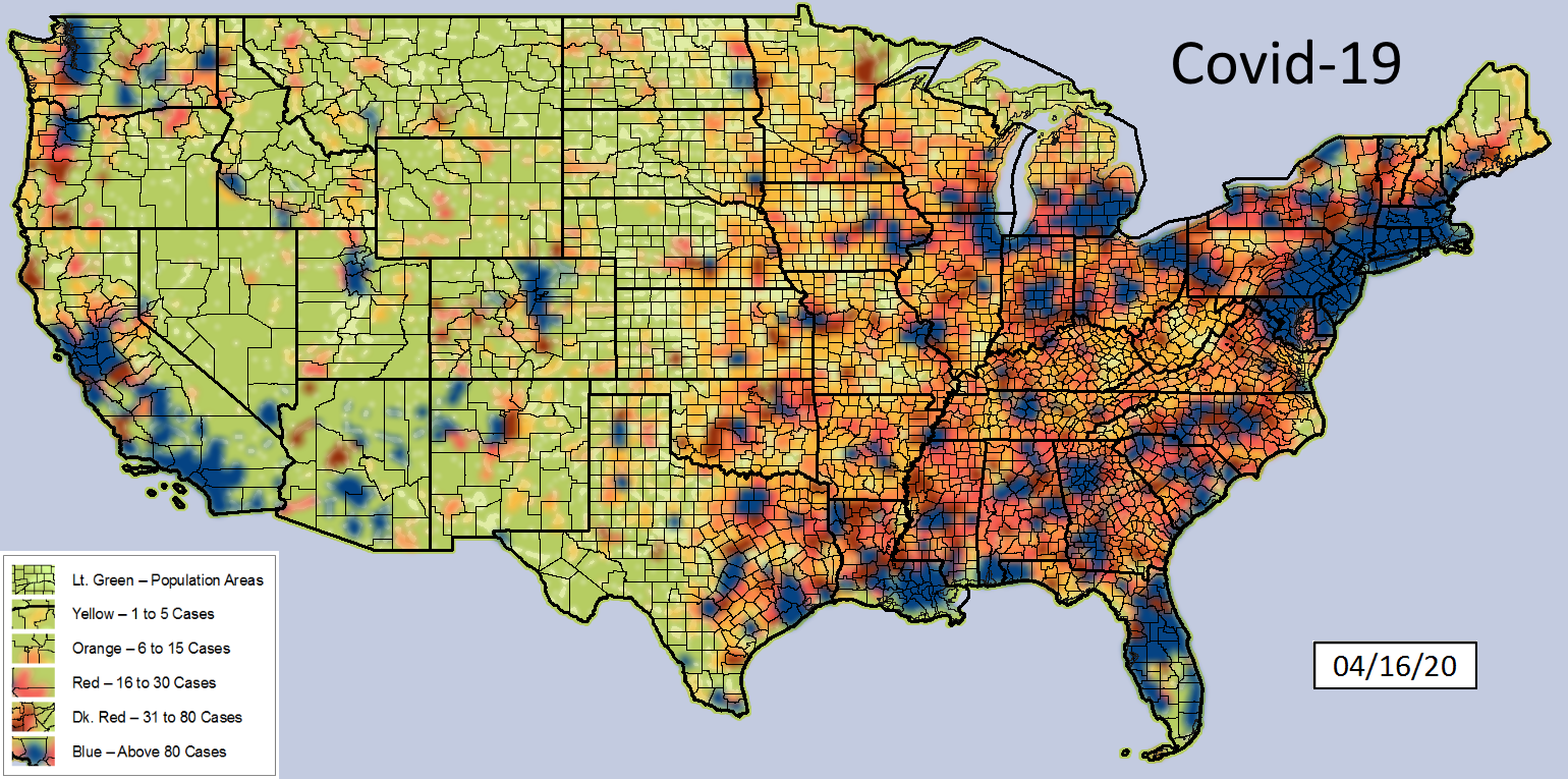
Covid County Map Dated: 04/16/20
The data for this map was pulled from:
https://github.com/CSSEGISandData/COVID-19/tree/master/csse_covid_19_data/csse_covid_19_daily_reports
I am validating data by comparing it with other sources:
https://covidtracking.com/data/
https://infection2020.com/
https://coronavirus.1point3acres.com/en
as well as various state .gov websites
No claims of the use or accuracy of these maps is implied.
Other parties may use these maps as their own.
Thanks for the effort.
Have you considered using census data to give rates of cases?
Simple numbers tell us very little except where there are more people, there are more cases.
Good work. Now do one where the color for each county is keyed to the number of cases per million population in the county. ;-)
I want to see American Samoa included.
sanctuary states hit the hardest.
It’s not an exact match but it’s pretty close to the 2016 election map by county. Population density and democrats seem to go together. When an infectious disease hits, I guess it is likely it would be worse there. It might be fair to say that democrats were hit the hardest by the coronavirus. Since the media is centered in heavy blue areas and they are being hit the hardest, I can see why they are in a panic. Had this virus he only rural areas, we wouldn’t be hearing a peep.
Other than the speed that it spreads, I see little difference with regard to population density as to what percentage of a given community come within effective contact of the virus.
I believe it will have to reach 60-70% of a community before it levels off and subsides. I used the 80 and greater benchmark as a point at which community efforts (isolation) have lost control and become ineffective. At that point the virus seems to run its course within.
Effectively a population density map — useless nonsense.
I appreciate the work but there needs to be a different measurement. How old are some of these cases? Where I live in Panama, I track daily the number of cases in our province and some towns have been the same numbers for close to a month with no change. If the quarantine period is 14 days, shouldn’t some of these cases now be either considered cured or in remission?
As useful as your map is, I think we have reached the point where raw numbers are a distortion and there should only be an indication of cases newer than 15 days. Otherwise, the map will never get “better”, only worse.
This is not a criticism of you, just a criticism that we, as a nation, are still looking at totals which will never go down. We need to start looking at new cases, not total cases.
That’s what is immediately apparent. There are more cases where there are more people. I know a lot of work went into that, because I’m too lazy to do it myself. But the one I’d like to see next is the same sort of map showing how many cases per 1000 of population.
As a single map? maybe, but I have done a map for everyday starting with 01/21/20. When viewed as a whole, they show the flow of the infection.
Just thought (regarding the press briefing yesterday) some might be interested in where the country stands.
That’s exactly what my map does. Active cases are arbitrarily removed after 19.6 days. 19.6 was arrived at after comparing the numbers from communities that followed up on recoveries. Not sure how accurate it really is.
That’s what is immediately apparent. There are more cases where there are more people. I know a lot of work went into that, because I’m too lazy to do it myself. But the one I’d like to see next is the same sort of map showing how many cases per 1000 of population.
~~~
I also appreciate all the effort, but I’ve been saying this from the beginning. I don’t mean to be critical for the sake of being critical, but this is really just a population density map. Unless you divide the cases by the population of each statistical area (per capita map) you really just can’t see on this map where the prevalence is higher or lower than other places with similar population levels
See post #7
The more numbers I run, the more I’m convinced that this virus will not stop until it has infected or effectively infected 60-70% of the whole population. I say “effectively infected” because not all infections have the same results.
If the heat map were based on a per capita value, It would end up being a population density map.
Disclaimer: Opinions posted on Free Republic are those of the individual posters and do not necessarily represent the opinion of Free Republic or its management. All materials posted herein are protected by copyright law and the exemption for fair use of copyrighted works.