Posted on 04/08/2020 8:16:17 AM PDT by BenLurkin
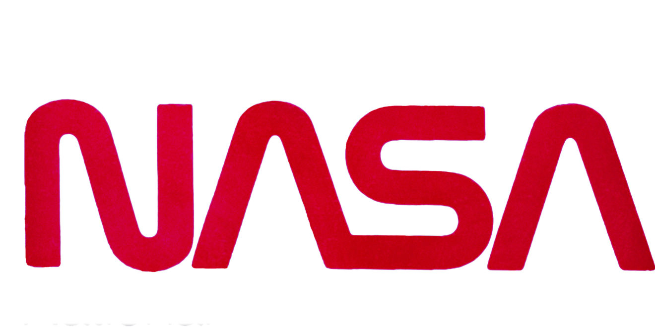
The Worm was born, a decision prompted by the 1972 launch of the National Endowment for the Arts’ Federal Design Improvement Program that aimed to improve visual standards across government agencies.
Danne & Blackburn’s “cleaner, sleeker” design system—complete with a full Graphics Standards Manual—aimed to make the agency’s logo more universal and versatile. The Meatball was not retired with the introduction of The Worm, but appeared in more limited contexts.
Although the “simplistic, yet innovative design” of The Worm logo was initially a hit... affection for the logo had soured less than a decade later.
At the suggestion of Langley Research Center’s then-director Paul F. Holloway, who had fielded both complaints from employees and the public about the “despised” logo, NASA administrator Daniel S. Goldin killed The Worm in May of 1992 and reinstated The Meatball as the official logotype.
The typographic logo was unpopular enough that Goldin’s assertion that “Slowly it will die… and never be seen again,” was met with the applause of Langley employees, according to a 1992 South Florida Sun Sentinel article.
The Worm was relegated to only limited appearances on NASA’s merchandise.
But love for the logo quietly endured, seeing a surge in popularity in 2015 when a Kickstarter by Pentagram designers Hamish Smyth and Jesse Reed initiated reprinting of Danne & Blackburn’s 1975 NASA Graphics Standards Manual.
The decision to emblazon the Falcon 9 with The Worm for its launch, which will carry astronauts to the ISS, marks an official renaissance of the typographic logo.
While NASA is still deciding exactly how and where each logo should be used, the agency also hinted that The Worm’s reappearance will be more than one time only: “There’s a good chance you’ll see the logo featured in other official ways on this mission and in the future.”
(Excerpt) Read more at adweek.com ...
Calling it a “worm” is a stretch.
Apparently NASA is still overfunded AND taking its eye off the ball of Islamic outreach.

So far, you got two snarky comments.
why do disposable rocket parts require logos at all? Waste of tax money.
And where would we be without the Islamic rocket program?

The "Meatball"

But who’s counting?
Hezbollah most affected.
Meatball with tweezers.
The spice must flow.
Or Chinese Meatball with Chopsticks.
Those “tweezers” always bugged me.
Engineers’ pride in a wondrous creation?
I never cared for “The Worm”, myself.
Then again, never knew that was the term for the logo, either, until now.
Didn’t miss it when I noticed it finally disappeared.
I liked him when he was with the Pistons....

PDJT is doing as an FU to Clinton & Obama. You could throw in Shrub 2 as well.
"The cabin was mostly white, oblong, and about the size of a smallish restaurant. In fact it wasn't perfectly oblong: the two long walls were raked round in a slight parallel curve, and all the angles and corners were contoured in excitingly chunky shapes. [italics added] The truth of the matter is that it would have been a great deal simpler and more practical to build the cabin as an ordinary three-dimensional oblong room, but then the designers would have got miserable." /THHGTTG


NASA Worm Logo

NASA Seal
Um...we’re NOT in the Obama administration anymore.
NASA’s main function is NO LONGER ‘Islamic outreach’.
I am really getting SICK and TIRED of FReepers continuing to trot that old thing out anytime something NASA does makes the news.
For the love of Pete....KNOCK IT OFF!!!
Disclaimer: Opinions posted on Free Republic are those of the individual posters and do not necessarily represent the opinion of Free Republic or its management. All materials posted herein are protected by copyright law and the exemption for fair use of copyrighted works.