The graph below shows how the volume of positive seasonal flu tests per week in 2019–20 compares to previous years. 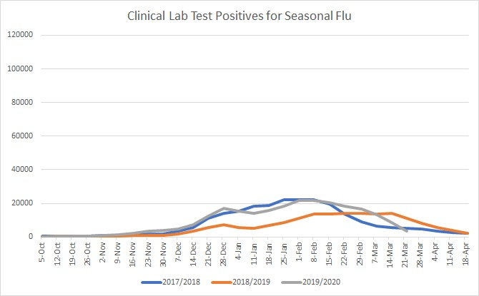
The graph below shows how the volume of positive seasonal flu tests per week in 2019–20 compares to previous years.
Link no work, according to site.
Error
410
This post is under investigation or was found in violation of the Medium Rules.
linky brokey
I use the date of the 1st fatality within a given region minus thirteen days. That should be close (plus or minus a week).
The national morons look at the death toll and think it’s a daily figure. Take the daily figure and divide it by the population of that district or state and you come up with a 10,000th of one percent.
Medium censors another article that doesn’t toe the line.
They’ve done it a few times lately. Always contrarian to sky-is-falling.
They pulled it. Just like they did with Aaron Ginn’s article weeks ago.
Physician visits? The curve were all focused on is the infection curve.
Posted a couple of days ago.
‘All our ICU patients are in their 50s or younger’ - frontline Welsh doctor recovered from virus
https://www.youtube.com/watch?v=ejlbCmRJMW4
Re being pulled: unless it’s copyrighted, post it in full here with exact title and author’s credit.
Search engines will find it, author will get his/her readership, FR will get more hits.
Three days ago.
New York City doctor: ‘The things that I see in the ER are scary’
https://www.youtube.com/watch?v=OGnxNsKtkjI
Presume it is flat. The $64,000 question becomes what next?
Beware.. this is a site KNOWN To present news that is 100% FAKE.
First, Medium is just a blog.
Second, the CV-19 impact is just starting in the country.
It’s been a few weeks. These kinds of charts are useless until it’s been about a year.
If the point is that you should be allowed outside to congregate—go ahead. No one is going to stop you.
So is the economy. DOA
In regards to the curve,...
2020-04-01 4,746
2020-04-02 5,821
2020-04-03 7,007
2020-04-04 8,352
Is the curve flattening out? Only if you look at it in logarithmic mode. In linear mode it still looks exponential to me.
And if the data is false...
“LIES, DAMNED LIES, and STATISTICS”