Posted on 03/24/2019 8:18:25 AM PDT by DoodleBob
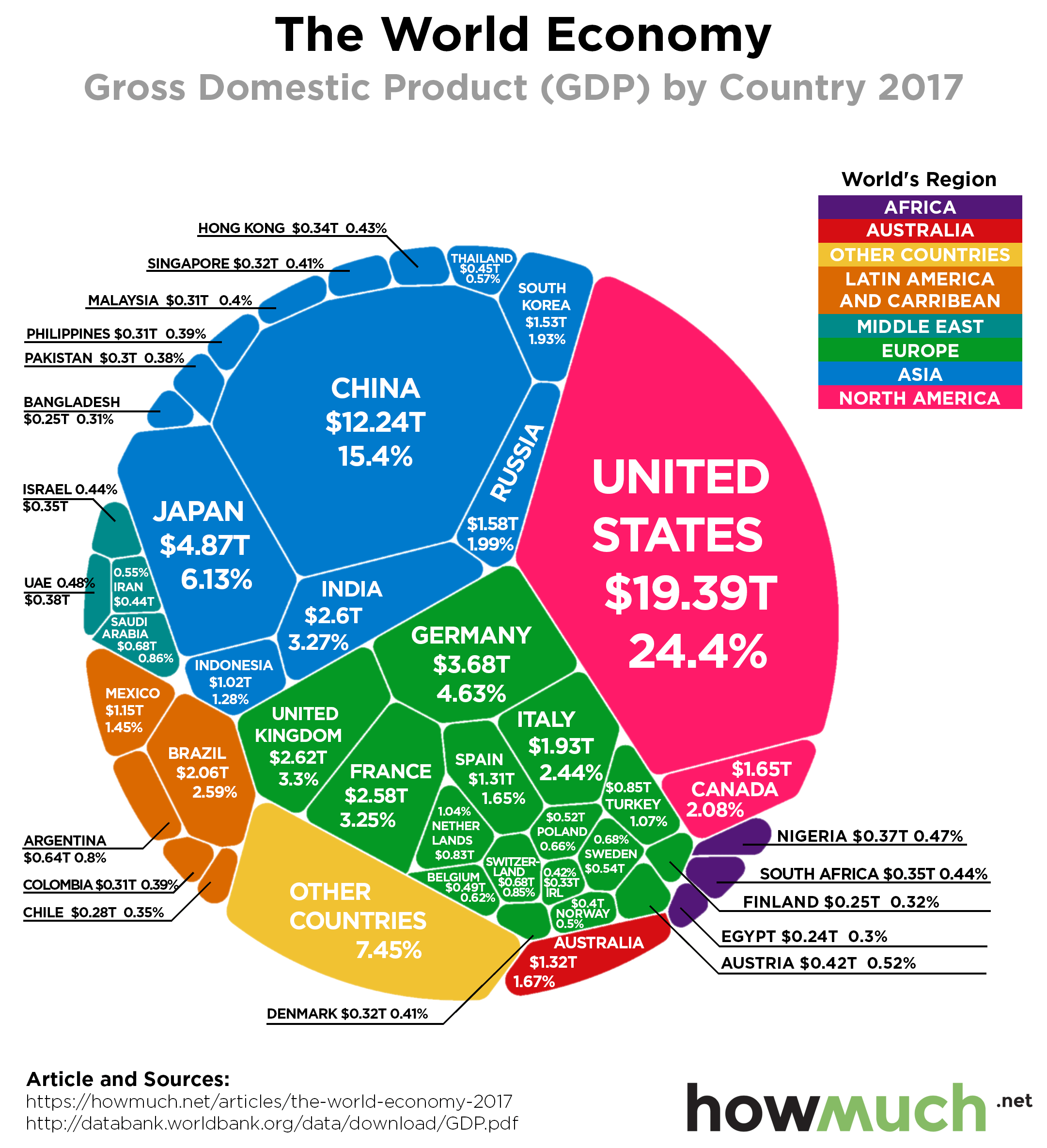
Last week President Trump announced a landmark new trade agreement replacing NAFTA, a deal that he thinks will pour “cash and jobs” into the US economy. We don’t want to debate the merits of Trump’s approach to trade, but the world should always pay attention when the leader of the world’s largest economy starts talking about tariffs. Our newest visualization highlights exactly how big the U.S. economy is compared to the every other country in the world.
Our visualization neatly slices the latest 2017 GDP numbers from the World Bank, released on 21st of September 2018, a few different ways. The underlying idea is that GDP is not a zero-sum game, meaning the pie can continue to grow for every country in the world and not just a few. Each slice represents the total economic output, or GDP, of a country in 2017, the latest year for which definite and complete data are available. The color corresponds to its geographic location, and we included the percentage of the world’s economy each country makes up for easy references. This lets you immediately see which countries and continents dominate the world economy, and which ones lag way behind.
(Excerpt) Read more at howmuch.net ...
funny story
In High School he told his calculus teacher, what the hell are we doing here?
I’ll NEVER use this.
He wrote that teacher a year ago, told her what he is now doing.
apologized to her and thanked her.
Thank you for the thread and charts! The charts put things I hadn’t thought much about into perspective.
Disclaimer: Opinions posted on Free Republic are those of the individual posters and do not necessarily represent the opinion of Free Republic or its management. All materials posted herein are protected by copyright law and the exemption for fair use of copyrighted works.