Posted on 10/02/2014 11:46:40 AM PDT by SeekAndFind

I switched from Windows 7 to Windows 8 from day one, and although I’ve dabbled with Start buttons, Classic Shell being the preferred choice, I learned to live with the Start screen, something that became easier once Microsoft released Windows 8.1 and 8.1 Update. But now that Windows 10 Technical Preview is here, it’s time to once again embrace the Start menu.
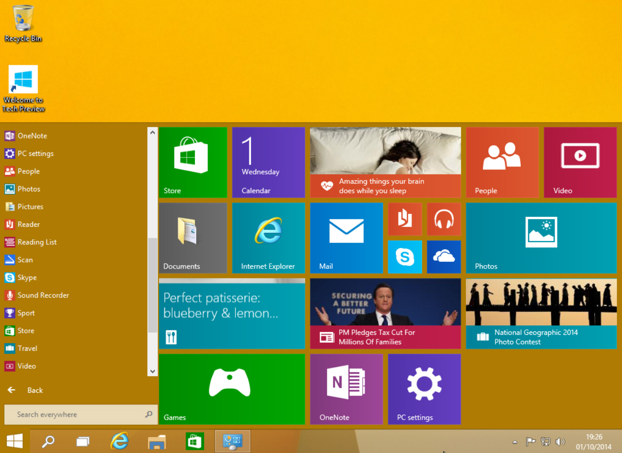
Windows 10’s Start menu is the perfect blend of Windows 7 and Windows 8.x. Click the Start button and the menu appears, displaying icons on the left and tiles on the right.
The top of the Start menu shows your user name and clicking on it will let you change your account picture, lock the computer or sign out. The power button to the right lets you put your PC to sleep, shut it down, or restart.
Underneath that are icons for Documents, Pictures, PC Settings, and File Explorer. Icons for your programs appear below those, and by default you see Snipping Tool, Calculator, Sticky Notes, Paint and Games.
Click on All Apps and you can access the bundled windows apps and any you've installed. The calculator app still fills the screen, but at least it now runs windowed and can be resized. Scroll to the bottom of All Apps and there are folders for Windows Accessories, Windows Ease of Access, and Windows System.
Right-click on an app and you can open it, uninstall it, pin to Start or pin to taskbar.
The Search box at the bottom of the menu lets you search your PC and the web.
The tiles on the right side of the Start menu look and work the same as the tiles on the Windows 8.1 Start screen. You can launch an app, or if you right-click its tile you’ll be able to unpin it from Start, pin it to the taskbar, uninstall it, or resize it. There are small, medium, wide and large sizes available (although not all sizes are available for all tiles). Live tiles can be turned on or off.
In the top right corner of the tiled section is a Windows Feedback app you can use to send feedback regarding the new OS to Microsoft.
The tiled area on the right expands or contracts as you add or remove tiles. So if you like apps, it will spread right across the desktop. If you hate having tiles, just unpin every one and it will change to a standard Start menu. To get the tiled section back, just pin any app to Start.
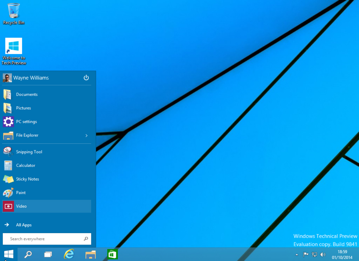
You can resize the menu by clicking and dragging on the top edge. Want a long, squat Start menu? No problem!
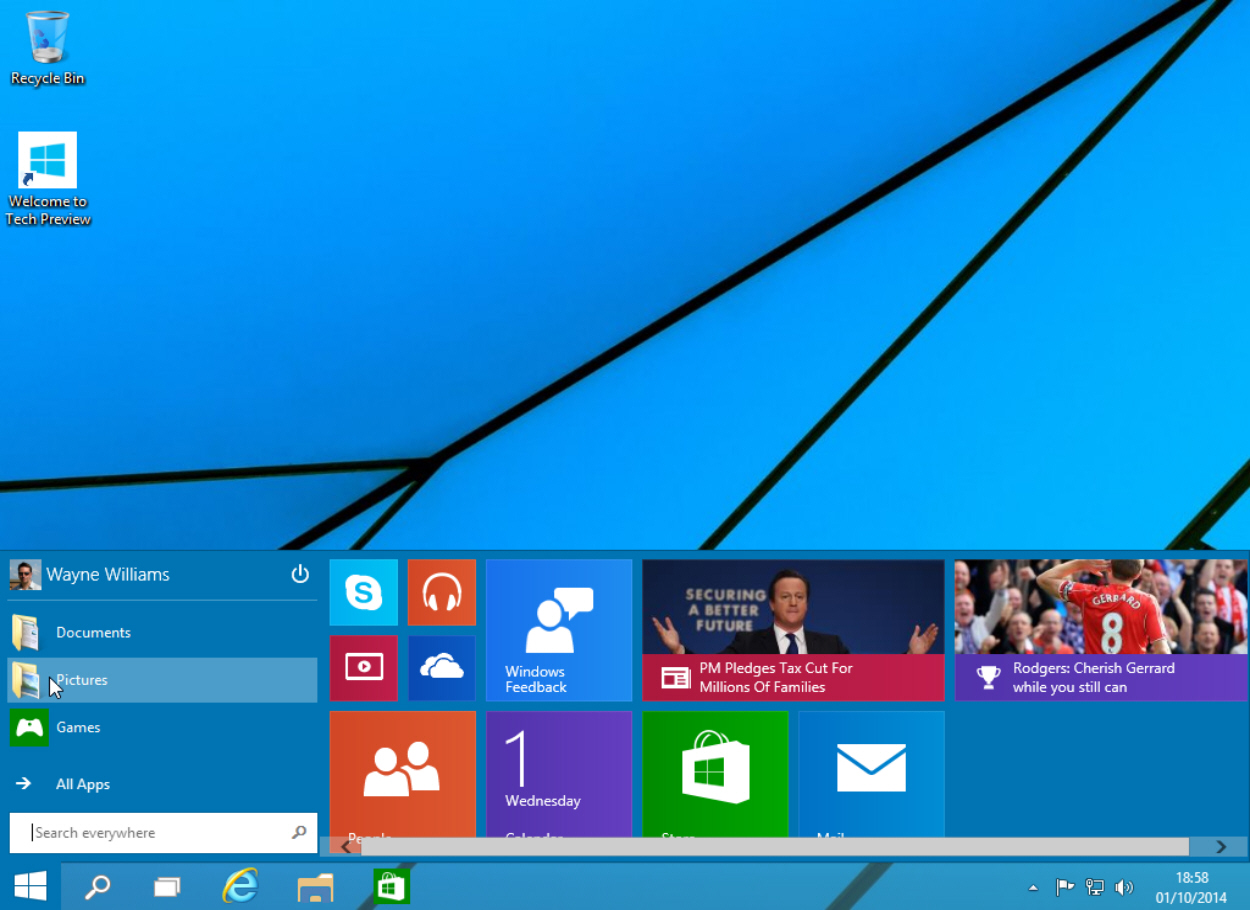
Right-click on a blank area of the tiled section and you can Personalize the menu or access Properties. The Personalize option lets you change the color of the taskbar, window borders and Start menu. The default choice is Automatic -- Windows will choose whatever goes best with your current setup.
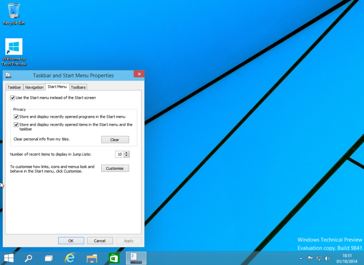
Click Properties and the Taskbar and Start Menu Properties window will open. Click the Start Menu tab and you can turn the menu off and go back to working with a Start screen. You can also manage your privacy and fully customize the menu. This last option will let you choose how links, icons and menus look and behave. You can also choose which items to pin to the Start list here. Should you want to revert to the original selection, click the Use Default Settings button.
Right-clicking the Start button will bring up the same context menu found in Windows 8.1, with some minor changes.
It’s all very intuitive, and Microsoft has done a great job of blending both worlds. Having got used to the Start screen in Windows 8.x I wasn’t sure I wanted to go back to a Start menu, but having spent just a short while with the one in Windows 10 I’m ready to make that change.
So you went from running a desktop OS that SUCKED to a desktop OS that SUCKS AND BLOWS!
Great post!
I don't really remember, but something like this: The main thing that was problematic with batches was DOS v. NT. Parsing was easier using word based (space delineated), because one had to assume DOS tools till one found out one had NT.
I don't remember exactly, but I DO remember a very long struggle trying to parse the version number assuming DOS. IIRC, DOS used a two word alpha name (Windows 98 [version]), NT4 used a two word alpha name (Windows NT [version]), but NT5 used one word (Windows [version])... So the only char you COULD test for was that '9'.
So generally speaking, VER and FIND was what was available (IIRC, FOR worked differently DOS/NT so it couldn't be used till you knew which one). Not much to work with. Once you knew which one, then you could do more.
Now, I know I could FIND for the precise version number right off the bat, but that is several more lines, when all I really needed to know is whether DOS or NT... which is where the lazy comes in. : )
As far as executables are concerned, I am too far away from BASIC and Pascal to even try to remember without examining some of that old code. But I DO know I would be suspicious that I had looked for 'Windows 9'.
So you went from running a desktop OS that SUCKED to a desktop OS that SUCKS AND BLOWS!
++++
LOL. I think I mentioned that I’m the only known Windows 8 fan. While there may be others, at least 3 or 4 perhaps, none except me have actually been identified.
But we are In perfect agreement vis a vis Vista.
**** “So, really, what’s the point of Windows 10? What does upgrading to Windows 10 do - other than enrich Microsoft - that Windows 7 doesn’t currently do?” *****
Exactly....
Only thing I can think of is that it starts training you for Windows 12 or 54 (depending how many numbers they want to skip)
TT
That’s very interesting. Thank you for the background!
MS skipped it.
I don’t claim Windows 8 sucks because its not Apple or Linux, in fact, most of the folks rejecting Win 8 are people who have used windows their entire lives... what a foolish thing to say that those reject it are just apple and linux fanboys.
Windows 8 is an unmitigated disaster, and that is the consensus of the market, which is made up mostly of folks who have never touched a linux or apple PC... they are people who have for the most part have only worked with Windows, at least since Windows 3.1 came on the scene.
Windows 8 sucks pure and simply because its a bastard product looking for a reason to exist. Metro is a horrible interface for a PC.. its a reasonable touch interface, but an abysmal failure for a PC... and to force your PC owners into this idiot paradigm because you once again misread the market was beyond idiotic.
Now to compound the failure of shoving Metro (ZUNE) onto the desktop, lets make it the default interface, which they did with 8.0 which made it beyond insane. 8.1 undid enough to at least make it passable but the damage has been done.
In fact the only people I have found who go out of their way to defend Windows 8, are either folks on the MS Payroll, or MS fanboys, and yep, they do exist believe it or not.
Metro just needs gone from the desktop, it has no place there.. and telling folks they should just shut up and take it is the attitude of a rapist not a successful business model.
7 ate 9.
Exactly. I haven’t tried Apple since the early 90s (may revisit that soon), but I didn’t like their interface then. Found it very unintuitive. So up till now at least, I’ve been a Windows guy, and I’m here to tell ya, W8 blows. Severely. Tons of stuff that was easy in 7 is not just nonintuitive, but objectively more work to get done in 8. Braaaap on this one, Microshaft! Please play again!
So you went from running a desktop OS that SUCKED to a desktop OS that SUCKS AND BLOWS!
*************************
Vista Business (windows 6.0) works better than Vista “home” and is 99% as good as Windows 7 (windows 6.1)...
Glad you got the humor in my post. I don't hate Windows 8. I actually like the fact that it's much faster than Windows 7, uses resources more efficiently, etc..
I just shake my head at Microsoft's boneheaded move to have two different user paradigms in the same OS on the same physical machine. Even moreso now that they've put both in the same interface (the start menu) where tiles and icons live together. It's absolutely HORRIBLE!
Whoever suggested that to them ought to be taken out and thoroughly horsewhipped and sent back to Usability Class.
Windows 10 will be free to Windows 8 users. That's the first time Microsoft is doing anything like it, and while they stand to lose some licensing money on the back end, they're betting on a solid platform to appease the masses to get folks off of 7.
Disclaimer: Opinions posted on Free Republic are those of the individual posters and do not necessarily represent the opinion of Free Republic or its management. All materials posted herein are protected by copyright law and the exemption for fair use of copyrighted works.