
Posted on 03/18/2010 7:59:03 PM PDT by Ernest_at_the_Beach
A Rawinsone being prepared for release at the Miami, FL airport - Image: NOAA
Jo Nova has more from Frank Lansner on what older records, this time from weather balloons, tell us about recent adjustments to the temperature record. WUWT readers may recall Rewriting the decline where the graph from National Geographic below raises some questions about temperature graphs today.

Above: Matthews 1976, National Geographic, Temperatures 1880-1976
Frank Lansner has done some excellent follow-up on the missing “decline” in temperatures from 1940 to 1975, and things get even more interesting. Recall that the original “hide the decline” statement comes from the ClimateGate emails and refers to “hiding” the tree ring data that shows a decline in temperatures after 1960. It’s known as the “divergence problem” because tree rings diverge from the measured temperatures. But Frank shows that the peer reviewed data supports the original graphs and that measured temperature did decline from 1960 onwards, sharply. But in the GISS version of that time-period, temperatures from the cold 1970’s period were repeatedly “adjusted” years after the event, and progressively got warmer.
The most mysterious period is from 1958 to 1978, when a steep 0.3C decline that was initially recorded in the Northern Hemisphere. Years later that was reduced so far it became a mild warming, against the detailed corroborating evidence from rabocore data.
Raobcore measurements are balloon measures. They started in 1958, twenty years before satellites. But when satellites began, the two different methods tie together very neatly–telling us that both of them are accurate, reliable tools.
You can see how similar the data from both methods is:
So what do the raobcores tell us about the period before satellites started recording temperatures? They make it clear that temperatures fell quickly from 1960-1970.

The decline in the original graph in National Geographic in 1976 is apparently backed up by highly accurate balloon data, and was based on peer reviewed data: Budyko 1969 and Angell and Korshover (1975). These two sets overlap from 1958 to 1960, and correlate well, so stitching them together is reasonable thing to do and it doesn’t make much difference which year is chosen from the overlap period (indeed any other choice makes the decline slightly steeper).
What’s thought provoking is that the raobcore data above is for 30N-30S, covering all the tropics on both sides of the equator, and yet still shows the decline. That begs the question of whether the Southern Hemisphere data has been adjusted too. It would be good to see the raobcore sets further up towards the arctic. It would also be good to look at the Southern Hemisphere. Where are the data sets and peer reviewed papers on temperature from 1965 to 1980? I’d like to follow that up.

Three decades of adjustments
When did the “funny business” begin? By 1980 Hansen and GISS had already produced graphs which were starting to neutralize the decline. His graphs of 1987 and then 2007 further reduced the decline, until the cooling from 1960 to 1975 was completely lost.
 (Click to see a larger image).
 Watch how the cooling trend of the 1960’s to 1970’s is steadily adjusted up so that 0.3 degrees cooler gradually becomes 0.03 rising (notice the red and blue horizontal lines in the graphs above).
Mathews Graph 1976: 1955 – 1965 was around 0.3C warmer than 1970’s
Hansen/GISS 1980: 1955 – 1965 was around 0.1C warmer than 1970’s
Hansen/GISS 1987: 1955 – 1965 was around 0.05C warmer than 1970’s
Hansen/GISS 2007: 1955 – 1965 was around 0.03C cooler than 1970’s
And in 1974, there was the fore-runner of the “It’s worse than we thought” message.
…
Frank has more information and details on his blog Hide the decline.
If 1958 temperatures were similar to the 1990’s, it rewrites the entire claim of all the unprecedented warming of late. Lansner also remind us of the photos taken in the arctic by submarines that surfaced around the north pole.

!!!!
**************************************
********************************EXCERPTS******************************
Gladstone is half way up the coast of Queensland, and though GISS (the Goddard Institute of Space Studies) can claim it has not “adjusted” the data, it appears to have cherry picked it.
Thanks to Ken Stewart for his detailed attention. The information here and graphs come from his blog.
![]() Start with several different records The oldest is the BOM (Bureau of Met) Post Office. The highest is the BOM radar, which stepwise jumps up a whole degree. The last is the BOM Airport, which confirms that the Radar for some reason is 1 degree higher than the rest.
Start with several different records The oldest is the BOM (Bureau of Met) Post Office. The highest is the BOM radar, which stepwise jumps up a whole degree. The last is the BOM Airport, which confirms that the Radar for some reason is 1 degree higher than the rest.
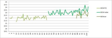
![]() You could drop the BOM Radar figures down to match the other two sets. But, if you wipe out the artificial 1 degree rise in the BOM radar, and if you combined the sets this way, Ken calculates that you only get 0.7 degrees of warming.
You could drop the BOM Radar figures down to match the other two sets. But, if you wipe out the artificial 1 degree rise in the BOM radar, and if you combined the sets this way, Ken calculates that you only get 0.7 degrees of warming.
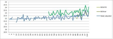
![]() Instead of this option, you could go the goulash route and carefully selectively delete the awkward parts, ignore the recent lower data set at the airport completely, and splice the left-overs together like this and get a 1.7 degree trend: Tick that box!
Instead of this option, you could go the goulash route and carefully selectively delete the awkward parts, ignore the recent lower data set at the airport completely, and splice the left-overs together like this and get a 1.7 degree trend: Tick that box!

(NB: Assume Gladstone has a local weather cell that’s getting warmer faster than surrounding areas. )
The average trend of the 5 nearest long-record rural sites is 0.8 degrees. Nearby cities of Rockhampton and Bundaberg show adjusted trends of about 0.7 and 0.5 degrees respectively, and Maryborough, ignored by GHCN, shows a trend of 0.4 degrees.
Thus the GISS record for Gladstone is derived from cynically cherry-picked data. The resulting trend of about 1.7 degrees Celsius per Century cannot be justified. The record is false.
If you are James Hansen, it seems you’d choose the goulash. He’s the man responsible for this “trend”.
Does no one have any shame any more? Did they assume that because no one was paid to check their figures that no one would?
A big thank you to Ken, who is doing an excellent job of unpacking the Australian GHCN “trends” on his new blog.
NOTE: The scale on the bottom axis is a little unclear. Ken has noted that the data corresponds with certain years:
“The Post Office from 1909 to 1956 which is dead flat at about 22
degrees; Gladstone Radar from 1958 to 2009, which is immediately 1 degree
warmer, and the Airport from 1994 to 2009, half to 1 degree cooler than
Radar.”"
See #22 for how it is done!
*****************************************************
Eddy Aruda:
February 24th, 2010 at 5:25 am
Well, the hits just keep on rolling for the IPCC, the CRU, GISS and the NCDC. The CRU altered temperature data (Harry Read Me File), GISS and Jim Hansen keep “adjusting” their numbers to show cooling in previous years and warming in recent years (exception: Hansen was caught in a Y2K error and revised his numbers downward, just once), the number of temp reporting stations continues to dwindle and the ones disappearing are at higher latitude and altitude and it seems every time the raw data is released it shows that the data has been fudged to show an exaggerated warming. Oh, and lets not forget the Bolivia effect. In essence, every land based temp data set is fraudulent, period. What is amazing and never mentioned by the useful idiots in the MSM is the fact that when only rural temp stations are used to avoid the urban heat island effect most of the alleged recent warming disappears. As Anthony Watts has shown, well over 80% of the GISS/NOAA temp stations do not meet NOAA standards and the U.S. temp data set is the “gold standard” of the world.
All the hockey sticks are broken and debunked. The Medieval warm period was, despite the best efforts of the AGW propaganda machine to convince us otherwise, global. There are hundreds of peer reviewed papers to prove that the MWP was global. Since temps were higher and CO2 levels were lower there is nothing unusual about the trivial amount of warming that has occurred since the end of the little ice age. Thank God it did warm up! The LIA was also a global event and not confined to Europe, as the AGW propaganda machine would like us to believe. THe Holocene Maximum which occurred during the bronze age was several degrees warmer than today yet CO2 levels were lower. Still, the climate cabal insists that the earth will suffer an apocalypse unless we revert to the peasant lifestyle. Try selling that to the suffering people of sub saharan Africa!
People all over the world are hurting financially because of the Great Recession. When they realize how much was squandered by these so called scientists the climate criminals will need police protection. Of course, if they are indicted and can’t make bail they will be in protective custody in whichever incarceration facility they are confined to. We need to start a pool on who will be the first to roll over and turn states evidence to avoid prosecution. I got “dibbs” on Briffa, although Jones is starting to look like a potential stool pigeon.
Well, I am going to go visit the FOX News website to see if there is another “gate” swinging open. Maybe they should roll all these gates up into one and just call it what it is, a flood gate!
*********************************EXCERPTS******************************************

Posted on January 27th, 2010 under AGW socio-political, Global Warming • Tags: AmazonGate, ClimateGate, GlacierGate, IPCC, Pachuri, PachuriGate, WWF
*********************EXCERPTS***************************
Posted on January 23rd, 2010 under AGW socio-political, Global Warming •
Tags: Climate Models, Penny, Penny Wong, Skeptics Handbook II, Wong.
How to create a crisis graph in 6 simple steps
One of the main arguments from the IPCC is that essentially, we can’t explain temperature changes any other way than with carbon forcings. This is matched with impressive pink and blue graphs that pose as evidence that carbon is responsible for all the recent warming.
This is argumentum ad ignorantiam — essentially they say: we don’t know what else could have caused that warming, so it must be carbon. It’s a flawed assumption.
It’s easy to create impressive graphs, especially if you actively ignore other possible causes, like for example, changes in cloud cover and solar magnetic effects.
…
1.

…
2.

…
3.

…
4.

(Addendum: Since the Skeptics Handbook came out we now know that actually they did care about that warm blip in the 1940’s that the models can’t explain. But instead of changing the models, they changed the data. Thanks to ClimateGate for that insight.)
…
5.

Error bars make the graph look more official. (On a graph based entirely on a logical error, what meaning does an “error bar” have?)
…
6. Add the key…

…
Thus, using data you already had, and a stab at the unknown, you can make it appear your models are accurate AND that carbon is the cause. Sure the modellers are using real carbon levels and physical calculations, but they assume carbon is responsible for the warming.
Thus it’s circular reasoning: decide that carbon is a problem; see its “effect” in this graph; declare carbon must be a problem, and rejoice, the models create what we fed them to start with. The Marvel!
(It’s too easy, and politicians fall for it. Then they give us more money to do more “modelling”.)
Page 12
This page is dedicated specifically to Minister Penny Wong in The Australian Government.
When Senator Fielding met Penny Wong in 2009, she waved the IPCC pink-and-blue graphs in the air and repeatedly referred to them as “evidence”, and saying words to the effect “How do I make policy based on this evidence?”
Can someone please email this page to her so that she can understand why this type of graph is most definitely not evidence?
All of the “unknowns” in the graphs are assumed to be carbon. The IPCC does not take solar magnetic effects into account; the models assume cloud-cover doesn’t drive the climate, in their simulations, the climate drives clouds; they can’t predict ENSO events, the same models that produce these graphs predict that the world would have been cooler in medieval times (which it wasn’t). These models also predict the band of air 10km above the tropics will warm much faster than the ground (but it doesn’t, there is no hot spot). In other words, it’s not just that the graphs above are wrong because they make assumptions that are unproven, these graphs are wrong because the evidence shows that they are wrong. The models that produce them are deeply flawed. The assumptions they are based on are wrong, because most of the predictions that follow from these assumptions have been empirically shown to be wrong.
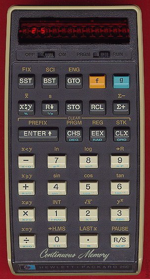
Furthermore models are never evidence, they are theory. “Evidence” means empirical observations from the real world. Models are just a glorified version of a string of calculations that could be done by someone on their high-school calculator (though it may take a few hundred years). You may remember from high school exams, that just because you held a hot Hewlett Packard HP-25C, that didn’t guarantee you always got the right answer.
The IPCC is doing a very clever PR campaign with top marketing techniques and a near infinite budget (of other people’s money). They are playing politicians for patsies.
But the politicians don’t have to be “played”, they can choose to hear both sides of the story.
This is page 12 of The Skeptics Handbook II. A 20 page PDF
I’ve got a smile on my face today! This is a delicious meal for me, but it must be giving Hansen cramps!
Aren’t the google ads inserted at WUWT a gas? Done on purpose of course.
“Ads by Google
No More Tar Sands Oil
Help End Dirtiest Project on Earth Tell Obama No More Pipelines
foe.org”
Well,,,, back to reading the good news!
*******************************EXCERPT*****************************************
![]() Once again, the audacity and brazen manipulation of scientific evidence is shocking. These are very serious allegations.
Once again, the audacity and brazen manipulation of scientific evidence is shocking. These are very serious allegations.
Thermometers moved from cold mountains to warm beaches; from Siberian Arctic to more southerly locations, and from pristine rural locations to jet airport tarmacs.
There were around 6000 thermometers 20 or 30 years ago in the global data set, but in 1989-1990, the number of thermometers were reduced to around 1,500. A new study shows a dramatic pattern of artificial adjustments in the way these thermometers were included or deleted. Jonathon Coleman announced the study results tonight on his blog and also in his broadcast (see below).
Apparently officials systematically left out colder thermometer recordings and kept in hotter data, and where there were empty points on the map, they “filled them in” with calculations instead of measurements. The data was homogenized, and the adjustments always increased the warming. This is the telltale sign of chicanery. This is how we know there were artificial adjustments. Normal scientific corrections are random, not all tending in one direction.
E.Michael Smith notes “When doing a benchmark test of the program, I found patterns in the input data from NCDC that looked like dramatic and selective deletions of thermometers from cold locations.” Smith says after awhile, it became clear this was not a random strange pattern he was finding, but a well designed and orchestrated manipulation process. “The more I looked, the more I found patterns of deletion that could not be accidental. Thermometers moved from cold mountains to warm beaches; from Siberian Arctic to more southerly locations, and from pristine rural locations to jet airport tarmacs. The last remaining Arctic thermometer in Canada is in a place called ‘The Garden Spot of the Arctic,’ always moving away from the cold and toward the heat. I could not believe it was so blatant and it clearly looked like it was in support of an agenda,” Smith says. [Source: IceCap ]
“It has been revealed that a “sleight of hand” was used in the computer program that rated 2005 as “THE WARMEST YEAR ON RECORD.” Skeptical climate researchers have discovered extensive manipulation of the data within the U.S. Government’s two primary climate centers: the National Climate Data Center (NCDC) in Asheville, North Carolina and the NASA Goddard Institute for Space Studies (GISS) at Columbia University in New York City. These centers are being accused of creating a strong bias toward warmer temperatures through a system that dramatically trimmed the number and cherry-picked the locations of weather observation stations they use to produce the data set on which temperature record reports are based. The two investigators say the system has been distorted in other ways as well. They have documented their findings in great detail in a scientific report that has been posted online. These findings are presented as a part of my television special report ”Global Warming: The Other Side” telecast Thursday night, January 14th at 9 PM here on KUSI TV.”
See here for the John Coleman interview with both men on last night’s broadcast. Watch the video.
The data is so homogenized, there are no actual temperature readings left, only interpretations of temperatures ….
Programmer E. Michael Smith and CCM Joseph D’Aleo, the two men who did the research, also revealed there are no actual temperatures left in the computer database when it proclaimed “2005 WAS THE WARMEST YEAR ON RECORD.” In the transition to a computer averaging system, the National Data Climate Center deleted actual temperatures at thousands of locations throughout the world as it evolved to a system of global grid boxes. The number that goes into each grid box is determined by averaging the temperatures of two or more weather observation stations nearest that grid box..
Those who control the datasets, control the “temperature”
E. Michael Smith blog is here.
Joe D’Aleo edits IceCap.
Science and Public Policy Institute (SPPI) will be putting up a detailed report very soon.
Thanks to Colin, David W, and also to Marc Morano at Climate Depot for the fast notification.
I know I need to check it out when three emails arrive in 5 minutes linking the same story.
************************************EXCERPTS*********************************************
December 20 , 2009
Guest Post by Willis Eschenbach
Recapping the story begun at WUWT here and continued at WUWT here, data from the temperature station Darwin Zero in northern Australia was found to be radically adjusted and showing huge warming (red line, adjusted temperature) compared to the unadjusted data (blue line). The unadjusted data showed that Darwin Zero was actually cooling over the period of the record. Here is the adjustment to Darwin Zero:

Figure 1. The GHCN adjustments to the Darwin Zero temperature record.
Many people have written in with questions about my analysis. I thank everyone for their interest. I’m answering them as fast as I can. I cannot answer them all, so I am trying to pick the relevant ones. This post is to answer a few.
• First, there has been some confusion about the data. I am using solely GHCN numbers and methods. They will not match the GISS or the CRU or the HadCRUT numbers.
• Next, some people have said that these are not separate temperature stations. However, GHCN adjusts them and uses them as separate temperature stations, so you’ll have to take that question up with GHCN.
• Next, a number of people have claimed that the reason for the Darwin adjustment was that it is simply the result of the standard homogenization done by GHCN based on comparison with other neighboring station records. This homogenization procedure is described here (PDF).
While it sounds plausible that Darwin was adjusted as the GHCN claims, if that were the case the GHCN algorithm would have adjusted all five of the Darwin records in the same way. Instead they have adjusted them differently (see below). This argues strongly that they were not done by the listed GHCN homogenization process. Any process that changed one of them would change all of them in the same way, as they are nearly identical.
• Next, there are no “neighboring records” for a number of the Darwin adjustments simply because in the early part of the century there were no suitable neighboring stations. It’s not enough to have a random reference station somewhere a thousand km away from Darwin in the middle of the desert. You can’t adjust Darwin based on that. The GHCN homogenization method requires five well correlated neighboring “reference stations” to work.
From the reference cited above:
“In creating each year’s first difference reference series, we used the five most highly correlated neighboring stations that had enough data to accurately model the candidate station.”
and “Also, not all stations could be adjusted. Remote stations for which we could not produce an adequate reference series (the correlation between first-difference station time series and its reference time series must be 0.80 or greater) were not adjusted.”
As I mentioned in my original article, the hard part is not to find five neighboring stations, particularly if you consider a station 1,500 km away as “neighboring”. The hard part is to find similar stations within that distance. We need those stations whose first difference has an 0.80 correlation with the Darwin station first difference.
(A “first difference” is a list of the changes from year to year of the data. For example, if the data is “31, 32, 33, 35, 34″, the first differences are “1, 1, 2, -1″. It is often useful to examine first differences rather than the actual data. See Peterson (PDF) for a discussion of the use of the “first-difference method” in climate science.)
Accordingly, I’ve been looking at the candidate stations. For the 1920 adjustment we need stations starting in 1915 or earlier. Here are all of the candidate stations within 1,500 km of Darwin that start in 1915 or before, along with the correlation of their first difference with the Darwin first difference:
WYNDHAM_(WYNDHAM_PORT) = -0.14
DERBY = -0.10
BURKETOWN = -0.40
CAMOOWEAL = -0.21
NORMANTON = 0.35
DONORS_HILL = 0.35
MT_ISA_AIRPORT = -0.20
ALICE_SPRINGS = 0.06
COEN_(POST_OFFICE) = -0.01
CROYDON = -0.23
CLONCURRY = -0.2
MUSGRAVE_STATION = -0.43
FAIRVIEW = -0.29
As you can see, not one of them is even remotely like Darwin. None of them are adequate for inclusion in a “first-difference reference time series” according to the GHCN. The Economist excoriated me for not including Wyndham in the “neighboring stations” (I had overlooked it in the list). However, the problem is that even if we include Wyndham, Derby, and every other station out to 1,500 km, we still don’t have a single station with a high enough correlation to use the GHCN method for the 1920 adjustment.
Now I suppose you could argue that you can adjust 1920 Darwin records based on stations 2,000 km away, but even 1,500 km seems too far away to do a reliable job. So while it is theoretically possible that the GHCN described method was used on Darwin, you’ll be a long, long ways from Darwin before you find your five candidates.
• Next, the GHCN does use a good method to detect inhomogeneities. Here’s their description of their method.
To look for such a change point, a simple linear regression was fitted to the part of the difference series before the year being tested and another after the year being tested. This test is repeated for all years of the time series (with a minimum of 5 yr in each section), and the year with the lowest residual sum of the squares was considered the year with a potential discontinuity.
This is a valid method, so I applied it to the Darwin data itself. Here’s that result:

Figure 2. Possible inhomogeneities in the Darwin Zero record, as indicated by the GHCN algorithm.
As you can see by the upper thin red line, the method indicates a possible discontinuity centered at 1939. However, once that discontinuity is removed, the rest of the record does not indicate any discontinuity (thick red line). By contrast, the GHCN adjusted data (see Fig. 1 above) do not find any discontinuity in 1941. Instead, they claim that there are discontinuities around 1920, 1930, 1950, 1960, and 1980 … doubtful.
• Finally, the main recurring question is, why do I think the adjustments were made manually rather than by the procedure described by the GHCN? There are a number of totally independent lines of evidence that all lead to my conclusion:
1. It is highly improbability that a station would suddenly start warming at 6 C per century for fifty years, no matter what legitimate adjustment method were used (see Fig. 1).
2. There are no neighboring stations that are sufficiently similar to the Darwin station to be used in the listed GHCN homogenization procedure (see above).
3. The Darwin Zero raw data does not contain visible inhomogeneities (as determined by the GHCN’s own algorithm) other than the 1936-1941 drop (see Fig. 2).
4. There are a number of adjustments to individual years. The listed GHCN method does not make individual year adjustments (see Fig. 1).
5. The “Before” and “After” pictures of the adjustment don’t make any sense at all. Here are those pictures:

Figure 3. Darwin station data before and after GHCN adjustments. Upper panel shows unadjusted Darwin data, lower panel shows the same data after adjustments.
Before the adjustments we had the station Darwin Zero (blue line line with diamonds), along with four other nearby temperature records from Darwin. They all agreed with each other quite closely. Hardly a whisper of dissent among them, only small differences.
While GHCN were making the adjustment, two stations (Unadj 3 and 4, green and purple) vanished. I don’t know why. GHCN says they don’t use records under 20 years in length, which applies to Darwin 4, but Darwin 3 is twenty years in length. In any case, after removing those two series, the remaining three temperature records were then adjusted into submission.
In the “after” picture, Darwin Zero looks like it was adjusted with Sildenafil. Darwin 2 gets bent down almost to match Darwin Zero. Strangely, Darwin 1 is mostly untouched. It loses the low 1967 temperature, which seems odd, and the central section is moved up a little.
Call me crazy, but from where I stand, that looks like an un-adjustment of the data. They take five very similar datasets, throw two away, wrench the remainder apart, and then average them to get back to the “adjusted” value? Seems to me you’d be better off picking any one of the originals, because they all agree with each other.
The reason you adjust is because records don’t agree, not to make them disagree. And in particular, if you apply an adjustment algorithm to nearly identical datasets, the results should be nearly identical as well.
So that’s why I don’t believe the Darwin records were adjusted in the way that GHCN claims. I’m happy to be proven wrong, and I hope that someone from the GHCN shows up to post whatever method that they actually used, the method that could produce such an unusual result.
Until someone can point out that mystery method, however, I maintain that the Darwin Zero record was adjusted manually, and that it is not a coincidence that it shows (highly improbable) warming.
From another article at C-Depot;
‘ The new scare report issued by the Obama administration refers (reference list) to the work of Stephen H. Schneider six times. You will recall that Schneider is infamous for telling Discover magazine (October, 1989, p. 45-48) that “we have to offer up scary scenarios, make simplified, dramatic statements, and make little mention of any doubts we might have...each of us has to decide what the right balance is between being effective and being honest.”’
Related thread...article from JoNova:
The big picture: 65 million years of temperature swings
JoNova ^ | February 18th, 2010 | Joanne
Posted on Fri 26 Feb 2010 10:45:29 PM PST by Ernest_at_the_Beach
************************************
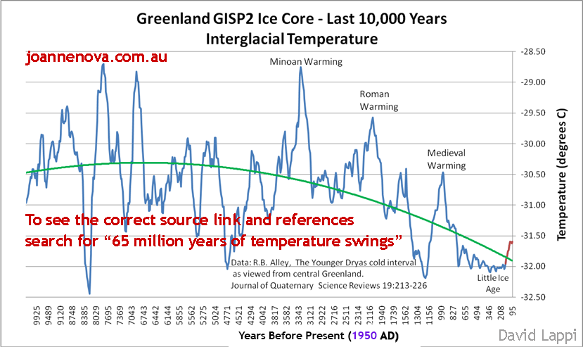
Greenland Temperatures - last 10,000 years. Are we headed for an ice age? (See below for more detail.)
David Lappi is a geologist from Alaska who has sent in a set of beautiful graphs–including an especially prosaic one of the last 10,000 years in Greenland–that he put together himself (and which I’ve copied here at the top).
If you wonder where today’s temperature fits in with the grand scheme of time on Earth since the dinosaurs were wiped out, here’s the history. We start with the whole 65 million years, then zoom in, and zoom in again to the last 12,000 from both ends of the world. What’s obvious is that in terms of homo sapiens history, things are warm now (because we’re not in an ice age). But, in terms of homo sapiens civilization, things are cooler than usual, and appear to be cooling.
Then again, since T-rex & Co. vanished, it’s been one long slide down the thermometer, and our current “record heatwave” is far cooler than normal. The dinosaurs would have scoffed at us: “What? You think this is warm?”
With so much volatility in the graphs, anyone could play “pick a trend” and depending on which dot you start from, you can get any trend you want. — Jo
**********************************************************
GUEST POST by David Lappi
See link**********************
Well Hansen and his group were effective,...and dishonest....but that was their intent....
Climate Abnormalities - What Temperature Anomaly Are We Trying To Explain?
Re the disappearing temp stations; There was an article on, I think, Climate Depot, a couple of weeks ago, that gave a list of when all the weather sites were shut down. Very short time period as I recall.
 |
||
| · join · view topics · view or post blog · bookmark · post new topic · subscribe · | ||
Glad to hear there is some movement to get rid of her.
I’m totally beat and ready to hit the rack to get up early. I will bookmark this post for closer examination later. Thanks.
Is it too late to do anything with the healthcare "crisis"???
Disclaimer: Opinions posted on Free Republic are those of the individual posters and do not necessarily represent the opinion of Free Republic or its management. All materials posted herein are protected by copyright law and the exemption for fair use of copyrighted works.
