Posted on 04/23/2006 1:53:04 PM PDT by Republicanprofessor
Have you ever been to Lincoln Center in New York? I had never been there until yesterday, when I was privileged enough to attend an opera at the Met. Although the opera was wonderful, I dare say I was even more impressed with the architecture of the entire center. It seems to me to be the epitome of modern architecture of the second phase of the International Style (that simplified skyscraper style with often-elegant materials, steel beams, and glass). In fact, the beauty and style of Lincoln Center could be said to rival the music created within.

I had always thought, from pictures, that the Center looked cold and barren. How wrong I was! The subtleties of the International Style II cannot be appreciated from distant photographs. Like minimal sculpture of the same period in the sixties, the experience of the viewer completes the aesthetic experience: for as we wander through the complex, the variations in shape, space, and texture enliven our experiences as human beings.
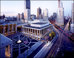
It was wisely laid out, by Wallace Harrison, of Harrison and Abramovitz, off to the side of Columbus Ave.: between west 62nd and west 66th Streets and Columbus and Amsterdam Avenues. A secondary street rises beside it, perfect for buses to cough up their passengers. The steps to climb set off the plaza still further and are more emphatic in photographs than when actually approaching the plaza.

To the left is the New York Opera, designed by Philip Johnson in 1962. This is the center for ballet and musical theater. To the right is Avery Fisher Hall, originally Philharmonic Hall, designed by Max Abramovitz in 1962. Straight ahead, taller and marked by elegant frontal barrel vaults, rises the Metropolitan Opera House from 1965. This is the first such cluster of concert halls designed for one location; it seems to me that they to reflect Michelangelo’s design for the Campidoglio in Rome. Michelangelo had unusual, acute angles with which to work, but Lincoln Center is wisely laid out at right angles, angles echoed in the columns affronting each building.


Like Michelangelo’s Senator’s Palace, the Met is definitely the pinnacle of Lincoln Center: due to its curved barrel vaults and to its greater height and central location. And its interior shines in comparison to the other buildings. We had time to kill before the opera and strolled to explore the lateral buildings. The ceilings on their lower floors were low, with openings on either side, where one could visit the cafeteria, the gift shop, and have access to the more open lobbies above. We did not visit the halls themselves, but noting the images on the web, the lobby in each was an effective contrast to the open, swirling experience of the auditoriums.


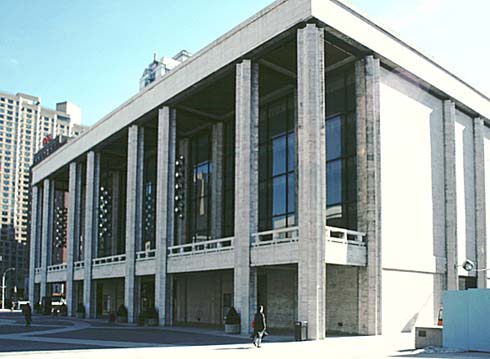
The New York State Theater, where ballet and musical theater is produced, designed by Philip Johnson. 

Avery Fisher Hall, formerly Philharmonic Hall, designed by Abramovitz.
The columns outside the buildings could easily be overlooked, but these forms subtly and beautifully enhanced the elegance of the ensemble. The columns of Symphony Hall on the right curved up and outwards in a most unique fashion. The travertine marble was reminiscent of the work of Mies van der Rohe, the king of the first International Style.


The cross shape of the columns of the New York State Theater remind me of Mies’ elegant steel crossed columns used in works like the Barcelona Pavilion from 1929, shown on the right above. Although Lincoln Center is most elegant, it does lack Mies' meticulous attention to detail was. This is probably best seen in the transition between the barrel vaults of the Met's building and the marble columns which was rather rough and awkward. (See above.) But this was one of the few details lacking elegance.
The interior of the Met was the most elegant of all: a full, sweeping double staircase that was reminiscent of the Paris Opera House. No low ceilings here; the space opened up in supreme curving elegance. Above, four levels of balconies rose above the main curves of the staircase, a perfect spot from which to gaze during intermissions. A restaurant presided on one side in the full open space. Smaller rooms were tucked into the sides, and restrooms were also tucked into the main body of the building (almost invisibly). The curved, mysterious suspension of the staircase was as magical and musical as the operas within. They say that architecture is the frozen music of the arts, and one could almost hear the strains of Mozart’s melodies in the sweeping forms.

Inside the auditorium, strong design continued to reign. The seven rows of seats in the five different balconies are steeply placed, so that one’s head is never in the way. There is a steep descent from row G to row A, from which one can see the gold circles of the ceiling design radiating outward. Ingeniously tucked into these gold shells are the lights for the stage. Cozy boxes line the sides of the theater. Perhaps the only clunky design here is on either side of the stage, where a dull gold cross design hardly echoes the elegance radiating elsewhere in the theater. (This may be only evident in person; in this photo it looks lovely.)


As we were leaving, my son remarked that the chandelier was now lit. This sunburst of a chandelier, descending several stories, is most unique. I realized how often the images of Lincoln Center are taken at night. Perhaps this is the first complex of buildings ever designed with electric lights in mind. The glass enclosed spaces are at their most elegant glowing of night, promising the elegance of the entertainment realized within.


What do you think? Have any of you ever been there? Are you intrigued now to visit?
Art ping.
Let Sam Cree, Woofie, or me know if you want on or off this Art Ping list.
Art ping.
Let Sam Cree, Woofie, or me know if you want on or off this Art Ping list.
Art Appreciation/Education Ping list.
This list is slightly different from the regulart Art Ping list (which I mistakenly pinged twice...sorry about that.)
If you want on or off this ping list, which is mostly essays of art interest, let me know. If you want to see other essays which I have written, check out my homepage.
By the way, what opera did you see?
We saw "The Marriage of Figaro." Not quite as tuneful overall as Verdi, but a fun opera nonetheless.
Great post & pictures. I've never been there, but always liked the architecture. Thank you for a lovely respite from the world's woes.
I think you will enjoy this lovely essay.
Thanks for a great report. I have attended several performances over the years at the Opera House and Avery Fisher Hall. The acoustics at Avery Fisher are dead. Big problem.
It is too bad that the acoustics at Avery Fisher Hall are poor. Shouldn't that be the first priority in design?
I have to agree that those are beautiful buildings. Though I like much of modern architecture anyway, with it's emphasis on simplicity. And at least in modern architecture, beauty and skill are still considered virtues, to my knowledge. OTOH, some of the stuff I see going up around here in Miami is pretty awful.
I have to say that as close as I've ever gotten to Miami is watching CSI: Miami. I have never been a city person, but I must say the producers sure make Miami look beautiful and glamorous there.
Grandma was born in Germany in the late 1800's. She told me every hamlet in Germany no matter how small or poor seemed to have its own concert haus and operetta company. The country was totally into music. My grandmother passed on her love of musical culture to me and I'm forever grateful. I still listen to the Met on Saturdays just like I did when grandma was sitting in her chair sewing and darning.
I live in Florida now. My area is rather a dry hole for opera.....but Ruth Eckerd Hall a half-hour from me in Clearwater puts on some passable opera. Sarasota, the home of Cong. Katherine Harris, has opera worth the two-hour drive. I saw Die Fledermaus there and really enjoyed it.
I appreciate the photos above so much. Opera, operetta, ballet and classical music are a great part of my life.
I hate today's music!
(......ducking!)
Leni

I guess Miami has its share of beautiful buildings, though IMO, a good many of them tend to be private residences, such as the Charles Deering Estate (now a county park) above. But I was referring to my distaste for the ever sprouting MacMansions, along with the Levittown type of cheap housing that is coming so quickly now. However, I guess those things are a plague other places as well. I happen to also think that the Miami Dade Municipal Building is beautiful, though I think it inappropriate for a goverment center to occupy such an imposing structure. Can't find a picture of it for some reason.

Some of the great PBS broadcasts of "Live from the Met" are now available on DVD from Amazon. I have a whole bunch of them.
One would think, but they missed the boat. They redid the place after it was done hoping to improve the acoustics, but it didn't do much. Their failure was a bit of a scandal here...NY audiences (as well as the NY Philharmonic) knew it.
The NY state Theater is by far the best piece in the complex. The entrance hall is very good, also filled with great modern art. It's a glorious warm space, with bronze fillagree railings and a gently arcing balcony.
 I find the rest of the complex to be mediocre at best. The plaza is semi-successful.
The Vivian beaumont building to the right rear of Lincoln Center is also a very good 60's brutalist building with bold expressed structure integrated with ceiling lighting.
 .
.


BTW
The entire complex is set to be completely transformed and redesigned.
This is just part one
http://www.lincolncenter.org/redev/home.asp?session=ECD1&version=&ws=&bc=99
Disclaimer: Opinions posted on Free Republic are those of the individual posters and do not necessarily represent the opinion of Free Republic or its management. All materials posted herein are protected by copyright law and the exemption for fair use of copyrighted works.