Posted on 06/01/2005 4:08:07 PM PDT by Republicanprofessor
I had such fun with my first Art Appreciation "class" last week. Thanks for all your support. For this second “class,” I’d like to discuss the basic ideas behind Impressionism and Post-Impressionism. Please continue to post more images that appeal to you; it’s great to have a continuing dialogue.
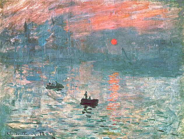
Let’s look at Impression: Sunrise by Claude Monet (1840-1926). This was done in 1874, and when it was exhibited, the slurred comments by a critic about it being only “an impression” gave the name Impressionism to the movement. Nowadays, however, we appreciate how it moves away from detailed realism to give us a different feeling of the moment. What is the weather, location, probable season? These were the concerns of the Impressionists. What kind of weather makes the sun so red at sunrise?
Later in the 1890s, Monet began several splendid series of works of similar subjects caught at different times of day: morning, noon, evening. He did these with grainstacks (or haystacks), Rouen Cathedral and poplar trees. Some complain that these works were just about light, color and atmosphere. (Cezanne is reputed to have said “Monet is just an eye, but what an eye!"). However, one article I read noted that these subjects are essential in French history and identity: the poplars are a national symbol, the grainstacks look like farmer’s thatched huts and thus glorify agriculture and farmers. Finally, the cathedrals are resonant with French gothic glory, since gothic cathedrals were initiated in France in 1144.


You can often guess the time of day in Monet’s Cathedral pieces because the entrance of these churches (in Europe) is always on the west side. Thus the light in the left image is clearly in the early morning. If you look on line, you can see different images from other times of day.
Monet’s latest Waterlilies series from the 1910s-1926 were awesome, but I’ll get to those later.
Another complaint of Monet was that his work was “formless:” that he had no hard edges, traditional space nor modeling (or shading). The Post-Impressionists like Paul Gauguin (1848-1903) added stronger forms, shapes and edges to the color of the Impressionists.

Gauguin’s Vision after the Sermon 1888. Done about the same time as Monet’s works, but notice how much more solid are the shapes (more fancily called forms). There is a sense of solidity and mass (or weight) about them.
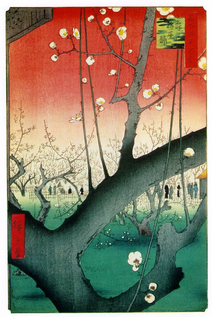
A question I always ask my students about this work: is the space flat or is it deep? This is a very important question in modern art. The small cow in the upper left shows a sense of distance, especially from the huge (Sally Field Flying Nun-type) nuns’ hats. But the diagonal and red background really flatten the space. That diagonal, the cut-off forms, aerial perspective and non-heroic, daily subject are strong influences from Japanese prints, which were inundating France after Admiral Perry opened Japan 1853.
What’s happening in Gauguin’s work is that these Breton women of northern France have come out from church and are visualizing a reenactment of their sermon: Jacob wrestling with the angel. (My problem with Gauguin is that he often doesn’t touch my heart, as Monet does. One writer, I believe it was Rosenblum, said that Gauguin watches others worship, but we don’t feel him worshiping. That’s true of his later Tahiti works as well.)
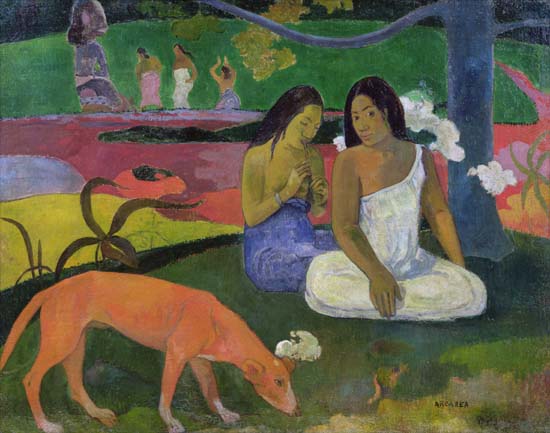
Gauguin’s Day of the Gods from his later Tahitian period. I love the abstracted, colorful swirls of the water. Here even the water is solid. Note the Tahitian god in the background.
Now, here’s my toughest concept of the “class.” That flattened space of Gauguin, the flat space that also hints at a deeper space, is an essential theme of modern art. Renaissance perspective is old-fashioned, and after the invention of the camera, artists are trying to explore different kinds of space. Now, if you can see a movement back and forth between two and three dimensions, that creates a new kind of energy in painting. And, to me, this is a spiritual energy that affects my eyes, my body and my soul. Modern art can be seen as very spiritual, for it does affect the spirit and soul in a new way. This is not the traditional kind of Christian images seen in the past.
I have given short shrift to so many other Impressionists: Renoir, who preferred people (while Monet preferred landscapes); Degas, whose melancholy pervaded even his now-famous ballerinas; Mary Cassatt who updated the traditional Mother and Child icon to middle-and upper-class mothers and their children.


In the next “class,” in about a week or so, I want to compare and contrast the emotional works of van Gogh vs. the more controlled (but equally influential) works of Cezanne.
BTW, the latest thread by Liz on Klimt falls into this time-line of the Art Nouveau of the late 1890s. Symbolists like Klimt were a subcategory of the Post-Impressionists.
Thanks. You can keep me on your list.
bump for later read
Thanks, Professor!
I like the Caillebotte's from post 14 and post 36, the Twachtman's in 16 and 24 (although the 16 is a better painting even though I love the real Emerald pool. God is the best artist of them all), the Monet's in 22 and the two Sloth posted (although the second is better than the first)
The Monet's posted in the article are too formless and dreary to go over the sofa. Likewise the haystack just doesn't catch the eye or the imagination.
It's a pity the old masters never did an Enterprise fighting a Klingon battle cruiser painting. :^)
Ah ha! I saw the the similarity but dismissed it, forgetting that the image would be reversed in the mirror Caillebotte must have used. Thanks for the little lesson on Caillebotte -- I've always liked his work and will now read up on the man.

Are the collections as awesome as the architecture?
Some of the collections change, but many are permanent. I can spends hours there looking at everything. The new Getty has incredible natural lighting. Plus, they serve beer & wine to make the visit even better. In the summer, they have concerts and dance events. They also have great food & allow you to picnic on the lawn.
I'm not sure about this squinting thing. We don't usually do that in class, because I just relish the brushwork as it is. What I love is how they can create images with just a splash of paint. That loose brushwork is not as easy as it looks and has more immediacy and spontaneity than using a very small brush and tight hand to get things exactly "right" as in a photograph.
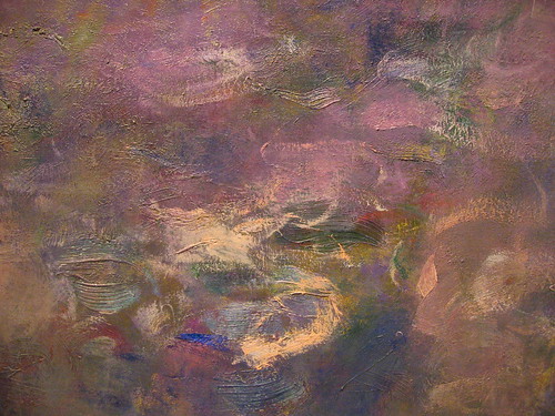
I also just like the way the blobs of paint, if you will, create a new level of visual interest, especially if the white of the canvas or other colors shine through. I think this is from one of the waterlillies, but I just found it on a google search and love it at it is: a detail of his brushwork.
I agree, but it has been pointed out to me that if you keep looking at the spot, the wave will continuously repeat itself, so you keep getting chances to examine it!
A watercolor instructor with whom I once studied noted that if you can draw mountains, you can draw waves. I find that a fairly valid observation within reason.
I've spent most of my life on the water and have noted one or 2 things myself: water is highly reflective, as well as being often transparent; the troughs of waves most always reflect the sky, while the crests will normally manifest the shadows and the local color of the water itself. As you look toward the horizon, the crests seem to get closer together, while you lose sight entirely of the troughs. This causes the water to actually appear to be getting darker as it fades into distance, defying the rules of atmospheric perspective.
Even so, water is damn difficult to render.
I'm not qualified to really comment on those guys, but I can bet that the artists themselves were squinting as they painted.
Interesting that the Impressionists purposely went for flatness. I have thought they did that because they were interested in portraying light for its own sake, without relying on devices such as chiarascuro or the artificially dark backgrounds that the academics, and even Sargent, used so effectively in portraits to make the sitter come forward. But I know also that they were influenced by Japanese art, which was flat by tradition. But I imagine that the new invention of the time, the camera, also notorious for making flat images may have been an influence.
Yeah, I agree with your provocative comment about the spirituality of modern art, though I'm pretty sure I'd like to exclude plenty of it from that characterization. Maybe most of it.
Meanwhile, I have been looking at an old photograph of that era, of bank robber and model citizen Frank James, which clearly imitates the 19th century academic tradition of painting!

What does "ashcan artist" mean?
If you have a ping list for these threads, please put me on it. Thanks.
LOL!
That's just it, I can't see the splashes of paint as anything more than splashes of paint unless I squint them into an image. I don't know if it's from nature or from training (I'm an engineer)
I guess the core of the matter is that I don't really care about technique or brushwork. I just want a picture that talks to me. And most of the impressionists don't talk to me. (The entire water lillies series doesn't grab me at all for instance)
One style that just crossed my mind is where they do the entire thing with many small dots of paint. Up close its just paint spatters on canvas but as you back away the image comes into view. Now that I can appreciate for the planning involved to get the image right. (Haven't an idea of what the style/technique is called)
Disclaimer: Opinions posted on Free Republic are those of the individual posters and do not necessarily represent the opinion of Free Republic or its management. All materials posted herein are protected by copyright law and the exemption for fair use of copyrighted works.