Skip to comments.
What Do You Think of Trump-Pence Logo Developed by Friend's Wife?
Self
| July 17, 2016
| P.J. Gladnick
Posted on 07/17/2016 5:35:25 PM PDT by PJ-Comix
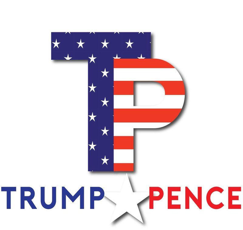
Okay, the original Trump-Pence logo has been scrapped. The second logo is okay and features a photo of Trump and Pence. Perhaps a little too graphic dense in terms of a logo. HOWEVER, the graphic artist wife of a friend of mine, Brian Craig, co-host of the Steve Kane radio show in South Florida has created the following Trump-Pence logo. What do you think of it?
TOPICS: Chit/Chat
KEYWORDS: donaldtrump; logo; mikepence; toiletpaper
Navigation: use the links below to view more comments.
first previous 1-20, 21-40, 41-60, 61-80 ... 101-118 next last
To: dp0622
Post #8 ~ As a 20 year graphics guy, the P looks like it’s in prison clothes, the font is still the most BASIC font there is and the white star is weak, as are the stars as they are arranged on the T. ~
Great analysis! TY for your expertise...
MY first thoughts when I viewed the logo were, “meh...” :^)
21
posted on
07/17/2016 5:47:39 PM PDT
by
heterosupremacist
("Resistance to tyrants is obedience to God." Thomas Jefferson)
To: PJ-Comix
22
posted on
07/17/2016 5:48:16 PM PDT
by
Albion Wilde
(We will no longer surrender this country to the false song of globalism. --Donald Trump)
To: dp0622
the P looks like it’s in prison clothesThat was my first impression. And, I don't like the TP initials - too much of a target.
23
posted on
07/17/2016 5:48:21 PM PDT
by
Kipp
To: PJ-Comix
Trump Pence on a WALL or even a camo wall to include vets?
Even Hillary can not make them fall from the wall! LOL
24
posted on
07/17/2016 5:50:23 PM PDT
by
3D-JOY
To: PJ-Comix
25
posted on
07/17/2016 5:50:36 PM PDT
by
Popman
(Righteousness exalts a nation, but sin is a reproach to any people. - Proverbs 14:34)
To: PJ-Comix
I think it ought to be something simple. All these clever logos are just too clever for their own good. Think about the simple "Reagan Bush" logo. Classic.
Something like "Trump. Pence. For America."
To: SERKIT
The Libs think that Logo looks like a sex act.
Not kidding.
27
posted on
07/17/2016 5:51:00 PM PDT
by
Kickass Conservative
(“’Islamophobia”, a word created by fascists, and used by cowards, to manipulate morons.” Christo)
To: ConservativeMind
Part of the 2012 0bama message was to encourage women to think about having sex with 0bama.
29
posted on
07/17/2016 5:51:53 PM PDT
by
combat_boots
(The Lion of Judah cometh. Hallelujah. Gloria Patri, Filio et Spiritui Sancto!)
To: Kipp
I know graphics people in the city who, for 500 bucks, would make a logo that would blow people’s minds.
They’re the best of the best at investment bank presentation centers.
They wouldn’t take any logo that’s been presented so far seriously.
30
posted on
07/17/2016 5:52:58 PM PDT
by
dp0622
(The only thing an upper crust conservative hates more than a liberal is a middle class conservative)
To: PJ-Comix
I Love It!

31
posted on
07/17/2016 5:54:44 PM PDT
by
Fiddlstix
(Warning! This Is A Subliminal Tagline! Read it at your own risk!(Presented by TagLines R US))
To: Carpe Cerevisi
The issue is not the logo or its design. The real issue is that if you are having a problem with your own candidate/campaign, point fingers at your opponent. The media whores have jumped on the logo issue and are doing what they can to deflect any attention AWAY from their failing candidate HITLARY.
False “poll” results spring up from one minute to the next and we all know they are bogus. Any means you have to direct attention away from your own failing campaign is fair game as far as they are concerned.
32
posted on
07/17/2016 5:56:02 PM PDT
by
DaveA37
To: PJ-Comix
What do I think of it? Not much.
33
posted on
07/17/2016 5:56:12 PM PDT
by
Enten
(I don't have islamophobia...I do have islamonausea)
To: dp0622
Since Trump ends in P and Pence starts with that letter, perhaps a logo could be developed that takes advantage of that?
34
posted on
07/17/2016 5:57:06 PM PDT
by
PJ-Comix
(Tell It, Skinner, about your Clinton Cash Payoff Money)
To: PJ-Comix
I don’t care for it. The “Pence” portion is too predominant.
35
posted on
07/17/2016 5:58:14 PM PDT
by
trisham
(Zen is not easy. It takes effort to attain nothingness. And then what do you have? Bupkis.)
To: PJ-Comix
Trump across, Pence down. I like it. Flag filling in the middle. Different font. Would work well.
36
posted on
07/17/2016 5:59:30 PM PDT
by
dp0622
(The only thing an upper crust conservative hates more than a liberal is a middle class conservative)
To: ConservativeMind
I do not agree,where is your mind? I like it.
37
posted on
07/17/2016 6:00:53 PM PDT
by
samantha
(keep up the fight....)
To: 2banana
I’m with you. NOOOOO! to TP. Imagine the ridicule.
38
posted on
07/17/2016 6:02:11 PM PDT
by
StAntKnee
( Add your own danged sarc tag)
To: PJ-Comix
39
posted on
07/17/2016 6:03:10 PM PDT
by
samantha
(keep up the fight....)
To: ConservativeMind
Which might make it attractive to the butthurt crowd!
40
posted on
07/17/2016 6:04:01 PM PDT
by
bigbob
(The Hillary indictment will have to come from us.)
Navigation: use the links below to view more comments.
first previous 1-20, 21-40, 41-60, 61-80 ... 101-118 next last
Disclaimer:
Opinions posted on Free Republic are those of the individual
posters and do not necessarily represent the opinion of Free Republic or its
management. All materials posted herein are protected by copyright law and the
exemption for fair use of copyrighted works.
FreeRepublic.com is powered by software copyright 2000-2008 John Robinson