Using HTML 'img', between the 'img' and the 'src=', insert 'width=350'. Use preview, and adjust the value accordingly. 350 seems to be a good number generally to start with.

Posted on 03/31/2020 5:50:25 AM PDT by Sir Napsalot
Look at the Y-scale of the CO2 graph. THAT IS NOT an exponential growth.
THIS iS PURE FEARMONGERING from very dishonest authors.
The WARMER the BETTER!!!
I’m looking at that graph and it’s so “perfect” it’s clearly fake. No way data presents itself quite like that.
It’s also how climate change works. And if there’s any silver lining in this mess, it’s that the coronavirus pandemic is teaching us a valuable lesson about the perils of ignoring destructive processes—and perhaps even larger, longer-term disasters—that increase exponentially.
The data looks reasonable to me.
All it measures is the amount of CO2 in the atmosphere.
It as very little to do with the average temperature of the earth.
What does my cat’s tail wagging tell me about climate change? Nothing.
(Author bio)
Howard Kunreuther is co-director of the Wharton Risk Management and Decision Processes Center at the University of Pennsylvania. He is co-author, with Robert Meyer, of The Ostrich Paradox: Why We Underprepare for Disasters.
Paul Slovic is president of Decision Research and professor of psychology at the University of Oregon. He is the author of The Perception of Risk. (end excerpt)
Risk management from UPenn’s Wharton business school should have a ROI analysis at the very least, no?
And what would the return on drastic climate change investment these authors want to impose?
Are you kidding?
That’s how I decide whether I need an umbrella or not that day.
>>> ...the coronavirus pandemic is teaching us a valuable lesson about the perils of ignoring destructive processes ...
Instead of “climate change” as their example of destructive processes,
we could use their argument to describe unchecked illegals invading this country.
I bet The Left won’t like it. Not one bit.
Using HTML 'img', between the 'img' and the 'src=', insert 'width=350'. Use preview, and adjust the value accordingly. 350 seems to be a good number generally to start with.

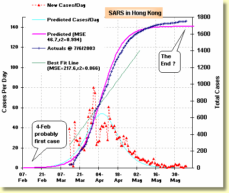
It's not exponential: it's logistic. Every biological process doesn't run in nature a-la the lily pads overtaking the pond. There are always natural brakes - and artificial ones- on future growth. It happened with SARS, and it'll happen here.

Sorry, dude, it's not even comparable. The premise that carbon dioxide can somehow trap huge amounts of heat in the atmosphere due to its wide fluorescent band in the infrared is fundamentally flawed, due to the principle of conservation of energy. And it already has been shown that carbon dioxide concentration increases with warmer temperatures. Finally, the more carbon dioxide there is, the more biomass the planet can support.
They adjust the data points as the wind blows low CO2 air from the nearby forests.
If climate change depends on us to alter our behavior enjoy the ride...this is all bs...everything is always tied back to climate change and tds..
Go to CDC.gov and search for “Climate change”. Then Transgender. Then Diversity. Look at the number of hits you get. Gain some understanding why the CDC and the national health establishment was so ill-prepared for a pandemic, which is a primary reason for them to exist. Those other things? Not so much in my mind. Pure SJW political pandering and electioneering using the public’s money.
You could plug almost anything in. It’s a political strategy that produces a media event to scare the sheeple.
The end except....It won’t take too many existing “light” cases (no symptoms-carriers) to start this growing again once we’re all out and about.
It looks to me like they have absolutely perfect linear increase in CO2 over a 60 year period. That could happen. But I would expect something with a few more dips and spikes (volcanic activity and whatnot). Also, the red squiggles I assume are specific data points that trace out the basic line of linear growth. The red squiggles that are just a hair above the line and just a hair below the line, year after year after year. That also seems a bit perfect and surprising.
Look at the graph in comment 11. Completely different data set, of course, but the little red marks for new cases go up and down fairly substantially. Taken as a whole, sure, they trace out a decent line. But you can see variability, which si what you would expect to see. But the Mauna Loa data on CO2 shows no variability at all. They are clearly adjusting their data. Because they have a story they want to tell. That's not science.
Global Warming?! Slowly I turn...step by step...inch by inch...exponentially...
STFU!!!!!!!!!!!!!!!!!!!!!!!!!!!!!!!!!!!!!!!!!!!!
Disclaimer: Opinions posted on Free Republic are those of the individual posters and do not necessarily represent the opinion of Free Republic or its management. All materials posted herein are protected by copyright law and the exemption for fair use of copyrighted works.