Posted on 09/07/2011 5:48:36 AM PDT by bigtoona
With the unveiling of a new convention logo, organizers of the 2012 Democratic National Convention officially kicked off the event Tuesday morning in uptown Charlotte just under one year before the convention that is expected to name President Barack Obama as the party’s nominee again, writes Derrick Rose.
More than 1,000 people gathered inside Time Warner Cable Arena in uptown Charlotte for the event. The area will also host main events during the week of Sept. 3, 2012.
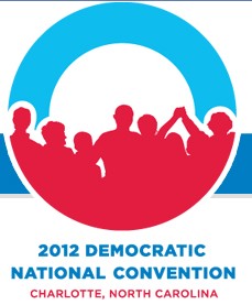
Along with the new logo, which is similar to the Barack Obama logo, but now features a group of people embracing one another, officials started the first part of pumping money into Charlotte’s economy by offering merchandise with the new DNC 2012 image.
Speaking at the event were Charlotte Mayor Anthony Foxx and DNC Chair Debbie Wasserman Schultz (D-FL). Both talked about several themes that will be seen throughout the convention.
Earlier Tuesday Wasserman Schultz talked about how the convention will be “the people’s convention” despite how big and spectacular the convention will be when it takes over the Queen City.
“I think people are so tired of special interest control of the political process, special interest access to the public policy, they want to make sure the average person, working class, middle class family want to make sure there isn’t that special interest filter between them and the people who are asking for their vote,” she said.
The convention is expected to attract to more than 35,000 delegates, media members and guests to North Carolina’s largest city, where it’s likely that Barack Obama will be named the party’s presidential nominee again.
http://saintpetersblog.com/wp-content/uploads/2011/09/dnc-logo.jpg
Event the RATS arent happy with it http://bluenc.com/new-obama-centric-dnc-logo-bothers-me
I think it’s very appropriate—a big zero with a bunch of reds in front of it.


....same old pig.
that is bland and lifeless.. fitting isnt it
What the hell are these freaks going to do when Obama is gone?
Every branding effort by them revolves around that stupid man.
It kind of looks like one of those corpuscles that is returning to the lungs for oxygen. Red = full of oxygen/ life; blue = used up.

logo: OH! THE HUMANITY.
Does this mean Pepsi will be re-doing their cans?
Let the PhotoShopping begin!
Remember the story about Humpty Dumpty and all his men?
It looks like a crowd of people waiting for the Stargate to open up so that they can go off-world.
Either that, or they are poised on the edge of the bowl, watching in dismay as their leader is circling the drain...
I agree. Dump the welfare queens, socialists/commies, race baiters, homos, tree and earth worm worshipers, weed eaters, union thugs, and we would all get along just fine. Normal people would be back in charge.
Now, if they weren't outright lying through their teeth about this, we'd have a deal.
Even after I stopped and looked better .... that first impression has stuck.
It attracts the lowest common denominator.
Looks like a Malignant Melanoma aggressively invading the surrounding healthy tissues. I don’t see what that could have to do with the Dems.
I believe Dr. Hoffa has disclosed the only effective cure.


Disclaimer: Opinions posted on Free Republic are those of the individual posters and do not necessarily represent the opinion of Free Republic or its management. All materials posted herein are protected by copyright law and the exemption for fair use of copyrighted works.