Posted on 08/19/2014 1:36:54 PM PDT by longtermmemmory
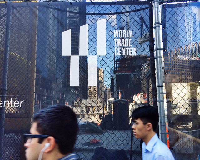
The World Trade Center Has A New, Very Confusing Logo
Cramming in a mind-melting series of visual allusions, the $3 million WTC logo is also an ad.
The World Trade Center has a new logo. Part of a $3.57 million branding endeavor, it's a riff on space and negative space, presence, and absence. It’s like a Rubin vase test, playing tricks on the eye and asking viewers to see what they want to see. Which would almost be poetic if not for the fact that it could also be read as an ad for a luxury shopping mall.
To be fair, Landor Associates, the firm that designed the logo, had the difficult task of branding something that's almost impossible to brand; there are too many conflicting ideas about what the World Trade Center site is, and should be. The logo reflects as much. As the New York Times reports, each of the five bars stands for the five towers in what will be the entire 16-acre World Trade Center complex when it’s complete. The slant of the top half of the logo is at a precise 17.76-degree angle, a hat tip to 1 World Trade Center’s 1,776-foot height
As for the Twin Towers, their shadows are visible in the logo if you look closely enough. The two empty columns in the top half refer to the Tribute in Light, a heartwrenching memorial to the fallen towers that got under way in 2002. Below them, the two white columns allude to the twin pools of the National September 11 Memorial.
The whole thing is also a W which stands for “World Trade Center” as well as the "Westfield World Trade Center," a luxury shopping center that opens next year. (To my eyes, it also bears an uncanny resemblance to the old Wired magazine W.)
According to the New York Times, the Port Authority of New York and New Jersey, the public agency that owns the World Trade Center site, awarded Landor a $3.57 million contract for the job last year.
The logo manages to squeeze in so many references, juggling a landmark, a Twin Tower tribute, and an ad in one, that it feels like it's pandering. But given the wildly competing interests that have informed the redevelopment of the site, this logo just might be the perfect embodiment of a space still in search of its identity.
Hey, thanks for pointing out negative space arrow. Good eye!


It looks like a man falling through the air with his arms raised and his legs akimbo.
Seems somewhat fitting that we remember those who plunged to their death because of Islam.
For just $3.57, my cat could have designed a better logo.

"W"
Meaning "world", not the lukewarm socialist.
The WTC memorial 'fountains' resemble a mirror image of the kabbah on the other side of the globe . . .flowing tears of mourning Americans sucked into the center of the black rock tomb.
That is very unfair to Hollywood to say nothing of San Francisco.
One could say that the five rectangles are the five pillars of Islam.
Face the other way and you are praying with hands and head on a prayer rug, butt in the air
I don’t like it. It’s eerie
We have piano keys!
Unreal. They do this stuff because just as always they side with enemies of the US. That’s one of the reasons I finally moved out of New York city and I grew up there, I just couldn’t take it anymore. I was there when those buildings fell, matter of fact I could have been in them. And what is the response of liberals? Honor those who did it. You ever notice the “Obama-Biden” ticket looks a little too much like the name “Obama Bin-Laden”? Did they do that subconsciously? Was it just a coincidence or was it done purposely as just one more middle finger dig at the US?
If we could go back in time and tell people in the street watching those buildings fall “Radical Muslims are responsible for this. In 2014 the US will have a radical Muslim as President, his senior advisor will be Iranian born, and he will have spent almost his entire term empowering and helping to spread radical Islam while destroying the US internally at the same time while Congress sits back and laughs. They will also build a memorial to the victims today but in a way that puts them down while honoring the killers. And just as a little extra dig they will put a gift shop in the memorial which is actually a graveyard.” People would never believe it.
Yeah but NYC is the Mecca of liberals. I tell people all the time, you want to see exactly what liberals want for the rest of the country? Move to NYC, I absolutely guarantee you 100% after a while you’ll feel like you’re living in North Korea except with food, but even food is now dictated to the masses. You can only eat what they allow you to eat. Every single aspect of your life is dictated and regulated.
Leni

Reminds me of this...
You ain't just a Shuyten!
That one works very nicely. Clearly delineated negative space works.
the WTC logo....mot so much
Disclaimer: Opinions posted on Free Republic are those of the individual posters and do not necessarily represent the opinion of Free Republic or its management. All materials posted herein are protected by copyright law and the exemption for fair use of copyrighted works.