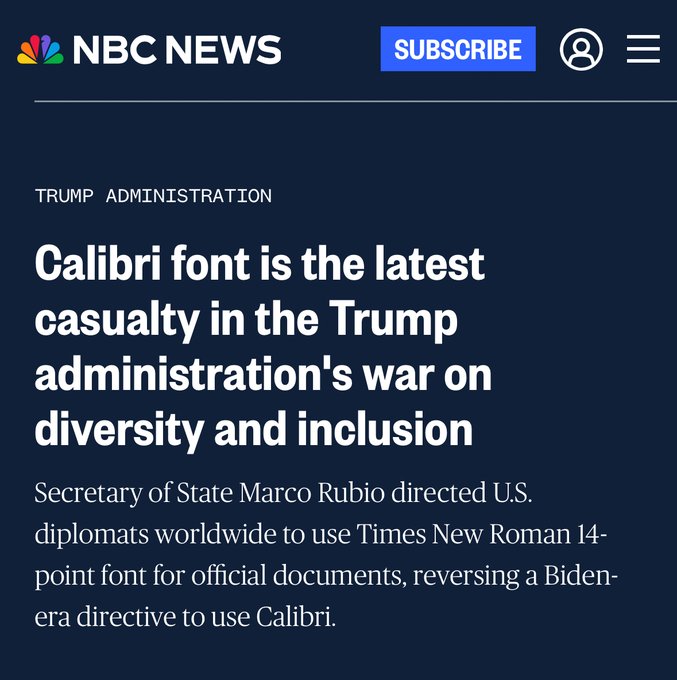
What’s wrong with caliber type? 14 font is going to use up a lot of paper.
Times New Roman is so pre-2007. It's a relic. It's also a serif font which is meant for printed documents, not for viewing on a computer screen.
Documents viewed on a screen should be in a sans serif font of which Calibri is a good one. Office 2007 came with Calibri as the default font.
Aptos has some advantages such as distinguishing a capital "eye" from a lower case "ell".
We need a new font that offers serif and sans serif versions, the ability to distinguish between capital "eye" and a lower case "ell", and slashes through zeros like Consolas font. A slash through the number seven would help as well.
Sounds good to me. TNR has always been my favorite font, and size 14 font is kinder to my old eyes.
On the other hand, I have hopes of never again reading any State Department document, for any reason.
The only font with eternal importance is Baptismal.

Now there is a real problem that needed to be fixed. Honestly I think that some in the Trump administration are just looking for ways to looks stupid and sabotage the effort.
The horror!
“”to roll back diversity and inclusion (DEI) initiatives””
Is this a joke? What does type/font have to do with DEI?
The State Department is such a mess I wonder how changing font solves any problem? Why hire someone whose mental energy deals with such issues, if the choice is someone capable of meaningful focus?
I fail to see why this is news.
https://en.wikipedia.org/wiki/Lucas_de_Groot
This swamp-dwelling dike-plugger designed Calibri.
Let me remind you, the Dutch killed all our beautiful elm trees.
Lucas talks like a fag and his s***s all retarded ...
It’s Times New Roman for unwoke, red-blooded, non-gay, all-American tree lovers who are not retarded!
Yay Marco, you go boy