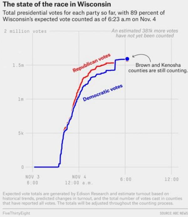
To: Pollard
I wish there was a chart or timeline like this of GA. I know Trump was up by 300,000 election night, then they counted in secret and he was down to 100,000 by morning. Now he leads by only 12,825
To: LilFarmer
These graphs are not related to the timeline. They show the distribution of the first digits of the reported counts. It turns out that for a random set of values, like election results, the distribution of digits tends to follow a fixed pattern.
When people fake data they put in digits that they think are random, but really aren't. So the pattern of digits is used in fraud investigations of all kinds.
To: LilFarmer
It would pretty much look like Milwaukee for Biden with one or two tall bars on the left.
19 posted on
11/05/2020 11:36:37 AM PST by
Pollard
(You can’t be for “defunding the police” and against “vigilantism” at the same time.)
To: LilFarmer
I personally think this chart presents the fraud in a manner more easily digestible - I'd like to see this chart for all States:

24 posted on
11/05/2020 11:43:22 AM PST by
DoodleBob
(Gravity's waiting period is about 9.8 m/s^2)
FreeRepublic.com is powered by software copyright 2000-2008 John Robinson

