Posted on 07/18/2016 5:14:15 PM PDT by PJ-Comix
Okay, yesterday I POSTED the graphic for a Trump-Pence logo developed by the wife of a friend of mine. The main criticism of it is that of the letters TP being together for obvious reasons. Also criticized was the fact that the red stripes in the P reminded folks of a prison uniform.
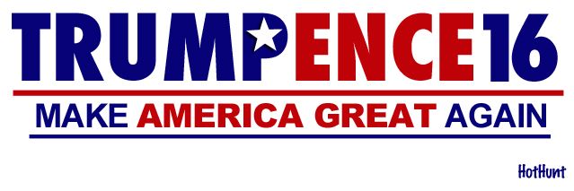
Okay, out of all that feedback came a logo posted by Freeper HotHunt and I think it could be a winner. IMHO it is definitely BETTER than the new Trump Pence logo which features a photo of the two of them. Um...I don't think a logo should feature a photo. It should be much simpler.
Anyway here is Freeper HotHunt's logo for which I will claim very slight credit since I suggested the final P in Trump serve as the beginning of Pence as well:
I like it, but reminds me of “tuppence a bag” from Mary Poppins.
Who’s the Ence guy? Did the governor of Indiana not work out?
Congratulations! I think you have a WINNER with the logo you designed. I hope the Trump-Pence campaign becomes aware of it because it is definitely BETTER than the official one they are now using.
Plural of Ent, of tree fame.
It does catch the eye nicely. Great job!
Perhaps the letter P could have angled red stripes over the blue background to indicate a shared letter?
The T, P and 16 should be slightly larger than the other letters.
I saw one similar that I liked slightly better, The capitol E in Pence was made to look like stripes in the American flag.
Good suggestion but I like it a lot.
It reminds me of that 90s band Sixpence None the Richer. One hit wonder. But that one hit was a monster song. Good times. Good times.
Hmmm... You might have a point there. Good idea.
What’s an ‘ence’??
Yes. I agree. P needs to be part of both names. M2C
Consider vertically slicing the “P” in half with blue/red on the two sides.
It’s ok.
Too generic. And it it nedds better visual hierarchy.
Gestalt principals are working against it as we humans tend to visually group things by similarities, and the red “ence”, “America Great” and the dividing red line are causing visual confusion because you are looking to the connection between them.
This would make a nice quick print sign if you need to get 10 thousand of them out to an area and dont want to spend a ton, though.
Maybe just tweak the color a little.
You could avoid the “Ence” issue if you had the blue blend into the red in the middle of the letter ‘P’.
Much better than TP
I like it with a few modifications as mentioned by others here.
>>Consider vertically slicing the “P” in half with blue/red on the two sides<<
Exactly. I was thinking an angled slice, but I’d like to see it both ways.
Also, as a previous poster mentioned, it should be in “small caps” as in Cap T, Cap P, and a 16 equal to those.
Disclaimer: Opinions posted on Free Republic are those of the individual posters and do not necessarily represent the opinion of Free Republic or its management. All materials posted herein are protected by copyright law and the exemption for fair use of copyrighted works.