
Posted on 06/08/2014 11:10:01 AM PDT by Ernest_at_the_Beach
NOTE: significant updates have been made, see below.
After years of waiting, NOAA has finally made a monthly dataset on the U.S. Climate Reference Network available in a user friendly way via their recent web page upgrades. This data is from state-of-the-art ultra-reliable triple redundant weather stations placed on pristine environments. As a result, these temperature data need none of the adjustments that plague the older surface temperature networks, such as USHCN and GHCN, which have been heavily adjusted to attempt corrections for a wide variety of biases. Using NOAA’s own USCRN data, which eliminates all of the squabbles over the accuracy of and the adjustment of temperature data, we can get a clear plot of pristine surface data. It could be argued that a decade is too short and that the data is way too volatile for a reasonable trend analysis, but let’s see if the new state-of-the-art USCRN data shows warming.
A series of graphs from NOAA follow, plotting Average, Maximum, and Minimum surface temperature follow, along with trend analysis and original source data to allow interested parties to replicate it.
First, some background on this new temperature monitoring network, from the network home page:
The U.S. Climate Reference Network (USCRN)consists of 114 stations developed, deployed, managed, and maintained by the National Oceanic and Atmospheric Administration (NOAA) in the continental United States for the express purpose of detecting the national signal of climate change. The vision of the USCRN program is to maintain a sustainable high-quality climate observation network that 50 years from now can with the highest degree of confidence answer the question: How has the climate of the nation changed over the past 50 years? These stations were designed with climate science in mind.
Source: http://www.ncdc.noaa.gov/crn/
As you can see from the map below, the USCRN is well distributed, with good spatial resolution, providing an excellent representivity of the CONUS, Alaska, and Hawaii.

From the Site Description page of the USCRN:
==========================================================
Every USCRN observing site is equipped with a standard set of sensors, a data logger and a satellite communications transmitter, and at least one weighing rain gauge encircled by a wind shield. Off-the-shelf commercial equipment and sensors are selected based on performance, durability, and cost.
Highly accurate measurements and reliable reporting are critical. Deployment includes calibrating the installed sensors and maintenance will include routine replacement of aging sensors. The performance of the network is monitored on a daily basis and problems are addressed as quickly as possible, usually within days.
…
Many criteria are considered when selecting a location and establishing a USCRN site:
- Regional and spatial representation: Major nodes of regional climate variability are captured while taking into account large-scale regional topographic factors.
- Sensitivity to the measurement of climate variability and trends: Locations should be representative of the climate of the region, and not heavily influenced by unique local topographic features and mesoscale or microscale factors.
- Long term site stability: Consideration is given to whether the area surrounding the site is likely to experience major change within 50 to 100 years. The risk of man made encroachments over time and the chance the site will close due to the sale of the land or other factors are evaluated. Federal, state, and local government land and granted or deeded land with use restrictions (such as that found at colleges) often provide a high stability factor. Population growth patterns are also considered.
- Naturally occurring risks and variability:
- Flood plains and locations in the vicinity of orographically induced winds like the Santa Ana and the Chinook are avoided.
- Locations with above average tornado frequency or having persistent periods of extreme snow depths are avoided.
- Enclosed locations that may trap air and create unusually high incidents of fog or cold air drainage are avoided.
- Complex meteorological zones, such as those adjacent to an ocean or to other large bodies of water are avoided.
- Proximity:
- Locations near existing or former observing sites with long records of daily precipitation and maximum and minimum temperature are desirable.
- Locations near similar observing systems operated and maintained by personnel with an understanding of the purpose of climate observing systems are desirable.
- Endangered species habitats and sensitive historical locations are avoided.
- A nearby source of power is required. AC power is desirable, but, in some cases, solar panels may be an alternative.
- Access: Relatively easy year round access by vehicle for installation and periodic maintenance is desirable.
Source: http://www.ncdc.noaa.gov/crn/sitedescription.html
==========================================================
As you can see, every issue and contingency has been thought out and dealt with. Essentially, the U.S. Climate Reference Network is the best climate monitoring network in the world, and without peer. Besides being in pristine environments away from man-made influences such as urbanization and resultant UHI issues, it is also routinely calibrated and maintained, something that cannot be said for the U.S. Historical Climate Network (USHCN), which is a mishmash of varying equipment (alcohol thermometers in wooden boxes, electronic thermometers on posts, airport ASOS stations placed for aviation), compromised locations, and a near complete lack of regular thermometer testing and calibration.
Having established its equipment homogenity, state of the art triple redundant instrumentation, lack of environmental bias, long term accuracy, calibration, and lack of need for any adjustments, let us examine the data produced for the last decade by the U.S. Climate Reference Network.
First, from NOAA’s own plotter at the National Climatic Data Center in Asheville, NC, this plot they make available to the public showing average temperature for the Contiguous United States by month:

Source: NCDC National Temperature Index time series plotter
To eliminate any claims of “cherry picking” the time period, I selected the range to be from 2004 through 2014, and as you can see, no data exists prior to January 2005. NOAA/NCDC does not make any data from the USCRN available prior to 2005, because there were not enough stations in place yet to be representative of the Contiguous United States. What you see is the USCRN data record in its entirety, with no adjustments, no start and end date selections, and no truncation. The only thing that has been done to the monthly average data is gridding the USCRN stations, so that the plot is representative of the Contiguous United States.
Helpfully, the data for that plot is also made available on the same web page. Here is a comma separated value (CSV) Excel workbook file for that plot above from NOAA:
USCRN_Avg_Temp_time-series (Excel Data File)
Because NOAA/NCDC offers no trend line generation in their user interface, from that NOAA provided data file, I have plotted the data, and provided a linear trend line using a least-squares curve fitting procedure which is a function in the DPlot program that I use.
Not only is there a pause in the posited temperature rise from man-made global warming, but a clearly evident slight cooling trend in the U.S. Average Temperature over nearly the last decade:

We’ve had a couple of heat waves and we’ve had some cool spells too. In other words, weather.
The NCDC National Temperature Index time series plotter also makes maximum and minimum temperature data plots available. I have downloaded their plots and data, supplemented with my own plots to show the trend line. Read on.
NOAA/NCDC plot of maximum temperature:
 Source of the plot here.
Data from the plot: USCRN_Max_Temp_time-series (Excel Data File)*
My plot with trend line:

As seen by the trend line, there is a slight cooling in maximum temperatures in the Contiguous United States, suggesting that heat wave events (seen in 2006 and 2012) were isolated weather incidents, and not part of the near decadal trend.
NOAA/NCDC plot of minimum temperature:

Source of the plot here.
USCRN_Min_Temp_time-series (Excel Data File)*
The cold winter of 2013 and 2014 is clearly evident in the plot above, with Feb 2013 being -3.04°F nationally.
My plot with trend line:

The trend line illustrates a cooling trend in the minimum temperatures across the Contiguous United States for nearly a decade. There is some endpoint sensitivity in the plots going on, which is to be expected and can’t be helped, but the fact that all three temperature sets, average, max, and min show a cooling trend is notable.
It is clear there has been no rise in U.S. surface air temperature in the past decade. In fact, a slight cooling is demonstrated, though given the short time frame for the dataset, about all we can do is note it, and watch it to see if it persists.
Likewise, there does not seem to have been any statistically significant warming in the contiguous U.S. since start of the new USCRN data, using the average, maximum or minimum temperature data.
I asked three people who are well versed in data plotting and analysis to review this post before I published it, one, Willis Eschenbach, added his own graph as part of the review feedback, a trend analysis with error bars, shown below.

While we can’t say there has been a statistically significant cooling trend, even though the slope of the trend is downward, we also can’t say there’s been a statistically significant warming trend either.
What we can say, is that this is just one more dataset that indicates a pause in the posited rise of temperature in the Contiguous United States for nearly a decade, as measured by the best surface temperature monitoring network in the world. It is unfortunate that we don’t have similar systems distributed worldwide.
UPDATE:
Something has been puzzling me and I don’t have a good answer for the reason behind it, yet.
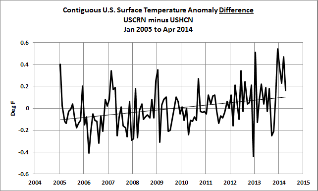
As Zeke pointed out in comments and also over at Lucia’s, USCRN and USHCN data align nearly perfectly, as seen in this graph. That seems almost too perfect to me. Networks with such huge differences in inhomogeneity, equipment, siting, station continuity, etc. rarely match that well.
![Screen-Shot-2014-06-05-at-1.25.23-PM[1]](https://wattsupwiththat.files.wordpress.com/2014/06/screen-shot-2014-06-05-at-1-25-23-pm1.png)
Note that there is an important disclosure missing from that NOAA graph, read on.
Dr Roy Spencer shows in this post the difference from USHCN to USCRN:
Spurious Warmth in NOAA’s USHCN from Comparison to USCRN
The results for all seasons combined shows that the USHCN stations are definitely warmer than their “platinum standard” counterparts: Spencer doesn’t get a match between USHCN and USCRN, so why does the NOAA/NCDC plotter page?
And our research indicates that USHCN as a whole runs warmer that the most pristine stations within it.
In research with our surfacestations metadata, we find that there is quite a separation between the most pristine stations (Class 1/2) and the NOAA final adjusted data for USHCN. This is examining 30 year data from 1979 to 2008 and also 1979 to present. We can’t really go back further because metadata on siting is almost non-existent. Of course, it all exists in the B44 forms and site drawings held in the vaults of NCDC but is not in electronic form, and getting access is about as easy as getting access to the sealed Vatican archives.
By all indications of what we know about siting, the Class 1/2 USHCN stations should be very close, trend wise, to USCRN stations, yet the ENTIRE USHCN dataset, including the hundreds of really bad stations, with poor siting and trends that don’t come close to the most pristine Class 1/2 stations are said to be matching USCRN. But from our own examination of all USHCN data and nearly all stations for siting, we know that is not true.
So, I suppose I should put out a caveat here. I wrote this above:
“What you see is the USCRN data record in its entirety, with no adjustments, no start and end date selections, and no truncation. The only thing that has been done to the monthly average data is gridding the USCRN stations, so that the plot is representative of the Contiguous United States.”
I don’t know that for a fact to be totally true, as I’m going on what has been said about the intents of NCDC in the way they treat and display the USCRN data. They have no code or methodology reference on their plotter web page, so I can’t say with 100% certainty that the output of that web page plotter is 100% adjustment free. The code is hidden in a web engine black box, and all we know are the requesting parameters. We also don’t know what their gridding process is. All I know is the stated intent that there will be no adjustments like we see in USHCN.
And some important information is missing that should be plainly listed. NCDC is doing an anomaly calculation on USCRN data, but as we know, there is only 9 years and 4 months of data. So, what period are they using for their baseline data to calculate the anomaly? Unlike other NOAA graphs like this one below, they don’t show the baseline period or baseline temperature on the graph Zeke plotted above.
This one is the entire COOP network, with all its warts, has the baseline info, and it shows a cooling trend as well, albeit greater than USCRN:

Source: http://www.ncdc.noaa.gov/cag/time-series/us
Every climate dataset out there that does anomaly calculations shows the baseline information, because without it, you really don’t know what your are looking at. I find it odd that in the graph Zeke got from NOAA, they don’t list this basic information, yet in another part of their website, shown above, they do.
Are they using the baseline from another dataset, such as USHCN, or the entire COOP network to calculate an anomaly for USCRN? It seems to me that would be a no-no if in fact they are doing that. For example, I’m pretty sure I’d get flamed here if I used the GISS baseline to show anomalies for USCRN.
So until we get a full disclosure as to what NCDC is actually doing, and we can see the process from start to finish, I can’t say with 100% certainty that their anomaly output is without any adjustments, all I can say with certainty is that I know that is their intent.
Given that there are some sloppy things on this new NCDC plotter page, like the misspelling of the word Contiguous. They spell it Continguous, in the plotted output graph title and in the actual data file they produce: USCRN_Avg_Temp_time-series (Excel Data file). Then there’s the missing baseline information on the anomaly calc, and the missing outputs of data files for the max and min temperature data sets (I had to manually extract them from the HTML as noted by asterisk above).
All of this makes me wonder if the NCDC plotter output is really true, and if in the process of doing gridding, and anomaly calcs, if the USCRN data is truly adjustment free. I read in the USCRN documentation that one of the goals was to use that data to “dial in” the adjustments for USHCN, at least that is how I interpret this:
The USCRN’s primary goal is to provide future long-term homogeneous temperature and precipitation observations that can be coupled to long-term historical observations for the detection and attribution of present and future climate change. Data from the USCRN is used in operational climate monitoring activities and for placing current climate anomalies into an historical perspective. http://www.ncdc.noaa.gov/crn/programoverview.html
So if that is true, and USCRN is being used to “dial in” the messy USHCN adjustments for the final data set, it would explain why USCHN and USCRN match so near perfectly for those 9+ years. I don’t believe it is a simple coincidence that two entirely dissimilar networks, one perfect, the other a heterogeneous train wreck requiring multiple adjustments would match perfectly, unless there was an effort to use the pristine USCRN to “calibrate” the messy USHCN.
Given what we’ve learned from Climategate, I’ll borrow words from Reagan and say: Trust, but verify
That’s not some conspiracy theory thinking like we see from “Steve Goddard”, but a simple need for the right to know, replicate and verify, otherwise known as science. Given his stated viewpoint about such things, I’m sure Mosher will back me up on getting full disclosure of method, code, and output engine for the USCRN anomaly data for the CONUS so that we can do that,and to also determine if USHCN adjustments are being “dialed in” to fit USCRN data.
# # #
UPDATE 2 (Second-party update okayed by Anthony): I believe the magnitude of the variations and their correlation (0.995) are hiding the differences. They can be seen by subtracting the USHCN data from the USCRN data:
Cheers
Bob Tisdale
The pause continues – Still no global warming for 17 years 9 months
By Christopher Monckton of Brenchley
http://wattsupwiththat.com/2014/06/04/the-pause-continues-still-no-global-warming-for-17-years-9-months/
E-A-T-B
Good stuff! Thanks for finding/posting it.
Bogie
I don’t need”Charts”!Just look at my “Heating-Oil”bills for the past ten-years!!!A lot more Oil;A Lot More Money!!!!!!!!!!
It could be argued that a decade is too short and that the data is way too volatile for a reasonable trend analysis, but let’s see if the new state-of-the-art USCRN data shows warming.
That's funny. Global Warmists can extrapolate a trend from two points, or one if really necessary.
Many criteria are considered when selecting a location and establishing a USCRN site:...
When looking at those criteria, it seems like they were created by people actually interested in the science rather than political hacks torturing the data until it confesses the desired results.
This doesn't sound right to me: "How"?
1) I think "they" have already decided "how" (man-made, of course!).
2) It looks like their equipment can only detect if there is any so-called "climate change", not how.
Any detectable temperature rise will be heralded by them and the "news" media as proof that Man is causing global warming. Any drop will be ignored as a "statistical anomaly".
Pre-loaded to provide them the answer they want.
Those stateion locations and equipment seems pretty solid.
Weather Bell aka Joe Bastardi was on fire yesterday about the climate change pervayers.
There are tourism interests in some of those “pristine environments” with lower than real temperatures reported.
A potent El Niño is supposed to be starting up and the forecast is for hotter temps ending the pause. We’ll see I guess.
Bookmark for reference.
Give them any 3 points on the globe and they can also define a plane and tell you the world is therefore flat.
As I understand temperature measurements, all instrument calibrations should be traceable to what used to be the National Bureau of Standards. All surface temperature measuring devices should be compared to a device that was calibrated by the NBS or a certified standard thermometer. Can anyone help me out on thisL
“... rather than political hacks torturing the data until it confesses the desired results.”
LOL - great analogy - use “waterboarding “ instead of “torturing” when saying that to a warmist and you’ll have him in apoplexy.
I agree that the planet is cooling, but we have no idea of the rate of cooling. Suspect it is much greater then potrayed by the atmospheric temperature trend. Until we know exactly what the entire ocean mass is doing to two decimal points, we are just pissing into the wind.
ping-a-ding-ding
Quite True !! Bastardi shows how they lie with their statistics, and skew the numbers to tell what they want !
They don't tell the truth !!
<< http://www.weatherbell.com/saturday-summary-june-7-2014 >>
Like our _resident , ... they lie !!
Liberal Garbage in, Liberal Garbage out. All that was being measured was urban sprawl and the shutdown of rural weather sites.
Disclaimer: Opinions posted on Free Republic are those of the individual posters and do not necessarily represent the opinion of Free Republic or its management. All materials posted herein are protected by copyright law and the exemption for fair use of copyrighted works.