![]()
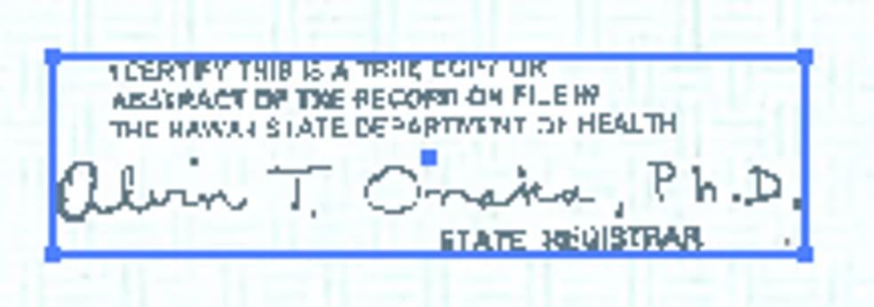
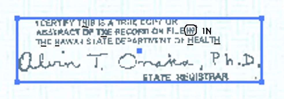
what would change an H to an X
Posted on 05/02/2011 5:57:08 PM PDT by Hillary'sMoralVoid
Barack Obama, meet Dan Rather........
It's amazing how Democrats never learn! They hire computer geeks to forge 1960s-era documents who have no clue how a manual typewriter works!
Remember the infamous "superscript" in the letter that Dan Rather used in his attempt to bring George W. Bush down? The letter was damning indeed, unfortuately, it could not have been prepared on its publication date, because superscript capability simply did not exist in that era, with the exception of an expensive IBM Selectric model, that Bush's unit never possessed.
Fast forwarding to 2011, President Obama presents what is purported to be a copy of his "original" birth certificate. The "kerning" of letters in the Obama documents is precisely analogous to the "superscript" on the Rather forgery.
Kerning is a computer process that allows certain letter combinations to "invade" each other's space for the purpose of readability and economy of space. This could not be done on a manual typewriter, because a manual typewriter cannot anticipate what the next letter might be. This process appears in Obama's "original" birth certificate, both in the PDF version and in the AP copy.
Karl Denninger's excellent post listed in the source URL above shows this persuasively. Add this to the list of multiple document layers and pixel differences in handwritten entries, not to mention the rather odd "African" race assigned to Obama Sr, and you have evidence of a forgery.
Either Hawaiian officials time-traveled to the 1980s or beyond and back to prepare this document, or our Commander in Chief has perpetrated a forgery of a official document, a felony in most states.
This is in no way an original document. The more you look, the less you really know....
Wag The Camel.
Did you watch the video? It isn’t the scanning that does it, it is the PDF generation. Blame Adobe...
So, to cut to the chase, does the document Obama released exhibit kerning?
If the answer is yes, was that possible on a typewriter in 1961?
Proportional spacing was COMMON in this period.
Absolutely uniformity in a document like this that was passed around to different people during its creation would suggest fraud. Finding differences of all sorts tends to suggest it's authentic.
....Absolutely uniformity in a document like this that was passed around to different people during its creation would suggest fraud. Finding differences of all sorts tends to suggest it’s authentic......
so how many different people handled the document and what did they do each time the handled it? what is the procedure from start to finish?
Hmmm...I don’t think I asked any of those questions.
What I asked is whether there is kerning exhibited in some of the typewriting.
It sure looks to me like there are letters that intrude into adjoining letters. Aren’t there? Isn’t that what kerning is?
I’ll watch it. Illustrator/Adobe is not my area of expertise, I do most of my work in Corel. However, regardless of what bitmap software you use, the inherent characteristics of bitmap graphics are the same. And this thing has been really monkeyed with.
But, there’s a bunch more here than just separated objects that smells pretty bad.
There’s another simple but significant flaw. Why would anyone do such a low resolution scan of a *real* document that was going to get such scrutiny? To save a meg or two of disk space while ending up with a scan that looks like crap? Not a chance. If this was real & they really wanted us to know that, this would have been scanned at a much higher resolution and not had lossy compression. You can embed bitmaps in PDF documents using lossless compression. This is a low resolution scan with significant compression causing noticeable jpg loss of clarity.
I am 10 years order and I can do a 300 dpi scan of my BC into Corel photopaint, do a quick little tonal adjustment to crisp it up, then publish a PDF that looks many times better than this garbage. And I don’t need Adobe to optimize it. Especially if “optimization” turns a good scan into junk like this.
I stand by my original assertion. This is deliberately done bad to make certain we will call it a fake. I don’t know why, but the how is pretty damn easy.
![]()
what would change an H to an X
Obvious kerning in the Obama BC:
http://www.youtube.com/watch?v=85yVkL94_BU
Can you explain to me why this is or isn’t a problem?
I just want the truth of the matter, as closely as it can be discerned.
ping for later viewing
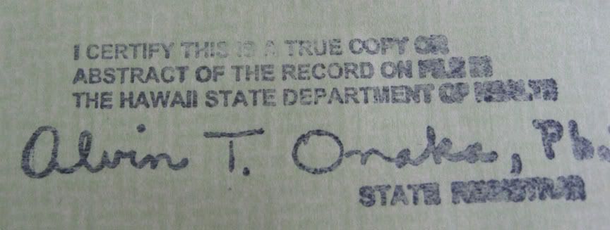
Like I mentioned in another thread, that stamp is a plea for help from Onaka. LOL
It’s a SOS distress mark indicating he and his family have been threatened.
I would really like an explanation of this anomaly that makes sense. It is not a machine stamp. It is a hand stamp. You can see that something has been whited out and the X is deliberate. But by whom...and why? To me, this is truly evidence of a forgery.
It is not an artifact of scanning, compressing, or anything else. Adobe didn’t do it. OCR didn’t do it. The stamp would not have been applied until AFTER the document had been rendered. If it was scanned afterward, it would still have been an H. No matter HOW you view it, it remains an X, even when other letters are skewed...as shown in the last image I posted. All the other Hs are in tact.
I still have not seen a real explanation of what would cause this...unless it was deliberate. THEN the question is WHY?
bttt
Me too. I agree that higher resolution and no compression for objects of value are your friend.
Good point!
I say: Was not.
At least one of my dogs is smarter than your dog. ;-)
Disclaimer: Opinions posted on Free Republic are those of the individual posters and do not necessarily represent the opinion of Free Republic or its management. All materials posted herein are protected by copyright law and the exemption for fair use of copyrighted works.