
Posted on 10/23/2005 8:32:47 AM PDT by Republicanprofessor
Blue Moon: a review by John Haber in New York City
Oscar Bluemner: A Passion for Color (Oscar Bluemner's Retrospective at the Whitney Museum of Art through Feb. 12, 2006)
Have I ever stepped off a museum elevator into such a blaze of color? Have I ever had my idea of an artist so thoroughly and instantly overthrown?
I doubt it, but in 1915 Oscar Bluemner had quite a year. He found a great dealer, and he had his first show with Alfred Stieglitz just when war had made New York City the temporary capital of modern art. He found his true medium, in painting, just when American painters were embracing Modernism. He found his subject matter, in the new factory towns of northern New Jersey and in the light that animated them at dusk and dawn. Most of all, the Prussian-born artist found himself and a still-new European art where one might least expect it—in his late forties and in America.
Defenders of the canon and attackers alike may find something seriously amiss. The show returns to a moment in American painting could almost exemplify a false start. Besides, amid today's vital openness to gender and cultural critique, what can one say about yet another dead white male? And I do not mean outsider art either, but rather the product of European training. In fact, however, every one of those ongoing debates makes the show more pertinent.
The Whitney's retrospective offers an unforgettable look at a little-known painter. Yet "A Passion for Color" also tracks an artist's desperate cycle of success and failure. With that, too, comes insight into the collision between Modernism and America.

No success like failure
Bluemner makes an unlikely candidate for rediscovery. He appeared in the legendary Armory Show of 1913 and in the Whitney's very first biennial, in 1932. At 291, named for the address of Stieglitz's Fifth Avenue brownstone, he joined a stable of artists as respected today as Arthur Dove and Georgia O'Keefe. His fluid shapes certainly recall them both, as do his many images of the sun and moon. However, his reputation, if not his color, pales beside theirs. Survey texts pass him by, and many works on display come from small museums or from private collections.
Why? Bluemner really did fail, again and again. Not a single work sold from that first exhibition. One could blame America's wartime anger at Germany, although Marsden Hartley, for one, positively doted on German uniforms—and the young men who wore them. Besides, Bluemner's biggest show twenty years later led to exactly one sale. He died in 1938, penniless and ill, a suicide.
Bluemner had a knack for failure. In his first career, as an architect, he submitted a plan for the Bronx County Courthouse on spec. After a Tammany Hall character claimed credit, he spent years fighting for credit and compensation, and the battle left him so disgusted that he switched to painting. His life as a painter repeats much the same pattern—of idealism, trust, heightened self-worth, disillusionment, and withdrawal. He set prices high. He had to switch dealers more than once.

He stood out in other discomforting ways as well. He retrained himself as a painter by studying modern art on a trip to Europe and by drawing after Renaissance paintings. At 291, the older man must have seemed a remnant of the past, just when O'Keefe and others were turning to unspoiled landscapes for a distinctively American art. Conversely, his first show demanded attention for a wholly new American scene, the factories that enclosed and separated human lives. Marcel Duchamp had already shocked New York by representing love as submission to a machine. The majesty, clarity, and despair of Charles Demuth's River Rouge Plan or Charles Sheeler's My Egypt, however, lay years away—not to mention Robert Smithson and his "tour of the monuments of Passaic."
It may well take a full-scale retrospective to pack a punch even now. The curator, Barbara Haskell, does a real service, first in removing an entrance wall and then grouping works much as in their original exhibitions. One needs the sheer volume of work coming off the elevators to give his color the cumulative impact it deserves. One needs a chance to get close and then to step back while keeping a painting in focus, more than a work stranded in a museum collection easily allows. One needs that first room, too, to see the luminosity in his late, gloomier work. I thought that I knew Bluemner from a night scene at the Whitney, and I was wrong.
All told, one needs Bluemner's career in retrospective to appreciate what went right and what went wrong. In 1915 critics expressed puzzlement at European-inspired art and horror at scenes they thought suitable only for automatons. In a sense, they found him both too old and too new. From that first room, one can see the roots of American Modernism and where it had still to lead. One can see an artist who needed America to make sense of the lessons he had learned abroad.
Strains of modernity
One may as well start in that first room. As part of his reinvention, Bluemner trashed his earlier paintings, reusing the canvas.
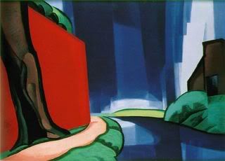
One can see how he created that depth of color, but also why one might have overlooked it before, just as the reproduction standing alone here looks so unimpressive. Dark strips at the edge of buildings and trees may suggest an almost monochrome architecture up close, but they avoid black and progressively intensify neighboring shades. Off-white strips in the sky may look plain, too, but from a distance they radiate outward. They fill an entire composition with light, as if Bluemner had radiated the darker masses from behind. The catalog suggests the influence of European cathedrals, of stained glass illuminating massive walls and pillars. Then, too, both Henri Matisse and Pablo Picasso could outline trees almost like tracery on glass.
If the color derives from one strain of Modernism, from Vincent van Gogh through Matisse, these early landscapes have the highly centered structure of art from Camille Pissarro through Cubism. Bluemner cares so much for painterly architecture that he begins with compositional studies in black and white. Often the buildings lie to either side, with a river or road in between defining the passage into depth. A choice of water rather than land—or a sharp dip in the road—emphasizes the surface structure: passage is for the eye alone. Trees arching over the center flatten things further.
As for people, forget it. However, Bluemner wants the scenes filled with life. One can consider the buildings as the actors, and studies include portrait-like close-ups of smokestacks. I tend to remember the buildings as hulking and windowless, but they also reach for the sky and bend to the ground, and so do the trees. One can compare this inhuman drama to the urbanism of Sheeler and Demuth, but one can also think of it as kind of animism. In years to come, Bluemner grew so attached to associations of his name with flowering that he gave himself a pretentious Latin middle name, Florianus, and signed his paintings with it.
The color and the drama have made others think of German Expressionism. I find the reds, yellows, greens, and blues too normative for that, however acrid. I also find the drama far indeed from Expressionism's revulsion at sensuality, including its own. Bluemner remains more concerned for reason, Classicism, and Paul Cézanne. He also seeks a renewal of life in his symbolic drama. Perhaps the flowing trees and spiritual hopes come closer to a different kind of Expressionism—in work of roughly the same years by Wassily Kandinsky.
Besides, he did start as an architect, so buildings should have a personality for him. At one point, he designed private homes, each tailored to the client. As an architect, he still had much to outgrow, with little sign of his future rebirth as a painter. The Bronx courthouse has the dead hand of tradition, with heavy columns and fussy decoration. However, his architectural studies, in the retrospective's second room, have some of the precision and clarity that he brings to landscape. And in one, at the end of a long, central passageway, the morning sun breaks the horizon.

Color him American
A decade after his 291 show, that glowing sphere becomes his obsession. Already in 1915, the paintings reflect a serious personal struggle. They look to European art and find the American scene. They look to buildings as to a stand-in for the artist's creative being and find something frightening indeed. They look to real-life communities and find an escape into a private world. After the death of his wife in 1926, he turns up the symbolic intensity that much further.
He may have felt ambivalence toward those stark New Jersey towns, but he and his wife moved to one in 1916. The savings did little to resolve his finances, and her death intensified his need to find spiritual comforts in an animated landscape. He makes smaller pictures, with large, sometimes concentric circles for the sun or moon, and one has a hard time knowing which. He grows more focused than ever, too, on making the painted object glow. He experiments with mixed media, including formaldehyde. He refers to his watercolors as paintings, and he insists that they will last as well as oils.

The Whitney hangs the suns and moons beautifully, in a small, dimly lighted room, with the walls painted a soft, dark color. Ceiling spotlights train directly on the work. They afford Bluemner's art its own light, seemingly from behind or within.
Paintings like these loosen landscape from its moorings. In the 1930s, Bluemner returns to buildings, rivers, and trees, but the mooring is gone for good. The cathedral towns have given way to graveyards. For two more rooms, buildings grow brighter, more dominant, less vertical, and more ghostly. The scene settles permanently into night and winter, as in The Last Evening of the Year. His self-portrait has the arrogance and harsh shadows of early Lucian Freud, but it has the name and date written backward, as if he must count on himself alone as a perceiver.
I can appreciate the continuing experiment with color and light, but I cannot imagine those last rooms without the show's opening to guide me. One could call that the retrospective's triumph and the painter's tragedy. One can also call it a clue to a premature moment of stardom for New York art. I said that Bluemner struck others as both too old and too new. He sought a thorough grounding in Modernism and urban realism, when American eyes still looked within. He trained a cosmopolitan eye on nature itself, when even the most progressive art looked to America's shores for national and personal self-awareness.
Bluemner left Germany in 1892, at almost the same time as my great-grandfather. By World War II, another wave of immigrants and the children of immigrants—including Arshile Gorky, Willem de Kooning, Mark Rothko, Lee Krasner, and Janet Sobel—was helping to remake American art. Unlike Bluemner's critics, they looked outward, taking Modernism, the urban scene, symbolic representations of the mind, and America's place in the world for granted. Unlike Bluemner, they did not have to repeat any of these so literally or humorlessly. Once again, his talent places him on the edge of the action. Yet a retrospective shows how much color and feeling one can miss by not looking toward the edge.
Excellent post. Thanks!
Art ping.
Let Sam Cree or me know if you want on or off this list.
The room with these small watercolors of suns and moons was amazing. They were lit so that they looked like stained glass lit from behind. He did these as he was recovering from the grief of his wife's death.
I used to know only a minimal amount about Bluemner. He is really a fascinating person and I highly recommend this show. (I also recommend as highly the brand new show of Elizabeth Murray's work at the Museum of Modern Art. Her use of color is amazing too. I will write about it soon for FR.)
Art Education/Appreciation ping.
Let me know if you want on or off this list.
bump!
You are fast! I hadn't even finished posting my own comments and pings yet.
If you think the article is good, the show is even better. The color is amazing.
Leni
She notes much that is also in the catalogue for the show, which I did buy. I've been thinking of copying more images from that for FR posting, but I don't know about copyright infringement and would rather play it safe by using other images that have already been posted.
> You are fast! I hadn't even finished posting my own comments...
LOL. I'd only skimmed the article and was off to the the NGA to look for a disturbing, colorless painting of a New Jersey factory (forgot the artist & couldn't find it, drat!) that is the exact opposite of Bluemner's work.
His use of color makes me want to paint!
Tell me more about the NGA and the work you saw there.
The rest just do nothing for me. I stand and go "?????"
> more about the NGA and the work you saw there.
It's a factory in possibly Newark, NJ painted in drab colors that make it look moldy and creepy. None of Bluemner's vitality. I ran across it a few months ago looking for something to post to a thread about American Gothic. I think I ended up not posting it because the artist wasn't American. Went back to that thread anyway to see if I could jar my memory. Went and poked around at the NGA site. No luck. I'll ping you if I find it.
Yes, I thought the watercolors were the best. I think it is because the colors blended and were more subtle in those, plus the special lighting in the show made them glow like stained glass.
The other paintings are very architectonic. Each brushstroke is like a building block. They are strong, not subtle. But the best ones are not the ones reproduced here. There are stronger works and they do work.
Thanks for the ping. Interesting art and article.
Disclaimer: Opinions posted on Free Republic are those of the individual posters and do not necessarily represent the opinion of Free Republic or its management. All materials posted herein are protected by copyright law and the exemption for fair use of copyrighted works.