
Posted on 06/09/2005 3:44:59 PM PDT by Republicanprofessor
There have been some great threads on art lately, and at the (great) risk of overdoing it….I want to continue with this little series on Art Appreciation (or, as some have termed it, Education). Many FReepers just love realism. (If you want to see some recent threads on this, do a search under vannrox as a poster, and you’ll see some lovely images by late 19th century realists.)
But what I want to deal with is the beginning of abstraction. Even Monet and the other impressionists are somewhat abstract. Anything that moves away from a strict recreation of reality, to emphasize what the artist is more interested in, is abstract. Monet’s work is early abstraction because it is full of loose brushwork that is not strictly realistic, although he is working from a visual reality and inspiration.
Cezanne once said of Monet “He is just an eye, but what an eye!” Can you tell the season and the weather from Monet’s work? How detailed is his use of line, or does the creation of light seem more important?
Now, van Gogh and Cezanne were both inspired, to a degree, by what Monet had done, but like the other Post-Impressionists discussed about a week ago, van Gogh and Cezanne have firmer forms than Monet. They did also worked in different styles to emphasize their own interests. Thus we have the beginning of abstraction (which is pushed further in the beginning of the 20th century into the work of the Expressionists, like Matisse, who develop van Gogh’s sense of shape and color; and in the work of the Cubists, who develop the planes of Cezanne.)
So, what differences do you see between these works by van Gogh and Cezanne?

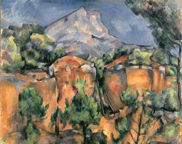
van Gogh Starry Night and Cezanne Mt. Ste. Victoire from Bibemus Quarry both from the 1880s
Is there a different use of color, brushwork, emotion? Does one seem more emotional? What do you feel as you look at these?
Van Gogh had a failed career as a minister, but I think his love of religion and nature is seen here, for the cypress tree (an evergreen in a cemetery, symbolic of life and death) and the church steeple are all that break the horizon between earth and heaven/sky. It is a scene of a small town, lying in a valley surrounded by mountains, with the first evening lights coming on (creating a cozy feeling) and the darkening deep blue sky of twilight and first stars and moon. Not how he paints the moon and the Milky Way with great emotional swirls. How small are stars when we see them at night? Like pinpricks. Note how large he makes them because he loves them. Van Gogh had a troubled life and it has been said that he was mad. But he is not crazy when he does these great works; but he is emotional and caught up with the beauty of the scene.
-apples-peaches-pears-and-grapes.jpg)

Still lifes by Cezanne (left) and Fantin-Latour on the right.
Now, let’s look at what Cezanne has done to structure his still life. Does Cezanne’s fruit seem round? How does he do this? Traditionally, as in Fantin-Latour’s work, artists have used black and white added to the main color to make objects seem round. Cezanne makes objects seem round by using COLOR. The warm reds and yellows make the fruit pop out and seem round, while the greens make it seem to go back into space, furthering that rounding quality. There is also a stronger composition in Cezanne, despite the unfinished lower right. The plate seems to pop forward and is almost tangible; much more so than in Fantin- Latour.
Cezanne is all about structure. He is not as emotional as van Gogh. Look again at another painting of the same mountain. And compare this with an image by Nicholas Poussin, who established academic art in France at the time of Louis XIV, early 18th century.
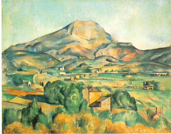

Cezanne vs. Poussin
Cezanne had said “I want to redo Poussin according to nature.” How can you see that here? What colors is Cezanne using vs. the browns of Poussin? Cezanne also said “I want to make of Impressionism something enduring like that art in museums.” Notice that his work is more solid than that of Monet and that he uses brighter greens than Poussin. (Why did the previous academic artists always have brown foliage? Well, they used a brown base in their paintings, and they did not paint outside, so they weren't really looking at nature the way artists did after Monet in the 1870s.)
Is Cezanne’s space flat or deep? Note that in Poussin’s work, artists of the past have used bluer colors in the distance to create a deep space. But Cezanne uses the same colors in the foreground and in the background. The mountain is small, so we know it is in the distance, but the similar colors make it seem flatter. This creates that tension between flat (2 dm.) and deep (3 dm) space that I talked about last week. That tension between flat abstraction and the depth the objects really take up is a prime concern of the best early Modernists.
Notice how much more controlled Cezanne’s brushwork is in contrast to van Gogh. These measured strokes, or flat planes, will develop into Cubism (a “lecture” or two down the line).


Cezanne’s work is very difficult to discuss and to understand. I could go on and on and on, but these are the most important points.
Sorry for the overdose of art lately, but I know some of you are very interested in learning about these ideas, and I don’t have a great deal of time before I leave for a long trip this summer. Next week I want to discuss French and German Expressionism as seen in the work of Matisse and Kandinsky and others. The following week will be Cubism
May I take issue with that comment? Admittedly, black was on the old master's palettes (most modern art teachers do not allow it) and colors were available in the late 19th century that were not invented yet in the time of the old masters. Rembrandt's palette, for instance is thought to have been limited to white, black, red oxide, yellow ochre, yellow, and occasionally, a blue of some kind. But he wouldn't just add black to darken a color, instead his cool black (ivory) mixed with white made a blue, his ochre, red oxide and black mixed, made anything from sienna to umber, his black mixed with ochre made green, etc. The old masters also used color in modeling, just a little more subtle at first glance. But you can see that they constantly did seemingly unintuitive things like putting amazingly bright oranges in shadows and cool blues and greens in the lightest lights. They frequently defied the modern rule that cools recede and warms come forward.
I would add that the Impressionists photograph and reproduce in print much more effectively than most of the older work, but that difference disappears when one actually sees the stuff in person.
117th century = 17th century!
Love this series! Post-Impressionism is close to being my favorite of all art styles.
Just as the 15th century artists were intent on showing the human form based on a bone and muscle framework, the Post-Impressionists were equally intent on the play of light. For the first time, artists took their work out of the studio and into nature. The freshness of the colors and the impression of objects as opposed to definition of line and the low light of the studio create masterpiece after masterpiece of joy and life and light. VanGogh was too intensely emotional to enjoy light for light's sake, so painted his soul.
Cezanne's style was a precursor to Cubism. VanGogh's style is generally accepted as the precursor of the Fauve movement (Matisse, et al).
Thanks once again RProfessor. I've enjoyed the first two threads and this one as well. The U of Free Republic has an outstanding faculty.
Thanks for the ping. Very interesting.
Neoclassicism: a movement of the late 18th and early 19th century that had many of the values of classicism (so valued by many FReepers). This art developed from that of Poussin (see above) and had strong drawing and little emotion. This included David and Ingres.

David Death of Socrates 1787 or so
Romanticism: a movement that reacted against the stiffer, more controlled Neoclassicism. The Romantics were interested in extreme emotions and subjective views. They valued color over drawing and extreme subjects of life and death. They included Turner, Gerricault, Delacroix, Gros and many others. Notice how much more emotional and dynamic their work is than the classicists above.

J.M.W. Turner Slave Ship 1835
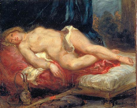
My favorite Neoclassicist/Romantic contrast is that of the Odalisques by Ingres (left) and Delacroix (right). An odalisque is a woman of a middle eastern harem. Note the funny apparatus in the lower corners: these ladies smoked something funny. The connection between drugs and use of women for sexual purposes is long established. What is the “story” in each of these? Before or after their encounters? And what kind of an encounter was it?

Realism (with a capital R) was a mid-19th century movement that I dealt with in my first "class" 2 weeks ago. These artists moved away from the overwrought emotion of the Romantics (such as Turner) and painted real subjects in a real world. These included Courbet and Manet in France and Homer and Eakins in the U.S. See “class” #1 two weeks ago for more details. Often their work is darker than the subsequent Impressionists.


realism with a little “r” is a general and vague term for works that look as if you were looking at them at the moment or with almost photographic precision.
Naturalism can be a synonym for realism, but it also refers to works that look realistic but could not be happening. As in the mythological Apollo and Daphne by Bernini in the 17th century.

Representational art is another synonym for realism. It’s what we could see in reality.
Surrealism is a movement beginning about 1925 with a manifesto by Andre Breton that emphasized the importance of dreams in our lives (and in our art). These artists are reacting against the carnage of WWI that came about as a result of the rational world. There are two kinds of surrealism (we’ll get to this about lecture 5): 1) the magic surrealism of Dali, Magritte and others and the 2) Biormorphic Surrealism of Miro and Masson.

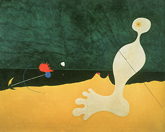
Dali Persistence of Memory (known more colloquially as the melting clocks) and Miro's Person Throwing a Stone at a Bird
That’s about all the definitions I can handle right now. Hope that helps; it’s a beginning.
Hudson River School artists were the first really important “school” of artists in the U.S. A school is just a group of artists painting in a similar way (not in a little school house). These artists, including Cole, Church, Bierstadt, Durand and many others, emphasized the beauty of our landscape (vs. the “history” and mythology paintings of Europe) and gave our land a spiritual quality similar to the religious paintings of Europe.


Thomas Cole Expulsion from Eden about 1840 and Albert Bierstadt Yosemite Valley about 1860 or so.
Abstraction is taking any image a step or two away from "reality" by emphasizing something the artist wants to deal with: super bright colors, distorted forms, etc. Sometimes it is mistaken with non-objective art, which has no basis in reality at all.

![]()
abstraction by Georgia O’Keeffe Jack in the Pulpit IV and non-objective art by Mondrian both about 1920-30
I'm not sure that they are so distorted; depth is emphatically emphasized, yes. Cole was looking a great deal at European landscape painting, although probably more at Claude Lorrain than at Poussin. But that's a very good observation.

A pastoral (peaceful) landscape by Claude Lorrain.
Interestingly enough, the Cubists backed away from completely non-objective art as well. Picasso's Nude Woman below is as far as they got towards non-recognizable objects. Then they came back and developed Synthetic Cubism with flatter forms, brighter colors and recognizable objects.


May I take issue with that comment? Admittedly, black was on the old master's palettes...
Sam, you are absolutely right. I was oversimplifying to emphasize the color that Cezanne uses to model with, which was a new concept at the time. Black is better when made with such combinations as you suggest, and I myself never use just black (or just any color). I mix a range of colors at all times; it gives greater depth to the color.
Michelangelo actually reversed this warm in foreground/cool in distance color formula in the serpent on the Sistine Chapel. His use of color blows my mind. He's incredible: as a painter, sculptor and as an architect. Definitely the best artist ever. (Ooops, did I, the abstractionist, actually say that?) 
Notice how, on the serpent's tail, the green is foremost and the yellow is in the back. Amazing.
Some titles that could be useful:
Janson's History of Art, a staple for decades. or his History of Art for Young People
Stokstad's and Gardner's History of Art books aren't bad, but they have more history in them and one could get bogged down. (Of course, you can skim and read what you want.)
Wilkins and Schultz's Art Past, Art Present is what I often use for class, but they split up artists and periods too much in order to keep it so strictly chronological. Michaelangelo is in 4 different sections! And it had a ton of non-western art, interspersed with western art; too much for me to handle in class. But the descriptions of the artworks are concise and the examples chosen are good.
Was Cezanne modeling without changing value, just by color alone? Using cools and warms?
Not sure who my favorite artist is at the moment - it may be that Velasquez just replaced Anthony Van Dyke. I'd like to see a Zorn or a Sorolla in person, though. Michaelangelo isn't my favorite, but it's impossible to deny the guy's greatness.
I'm curious who you might think were the best draftsmen of all time. I'm sure Michaelangelo would have to be included.

Peach Blossoms in the Crau, 1889

Irises, 1889
Primarily, yes. Sometimes the value changes anyway, because a bright yellow is lighter than most other colors, but primarily that was one of his innovations.
For those who don't know what Sam and I are talking about: value is just the light and dark property of colors. Colors have 3 properties: hue (what the color is, blue, red, etc.); intensity (how bright the color is: bright green vs. a very light or very dark green, which have usually been diluted with other light or dark colors); and value.
I'm curious who you might think were the best draftsmen of all time. I'm sure Michaelangelo would have to be included.
I'm more interested in color rather than line. But if I had to note great draughtsmen: I'd have to say many of the Renaissance artists: Piero, Raphael and yes, Michelangelo. I just love how he creates tension. In the 19th century: Ingres was probably the last great draughtsman before the camera was invented. Daumier was also great; a great loose use of line.


Michelangelo, study for a Sibyl for the Sistine Chapel, Ingres Artist's Wife early 19th century and a lithograph by Daumier, mid-19th century. Notice how loosely done the dress of Ingres' wife is and how Michelangelo has worked various images into one sheet. Daumier defines character and anatomy with just a few, loose but right-on lines.
Of course, paper only came into general use in the Renaissance, so records of drawings before this time are very scarce.
Colorists: Turner and Rothko top the list.
-white-center-(small).jpg)
A large painting by Rothko; the layering of his colors is awesome.
I can't note just one artist as my favorite. Each artist has too much to offer. I have reams of artists I just love, from each period.
I love those too. I think those irises were the ones that went for a record auction sale, about $86 million, in the 1980s. I believe it was bought by a Japanese insurance company. This is the epitomy of commercialization, for you would have to pay to see the work, and then you get hit up by an insurance agent on your way out.
I find it fascinating that the Japanese so valued van Gogh's works, after he was so influenced by their prints.
I have to disagree on the Rothko, that painting reminds me of early Amtrak interior decorating. IMO, the masters of layering were the Venetians, Rembrandt, etc. Those colors in the Rothko are kind of painful - I don't see much in the way of skill there, or even good luck! However, I admit to not being particularly aware of Rothko, so my opinion is necessarily a first impression and uninformed on that level. I'm not necessarily denigrating color shapes as art either, since of course all paintings, even especially representational paintings, are combinations of nothing more than color shapes.
I'm going to say that the old masters skill with the abstract qualities in their work is more responsible for their greatness than their other technical virtuosity. Now that I have written that down, it seems rather obvious. You are making me think - thanks!
It's not that I look down on abstract art anyway. It's that the art world, and, ironically, the "academics" of today look down on the "representational."
BTW, I've been using the term "representational" rather loosely. Maybe incorrectly. To me it includes more than just the "realists," but includes most of the history of Western Art, even the early stuff (admittedly somewhat abstract) that you spoke of. There is quite a bit of art that is something of a combination of abstract and realism, I guess.
I'd be interested in your thoughts on Christo, there were several threads on his Central Park orange "gates." I consider that stuff to be "art" and happened to have been to Central Park and seen them. OTOH, I figure it to be art in the way that interior decorating is, only it's "exterior decorating."
That's not necessarily a put down, since, IMO, lots of the commercial artists do some pretty great stuff compared to the "fine" artists. They have to, because they must sell it and, once sold, it must do a successful job for the client. In that way, they are more parallel to the old masters, especially the Renaisance masters, than modern fine artists.
Check #74 on this thread http://www.freerepublic.com/focus/f-news/1420406/posts?q=1&&page=51
It concerns art, but I think I won't activate the ping list for it.
http://www.freerepublic.com/focus/f-news/1348194/posts
It took me a while to appreciate Rothko. I'll get to him later in my "class." I put him out here to get people thinking....(and complaining, perhaps...) I didn't like him at first, but now I love him. I've read a great deal about him and not all of his works are great (to me), but the ones that are do it fabulously. You'll see why later...
Disclaimer: Opinions posted on Free Republic are those of the individual posters and do not necessarily represent the opinion of Free Republic or its management. All materials posted herein are protected by copyright law and the exemption for fair use of copyrighted works.