Skip to comments.
What Do You Think of Trump-Pence Logo Developed by Friend's Wife?
Self
| July 17, 2016
| P.J. Gladnick
Posted on 07/17/2016 5:35:25 PM PDT by PJ-Comix
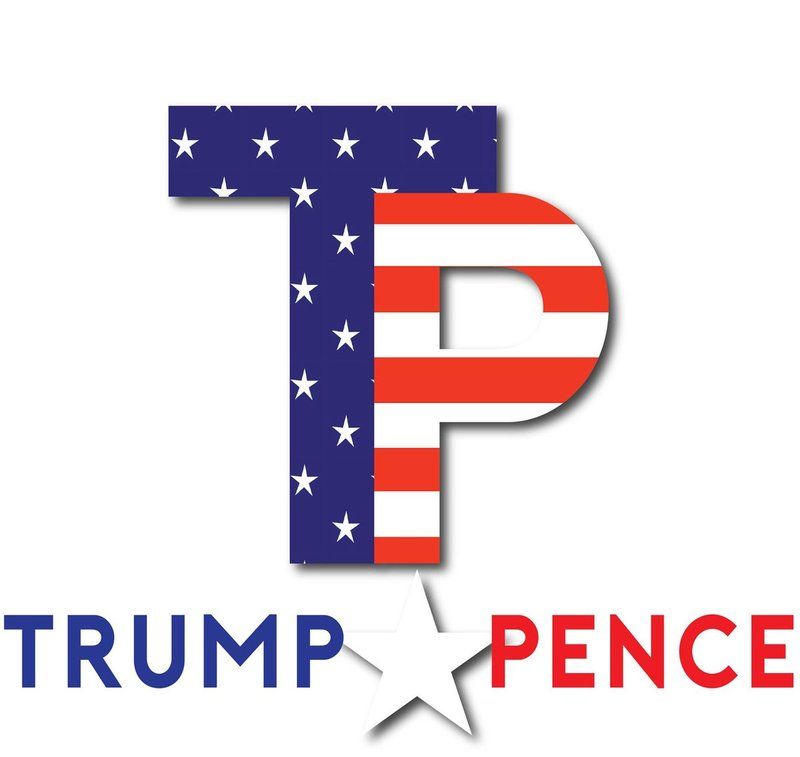
Okay, the original Trump-Pence logo has been scrapped. The second logo is okay and features a photo of Trump and Pence. Perhaps a little too graphic dense in terms of a logo. HOWEVER, the graphic artist wife of a friend of mine, Brian Craig, co-host of the Steve Kane radio show in South Florida has created the following Trump-Pence logo. What do you think of it?
TOPICS: Chit/Chat
KEYWORDS: donaldtrump; logo; mikepence; toiletpaper
Navigation: use the links below to view more comments.
first 1-20, 21-40, 41-60, 61-80 ... 101-118 next last
Do you think this logo should replace the latest Trump-Pence logo. BTW, Brian Craig, along with Steve Kane both enthusiastically ENDORSED Trum the moment he announced he was running last year. I believe they were the FIRST radio hosts in the country to endorse Trump.
1
posted on
07/17/2016 5:35:26 PM PDT
by
PJ-Comix
To: PJ-Comix
I like it very much.
Email it to the Trump Team!
2
posted on
07/17/2016 5:37:06 PM PDT
by
Right-wing Librarian
(God's Chosen Warriors vs. Satan's Chosen Warrior: The choice couldn't be more clear.)
To: PJ-Comix
That one reminds me of “toilet paper” as initials.
3
posted on
07/17/2016 5:37:07 PM PDT
by
ConservativeMind
(If 0bama had a son...he would be killing people.)
To: PJ-Comix
Like it, but what about the white star?/sarc.
4
posted on
07/17/2016 5:37:08 PM PDT
by
orchestra
((And there were also two other, malefactors, led with him to be put to death.))
To: PJ-Comix
5
posted on
07/17/2016 5:37:50 PM PDT
by
2banana
(My common ground with terrorists - they want to die for islam and we want to kill them)
To: PJ-Comix
Anything with TP is a nonstarter for me.
6
posted on
07/17/2016 5:37:50 PM PDT
by
Genoa
To: PJ-Comix
The left will attack anything Trump does, so it doesn’t matter to me. “TP” is a little too easy a target, though.
To: ConservativeMind
As a 20 year graphics guy, the P looks like it’s in prison clothes, the font is still the most BASIC font there is and the white star is weak, as are the stars as they are arranged on the T.
8
posted on
07/17/2016 5:39:44 PM PDT
by
dp0622
(The only thing an upper crust conservative hates more than a liberal is a middle class conservative)
To: PJ-Comix
I like the bottom part with the names and the star between them. I don’t like the initials.
9
posted on
07/17/2016 5:40:07 PM PDT
by
mongrel
To: PJ-Comix; Liz; HarleyLady27; flat; unkus; sheik yerbouty; vette6387; JLAGRAYFOX; MinuteGal; ZULU; ..
Sorry, but visually I don’t care for it. And, I agree about the TP comments.
To: PJ-Comix
I know message should be the key, but Trump's team to date has been amateurish in its use of symbols.
11
posted on
07/17/2016 5:41:50 PM PDT
by
buckalfa
(I am feeling much better now.)
To: PJ-Comix
I’m not digging the TP letters either...too much like TP. ;)
Have both names written out - or tone down-shade the ‘Pence’
12
posted on
07/17/2016 5:42:07 PM PDT
by
libertarian27
(FR Cookbooks - On Profile Page)
To: PJ-Comix
I liked the first one. Look at it as 3d. A cross. On a hill.
13
posted on
07/17/2016 5:42:08 PM PDT
by
wastoute
(Government cannot redistribute wealth. Government can only redistribute poverty.)
To: ExTexasRedhead
I don’t like it....looks amateurish.
14
posted on
07/17/2016 5:43:04 PM PDT
by
Liz
(Trump needs to get on this Dem sSAFE PACE A liberal's mind. Nothing's there. Nothing penetrates it.)
To: PJ-Comix
15
posted on
07/17/2016 5:43:49 PM PDT
by
SERKIT
("Blazing Saddles" explains it all.......)
To: ozzymandus
Yes. I am certain they will be all over it like a bunch of seventh graders.
16
posted on
07/17/2016 5:44:38 PM PDT
by
Chuckster
("Them Rag Heads just ain't rational" Curly Bartley 1973)
To: PJ-Comix
Love you, but I write TP on the shopping list when we need, well, tp : /
17
posted on
07/17/2016 5:45:27 PM PDT
by
goodwithagun
(March 3, 2016: The date FReepers justified the "goodness" of Planned Parenthood.)
To: SERKIT
To: PJ-Comix
Sorry, I thought Toilet Paper the first time I saw the last one...with that history this one is evaluated with that in mind.
NO TP...NO WAY
develop something with names or that Lion thing from the primary...2 lions or shadow on one???
Keep trying everyone...agree on prison stripes and weak stars!
19
posted on
07/17/2016 5:47:32 PM PDT
by
3D-JOY
To: libertarian27
How about - keep it simple?

20
posted on
07/17/2016 5:47:38 PM PDT
by
libertarian27
(FR Cookbooks - On Profile Page)
Navigation: use the links below to view more comments.
first 1-20, 21-40, 41-60, 61-80 ... 101-118 next last
Disclaimer:
Opinions posted on Free Republic are those of the individual
posters and do not necessarily represent the opinion of Free Republic or its
management. All materials posted herein are protected by copyright law and the
exemption for fair use of copyrighted works.
FreeRepublic.com is powered by software copyright 2000-2008 John Robinson
