Skip to comments.
Department of Education Home Page Chart (I can't believe this is there!)
U.S. Department of Education Web Site ^
| Dept. of Education
Posted on 07/07/2003 4:46:24 AM PDT by FreedomPoster
Here is the chart currently on the home page of the Dept. of Ed. web site:
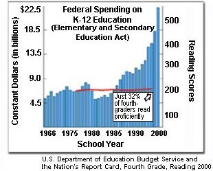
Could there be a better argument for immediate abolition of the Dept. of Education? Can you believe this is where it is at?
TOPICS: Culture/Society; Government
KEYWORDS: education; educationnews; homeschoollist; literacy; nclb; nochildleftbehind; spending
Navigation: use the links below to view more comments.
first 1-20, 21-40, 41-54 next last
Comment #2 Removed by Moderator
To: *Education News; *Homeschool_list
Has this been posted before?
3
posted on
07/07/2003 4:53:35 AM PDT
by
FreedomPoster
(this space intentionally blank)
To: jodenkoekje
No telling. I'm still shaking my head in amazement.
4
posted on
07/07/2003 4:54:04 AM PDT
by
FreedomPoster
(this space intentionally blank)
To: FreedomPoster
bump for later
To: FreedomPoster
If the numbers on this chart are valid, then it is pretty damning. The weasals who work in our Government would not want people to consider this sort of data at length. The teachers unions and their vile representatives will likely go far out of their way to dispute the reality.
It was Hitler who once boasted in his famous book that it was through public education that he would conquer societies. Stalin made similar comments. Public education in our Society is a disaster, and it is getting worse. The teachers unions are comprised of nothing less than Social Marxists who do not have the best interests of posterity in mind. They are generally speaking short sighted people with a very selfish agenda.
6
posted on
07/07/2003 4:55:11 AM PDT
by
Radix
To: FreedomPoster
I can't believe it!!! Well,hmmm I guess I can..... we are in deep du du......
7
posted on
07/07/2003 4:56:44 AM PDT
by
.45MAN
8
posted on
07/07/2003 4:58:48 AM PDT
by
FreedomPoster
(this space intentionally blank)
To: FreedomPoster
/arguable/arguably/
9
posted on
07/07/2003 4:59:55 AM PDT
by
FreedomPoster
(this space intentionally blank)
To: FreedomPoster
And keep in mind that the Fed only accounts for about 6% of education funding. It would be nice to see a state by state comparison chart, but just by doing the arithmatic the number is staggering.
To: FreedomPoster
Do you have the URL for the page that uses that graph?
To: DumpsterDiver
12
posted on
07/07/2003 5:05:25 AM PDT
by
MattMa
(I'm not a victim, I am a conservative and if you get to close, I just may bite.)
To: Radix
HEAR! HEAR!!
SUPPORT VOUCHERS! BREAK THE UNIONS! SAVE THE CHILDREN!
13
posted on
07/07/2003 5:05:52 AM PDT
by
jocon307
(I oughta be ashamed of myself)
To: FreedomPoster
I could almost laugh. Almost.
To: FreedomPoster
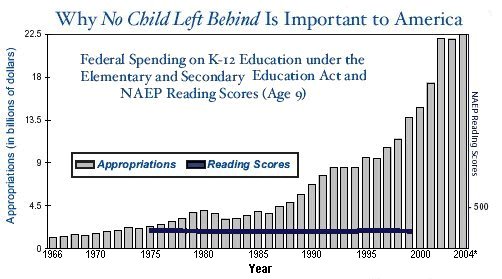
Note the reading scores are not posted post 1999. I would assume we will either have an improvement in reading scores OR some educators will be looking for funding somewhere else. Accountability is part of the bill that was passed, along with increases in funding.
The reason you know the accountability is starting to kick in is because the NEA is howling that this isn't fair, local schools don't have enough money, etc. etc.
To: FreedomPoster
What did you expect? Our teachers themselves can't read effectively, alot of them end sentences in double negatives! Our children are being taught Ebonics instead of English, wakeup folks!
16
posted on
07/07/2003 5:10:41 AM PDT
by
D. Miles
To: FreedomPoster
A picture is worth a thousand words, but this one is worth many billions of dollars
17
posted on
07/07/2003 5:15:14 AM PDT
by
garbanzo
(Free people will set the course of history)
To: FreedomPoster
I'm not defending the Deptartment of Education, but a couple points:
The student performance is going down. That's bad, period.
The graph is a bit misleading because it doesn't acount for:
- The number of students (i.e. dollars per student is a better measurement than dollars)
- Inflation
It's possible that the dollars per student, in some "constant" dollar, hasn't gone up as dramatically as the graph indicates, and it is also possible that the increase in dollars per student is even -MORE- dramatic.
18
posted on
07/07/2003 5:19:03 AM PDT
by
Cboldt
To: MattMa
Thanks, but that's not what I'm looking for. The URL for the Dept of Ed's main page is
http://www.ed.gov/ and I'm looking for the particular page of that website that used the graph. I wanted to see the entire page, not just the graph itself.
To: Cboldt
No arguments, but I didn't produce the graph, a government employee did. It's still pretty damning.
20
posted on
07/07/2003 5:21:09 AM PDT
by
FreedomPoster
(this space intentionally blank)
Navigation: use the links below to view more comments.
first 1-20, 21-40, 41-54 next last
Disclaimer:
Opinions posted on Free Republic are those of the individual
posters and do not necessarily represent the opinion of Free Republic or its
management. All materials posted herein are protected by copyright law and the
exemption for fair use of copyrighted works.
FreeRepublic.com is powered by software copyright 2000-2008 John Robinson