
Posted on 04/12/2015 5:18:04 PM PDT by bryan999
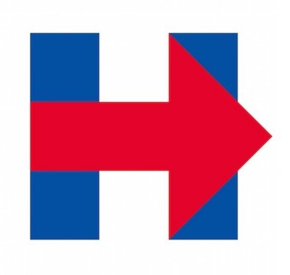
The release of Hillary Clinton's launch video late Sunday afternoon not only ruined boozy brunches and wholesome family outings for countless political journalists—it nearly overshadowed the real Clinton news of the day: our first glimpse of the official logo that will define her 2016 campaign. The logo, pictured above, got a mixed response on Twitter.
(Excerpt) Read more at slate.com ...
It shows where the airliners hit the WTC



I will not be part of the social media bullshit!!!
What I do in life is none of anyones god damn business!!!!!!!
Oh hammer meet nail. So true.
Her logo immediately reminded me of those “I’m with stupid” t-shirts.
It looks to me. although I know little to nothing of British Signage...like something you Might FInd in a british parking garage
the new Industrial Strength Hillary!! now available in Extremely Large!


Yuck. Some fresh graphic arts student could beat that by a mile. Just pitiful. The arrow should be pointing far left, too.
Want to see sexual rape?
Go to 2:11 in Hillary's announcement video and watch what the logo does.
You’ve got a blue capital H, and a big red arrow ramming it from left to right.
The H is a person spread out. The meaning of the arrow is obvious. The effect is violent and angry and actually shocking. Turn the sound off and watch it.
Subliminal Advertising: it’s supposed to remind women to vote with their genitals against the evil males, who they have been taught are all rapists. It was made by a very nasty shrink playing hardball. You know how the Left is obsessesed with “microaggressions” and “triggering events”? Well here’s a professional example of the real deal - because that’s exactly what this logo anamation is supposed to do to women.
So right out of the gate, Hillary is raping women into a shocked emotional state to subliminally force them, through PTSD-triggering compusions, to vote for her. And I’ll bet you’re going to see that animation over and over and over again. Because that’s how torturers work - they smash trauma into the subconscious through repetition.
THAT’s the real Hillary - right there in her logo.
its too clever by....i dunno
Its very self concious...and oddly it will PROBABLY put people in mind of Obamas...FORWARD...imagery!
too late for her to change it now though!!
haste maketh waste
WIKILEAKS claims that hillary stole their logo!!!!
Maybe inspired by the Cuban flag. The other possibility is North Korea.
If that's what they were trying to communicate, they totally flunked.
Look at it. It's a big RED arrow, pointing to the RIGHT, and it's on TOP of the blue Hillary H. Just what the heck is that supposed to communicate, given that it's the official image of the Democrat front runner?
I don't know if I've ever seen a worse failure of political imagery.
I've been trying to make that point all night.
Not only is the arrow pointing RIGHT, it's also RED, and it's on TOP of the blue (Hillary) H.
Ya just can't fail much harder than that with political imagery.
How so?
What does that image say to you? What do you think it communicates to the average person?
Personally, I think it's a complete failure to communicate anything that a left wing voter will quickly grasp. Heck, even we Freepers are scratching our heads over it.
In other words, the symbol communicates from Hillary's point of view - not that of the viewer voter.
How typically arrogant of her.
Disclaimer: Opinions posted on Free Republic are those of the individual posters and do not necessarily represent the opinion of Free Republic or its management. All materials posted herein are protected by copyright law and the exemption for fair use of copyrighted works.