Was Obama's "Certificate of Birth" manufactured?
I've been working with computers, printers, and typewriters for over 20 years, and given a set of printed letters, I can discern what kind of device made them. Printer output is quite different from the text created by a graphics program, and even if a document looks "official," it may not be.
The "Certificate of Birth," which I will call "COB," is posted on the Kos website as a color JPG. The reason for making it a color JPG, IMHO, is to induce the viewer to believe that this is a genuine copy of an original document -- something that a black & white, or even greyscale, reproduction would not convey as well.
Basically, anyone could have produced this document on his or her own computer, and I'll tell you why.
As represented by the JPG, the "original" COB seems to be a sheet of paper measuring 8.09" x 7.90" with a green "Rattan" pattern embedded in, or printed on, the paper and a "Bamboo mat" pattern for its border:

At the bottom of the JPG image, reading right from left, one can see following text:
OHSM 1.1 (Rev. 11/01) Laser This copy serves as prima facie evidence of the fact of birth in any court proceeding. [HRS 338-13(b), 338-19]
There are a lot of problems with this statement, foremost of which is that the text in this document were produced by a graphics program and not a laser print, or any other printer, for that matter.
If the letters were made by a laser printer, you would be able to see the background, the pattern, through the spaces of the letters.
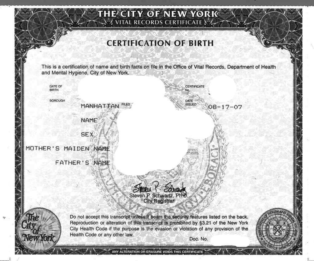
Here's a genuine copy of a real certificate of birth -- my own:

When text is entered via a graphics program, the pattern cannot be seen without noticeable distortion. However, when text is entered with a computer printer or typewriter, you can clearly see the pattern below the letters.
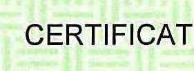
Here is a segment of the COB showing the letters, "Certificat" (from the "Certification" field) enlarged about: 500%:

Now, let's enlarge it some more:

The fuzzy outline is a dead giveaway that these letters were made by a graphics program. Also a dead giveaway is that the letters still retain a sharp outline. With printed or typed text, there is a clearly definable characteristic of a symmetrical shadow when the image is saved at a lower resolution, that is, a more compressed JPG file.
Here is the word, "Certification," from my certificate of birth enlarged :

As you can see, there is virtually no distortion and no pixelation around the letters, and no dropouts from the background. The most noticeable pixelation and dropouts from the background can be seen in the Barack's father's name "HUSSEIN" on the COB:

Take a look at the area between the "S's in "HUSSEIN." No hint of any background color. Plenty of grey and white pixels -- exactly what would result from enlarging text entered with a graphics program.
WAIT, there is an even bigger red herring here. All of the type on this document was produced by the same program.
Whatever made the text for all of the headings also made the text for all of the entries.
What's wrong with that?
Well, only that real certificates are created ahead of time by a commercial printer, or, at least, a different printer than the one used to create the data entries. This is why the headings on my certificate of birth look entirely different than the entries.
That is questionable by itself. But it is the way the text looks that gives it away.
Any text made by a typewriter, laser printer, or even inkjet printer, would NOT have the smeared, black & white pixels underneath it -- there would be several pixels bearing the same color as the paper, nor would the left side of the letters be clear and free of any artifacts or shadows. Scalable type produced by a graphics program will look about the same regardless of the magnification with a minimal or uneven staircase pattern of pixels on its sides, whereas printed text -- even laser text -- will show a clear, uniform staircase pattern of pixels on both sides of each letter that proportionately increase in size with magnification.
Here are some examples:
Here is the "Certificate" heading from Barack's COB enlarged 5 times:

Virtually all of the letters lack any shadows, and only the "A" and the "R" show only a slight, uneven staircase effect. Basically, the letters would look essentially the same -- especially letters made from straight lines like "I," "E," and "T," regardless of the magnification used to view them, and this is a key feature of scalable type produced by a graphics program.
Now, here is the "Certification," heading from my genuine certificate enlarged 5 times:

The double shadow appears on all letters, and this shadow grows proportionately in size as the letters are enlarged. Also, there is pronounced staircase effect on the "C," "A," and "R." Notice, too, that the "steps" are uniform in size, in contrast to the uneven staircase effect on the Barack headings.
Again, the most glaring anomaly in Obama's COB is the following:
All of the letters that appear on Barack's Certificate of Birth were made, at the same time, and by the same method -- which was the use of a graphics program and not the use of any printer.
You can also tell that this is an obvious Photochop by looking at the border patterns.
Looking at the corners of the darker green border, you can see that the border is discontinuous. In other words, the vertical border bars were made by drawing a long rectangle, copying that rectangle, and then overlaying each of them on either side:
UPPER LEFT CORNER OF BORDER

LOWER RIGHT CORNER OF BORDER

What is readily apparent is that the top and bottom horizontal border bars are overlapped by the top and bottom edges of two vertical rectangles.
If this certificate was a professionally-made, there would not be any overlaps, or any outlines of the side rectangles -- the border would appear to be one, continuous whole. Note, too, that both the left and right side rectangles are equal in length. It appears that they were made that way ( or cloned) to make the patterns line up.
Now, getting back to statements on the certificate, there is something else clearly wrong with the "OHSM 1.1" statement at the bottom -- besides the fact that it was produced by a graphics program. There should have been that distinctive "double S" mark preceding the Section number of the statute -- , as in §338-13 -- so as to indicate that a reference is being made to a particular section of a statute, which, in this case, is Chapter §338, Section 13.
As for the first part, the acronym, "OHSM," stands for "Office of Health Statistics Management," which is not the responsible office within the Department of Health for issuing a certificate of birth. The "1.1" that follows refers to a non-existent document. If there were a "1.1", it would mean a revision of "Form 1" or "Document 1," and since "Document 1" is the form for a "Marriage Certificate," "OHSM 1" would refer to a Marriage Certificate form, and "OHSM 1.1," would refer to another version of that Marriage Certificate form, rather than a "Certificate of Live Birth" form.
Also, in this line, there is a reference to "HRS Section 338-13, paragraph (b)" which states, "Copies of the contents of any certificate on file in the department, certified by the department shall be considered for all purposes the same as the original, subject to the requirements of sections 338-16, 338-17, and 338-18."
OK...so where is the certification by the department?
Not only is there no department certification, there is also the absence of any watermark on the paper. Official state documents are supposed to have a watermark on the paper -- like my certificate of birth -- especially when that document is a very important one, like a certificate of birth.
A certified document must have a signature (or signatures) from individuals within the State's Department of Health who are authorized to reproduce the document, and to certify that the document is genuine.
Nothing like that appears anywhere in this JPG.
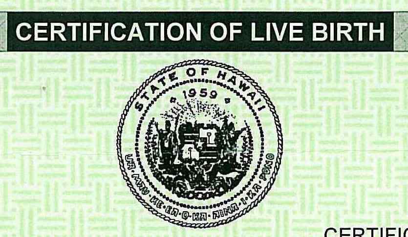
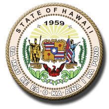
Also, the official Seal of Hawaii in this JPG is a 2nd generation, black & white bitmap copy of the original seal -- at best.

You would think that the seal would be in color, like the original

or at least a higher quality reproduction if this was a copy of an original document.
In short, there is nothing in this copy to indicate that it is, in fact, a "certified copy." As I have shown above, there is a whole lot of evidence that it is a manufactured copy. There certainly is a very strong motive for creating one.
Unless the voting public is given a real birth certificate to examine, the question of Barack's birth is still up in the air.