
I am looking forward to it.
Don't trust main stream media. Their scare tactics have flip-flopped four times over the last eighty-some years.


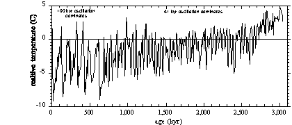
The following graphs show that Earth is in a brief period of global warming called an interglacial. The longer time spans, the deep troughs are glacial periods. The line that runs across the graphs is the temperature in 1950 and listed as "0" on the left axis.
As can be seen in Figure 1-5, Earth appears ready to move toward another ice age in the cycle.
I'm more concerned with sustaining global warming to offset global cooling and the next ice age.
|
Ice Ages & Astronomical Causes |
This first graph looks bad, doesn't it -- steeper upward temperature trend. Horizontal red line is temperature at 1950.

Figure 1-1 Global warming
The second graph shows today's temperature isn't out of the norm. Horizontal blue line is temperature at 1950.

Figure 1-2 Climate of the last 2400 years
The next graph shows a downtrend in temperatures from 8,000 years ago to today. The down trend is steeper in the recent 2,000 years. From left to right the upper spikes have lower highs while the lower spikes have lower lows. (The same effect can be seen in Figure 1-2, above.)

Figure 1-3 Climate of the last 12,000 years
This graph shows that agriculture and stationary societies emerged 8,000 years ago during a time frame when global temperature was much higher than normal, or average.

Figure 1-4 Climate of the last 100,000 years
The next graph shows that the recent 8,000 years was one of five brief hot spikes when glaciers were at minimums. With much longer troughs when glacials (ice ages) were the norm most of the time.

Figure 1-5 Climate for the last 420 kyr, from Vostok ice
The graph below is reversed. That is, the left side is present day and the right side is 3 million years ago. It shows a 3 million year down trend toward widening extremes in the temperature cycle.

Figure 1-6 Climate for the last 3 million years
The final graph shows CO2 lagging temperature change -- not leading it.

Figure 1-7 CO2 and temperature for the last 450 kyr
When man can cause meaningful global warming yesterday would be a good time to begin thwarting the next ice age.
Great documentary: The Great Global Warming Swindle at Google.
The Great Global Warming Swindle at You Tube.
If the above links don't work use the respective search function at each Website. Type: The Great Global Warming Swindle.Anthropogenic global warming parasites and their dupes would tell you not to believe your lying eyes.
Can anybody confirm this ratio one way or the other?
Dozens eh?
The Stalinists have goosestepped on stage, led by the Marxist propagandists at the Guardian.
SO MUCH FOR “DIVERSITY.”
I was able to download this a few weeks ago and I STILL haven’t been able to digest all the great information they put into this. It’s a big pill to swallow.
Bump
Guess he hasn’t see Algore’s film or anything done by that fat guy.
So, if there is so much wrong with “Swindle” why don’t they explain what it is? The only comment directed toward data or statistical info was in re to volcanoes and CO2 emission, and yet there was no reference to any data where people could confirm or refute the point.
Why am I not surprised.
This is a terrific video. This is what should be shown to schoolkids instead of Al Gore’s Oscar winning propaganda film.
My wife and I watched it the other night on YouTube. It was very thought provoking. I have no doubt that the GW alarmist don’t want people to see it. It should be shown nationally here, but never will be. At worst it should be shown in any school that has been forced to show Big Al crap.
Durkin should just fix the documentary and release it.
There are two problems with the documentary:
- “That volcanoes emit more CO2 than man” - Not true - Just change it to “natural sources” emit over 20 times as much CO2 as man - True
- “The satellites do not show an increase in temperatures” - The MSU satellites of the NOAA used to show no real change in lower troposphere temperatures (as would be expected with global warming) but the satellites were found to have a few processing errors and have now been corrected showing a small warming (about half of what the global warmers are predicting);
Other than that, it is primarily factual.
Some argue that the temperature chart showing cooling from 1940 to 1975 is not accurate. Well it is accurate if you use the actual temperature measurements (versus the global warmer’s adjusted temperature trendline which has adjusted the raw data about 4 times now so that it shows global warming.)
Now compare that to Al Gore’s fabrication which is being forced on nearly every school child.

If Greens Persist, That Incandescent Glow May Flicker and Dim
Global Warming on FreeRepublic
Latest from Global Warming News Site
Latest from Junk Science (scroll down)
China Delays Release Of Climate Change Report
Mosquito Genes Explain Response To Climate Change
Are Pies In The Sky A Solution To Global Warming
Satellites Offer Sunny Outlook On Understanding Polar Climate With Help Of Cloudy Skies
Nothing funnier than an elephant with fleas crawling up her belly; swat, crash; swat, crash...
"Show me just what Mohammed brought that was new, and there you will find things only evil and inhuman, such as his command to spread by the sword the faith he preached." - Manuel II Palelologus