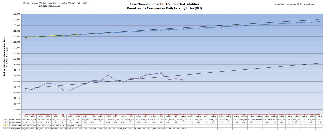


Just my opinion of course - but with the wide spread testing so far and the increase in positive cases shows the virus is now running wide in the general (healthy and younger) population.
Back in April we were running 30K +/- new cases a day with 2K +/- deaths per day. Lots of those deaths were in congregate living facilities.
Now we’ve been running 50k +/- new cases a day for the last 3 weeks (last 2 weeks over 60k +/-) with deaths per day 1k or under.
It ain’t over yet - but the time for panic is over.
Just my opinion of course.
“”” I had alwys thought folks
were smart enough to realize all the tests given minus the posities would be the
the level of negatives.”””
That presumes ‘all tests given’ is an accurate number.
I agree the numbers from WOM are the best we have for the overall view.
July 20:

•Blue line represents projected death totals.
•Yellow line is actual death totals based on WorldofMeters.info data.
•Purple line is actual daily cases offset by 14 days.
•Red line represents projected daily deaths.
•Black extension lines are trend lines.