Oh bovine scat!
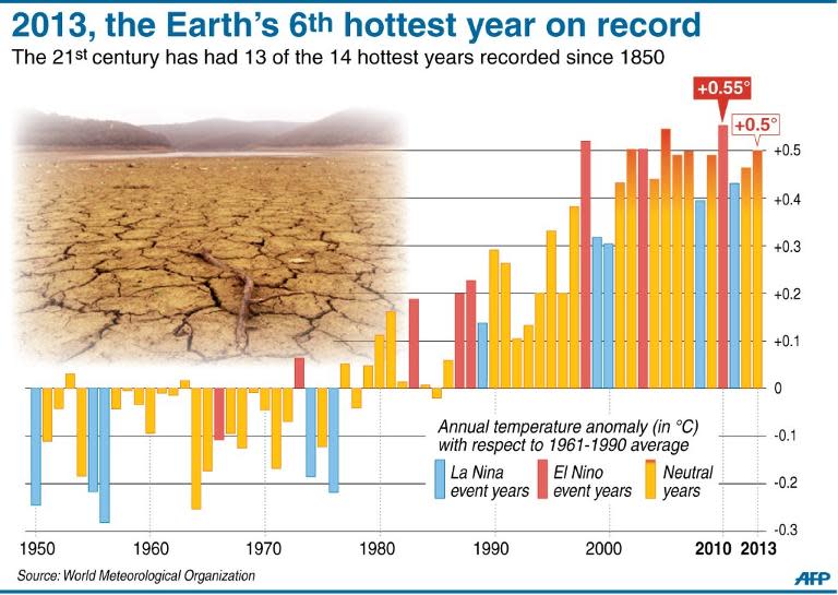
“since reliable records began in 1850,”
Those records aren’t reliable at all.
What does the chart from 1850 to 1950 look like?

.
.
.
Graph does look like it has leveled off as per NOAA & NASA
Grape/wine growers have done well here in the Northwest, hope we don’t go deep freeze.
Where? Last Summer was pretty hot, but that’s normal for S Texas. The Summer before was almost cool. And here we all are, dang near freezing to death. (that wind is COLD!)
These people are either delusional or bald faced liars. I’ll go for both.
My guess is up until around 1980ish all weather stations were probably using mercury thermometers.
Nice graph. Confirms the recent cooling trend. Wonder why don’t they show the corresponding CO2 levels?
Steve
I was surprised by the stats that Australia had a high average temp last year - the Summer was not overly hot in South Australia but the winter was rather mild so that can stuff with the averages. This year has been the hottest summer I can remember since the early 70’s. If we are back in that cycle I predict a late wet cold winter and a lower overall temperature and I also predict that will not get a mention in next years figures.
Interesting that they chose 1960-1991 as the base rate - because as I remember the stats, temps were about .5 degree F higher during the first half of the twentieth century, meaning that all we’re doing is returning to where we were before we dove into a colder period when everyone thought we were going toward another ice age.....
“Lies. Damned Lies. And Statistics.”
LOLOLOL.
Sure is a pretty graph, though.