Posted on 01/10/2008 10:33:38 PM PST by neverdem
It’s not too cold here. I’d have to say there is no global warming in our area. How about everyone else?
It’s not too warm here. I’d have to say there is no global warming in our area. How about everyone else?
I just got back to Maryland from Iowa, and the earth has definitely warmed.
Of course, there is other more reliable data that there has been a slight decrease in global temps since 1998.
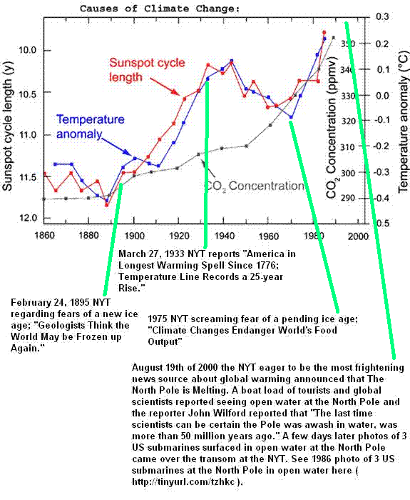
Sources and graphs would be appreciated. Does any one have data on CO2 concentrations during this time period?
Three of the four lines at the end are outside the predicted area,
colder the predicted.
Hilarious.
And it is a tiny portion of data, a fraction of a heartbeat of earths age.
HIV helpers can be hijacked - Human proteins could provide new target for HIV drugs.
FReepmail me if you want on or off my health and science ping list.
It’s cold right now. It was warm this afternoon.
If that graph were of government spending, the NYT would be bemoaning a huge drop in spending.
At around Midnight, almost without fail, it is cooler than at Noon. Sometime after Dawn it begins to warm, progressively getting warmer and warmer throughout the daylight hours, until around 6:00PM when the temperature stabilizes and slowly starts to decline.
I have two theories as to what's going on here.
1. The clocks are causing Global Warming. If we change the clocks to only show the hours 7 to 10, we could capture the hours of the most moderate temperatures of any average day and avoid the extreme average daily heat and coolness of the other hours.
2. While watching both the clock and the thermometer, I also notice that they both become easier to read when that big bright yellow things is visible in the sky and harder and harder to read as that same glowing ball goes away every night. I'm not sure if the big glowing ball has any effect on temperatures as I am concentrating on studying the clock right now, but maybe there can be a relationship to my Time vs. Temperature Change ratio.
~~Anthropogenic Global Warming ™ ping~~
How can anyone draw a straight line through that mess of randomness? It looks like wishful thinking to me.
It’s simple. When it is dark you turn on your lights. Light bulbs cause global warming. But of course it doesn’t happen right away - there is a lag time. I’m sure that some scientific calculations could be made, but suffice it to say that the global warming is only observed until AFTER you turn the lights off.
Of course when you turn on the lights on again in the evening they are USING energy, which leaves less energy available to heat the earth, so a momentary cooling effect is observed, until of course the global warming kicks in again the next day after you turn the lights off.
How can anyone draw a straight line through that mess of randomness? It looks like wishful thinking to me.
Now, lets see a 70 year or a 100 year chart with a straight line projection. A seven year chart is useless and meaningless.
Please ping me if you get a response because the manmade link is the important part; logic and hard numbers are rare with this topic. The NYTimes readers responding at the end of this piece felt the graphic vindicated the IPCC's predictions. This proves that the NYTimes is good at selling newspapers, and whether they're talking cooling or warming, it's the sun and not CO2 (manmade or natural) that relates to the anomaly.
How can anyone draw a straight line through that mess of randomness? It looks like wishful thinking to me.
No, no, no.
That’s part of the problem - You’re TRYING to draw a straight line through the numbers, and the IPCC (even at this level, when ONLY it’s LEAST aggressive (slowest increasing!) temperature increase in being shown) IS CLAIMING a straight-line increase is DEMANDED by the linear CO2 increase of 1.1 percent each year).
Neither assumption is correct: Temperatures are cyclical, and show a sinusoidal variation with time: Globally, temps rose 1/2 of one degree the 27 years from 1908 through 1935, then fell 1/2 of one degree from 1935 to 1972, then rose 1/2 of one degree from 1972 through 1998.
Since 1998 (an El Nino year - which NONE of the AGW programs can predict!), they have randomly oscillated about the temperature corresponding to 1996-1997: Statistically, as you can see from that part of the chart from 2002 to 2007, they have stayed about the same. Later years indicate a very slight cooling - which is what IS EXPECTED if the next 27 year downward trend has begun.
Yes, CO2 has linearly increased from approximately the early 1940's - exact measurements exist ONLY since the Hawaii lab opened in the early 70's - AS A DELIBERATELY ATTEMPT TO DETERMINE THAT CO2 LEVELS AFFECT CLIMATE.
The ENTIRE purpose of that lab to to "verify" what it was funded for - nonetheless, its data shows a linear increase in CO2 at 1.1 percent year.
Unfortunately for the AGW extremists, temperatures have NOT followed that trend: 27 years they go up, 27 years they go down, 27 years they go up, 7 years they stay steady (and begin to go down) ....
For this, the enviro's DEMAND the destruction of America's economy!
I'll answer that question. 1998 had the highest temperature in the last 80 years. If it were included, the graph would incontrovertibly show global cooling! All of the trend lines would point down.
Disclaimer: Opinions posted on Free Republic are those of the individual posters and do not necessarily represent the opinion of Free Republic or its management. All materials posted herein are protected by copyright law and the exemption for fair use of copyrighted works.