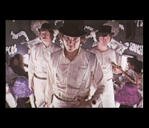
Always a popular theme.
Posted on 05/11/2006 5:38:23 AM PDT by snowrip
Mickey D's McMakeover By Pallavi Gogoi, with Michael Arndt in Chicago and Abed Moiduddin in Oak Brook
A Bold New Look
A comfortable armchair. Cool hanging lights. Funky graphics and photos on the walls. Wi-Fi access. Premium coffee. Isn't Starbucks great? Except...this is McDonald's. McDonald's (MCD)? That's right. After 30 years without a major design overhaul, the 51-year-old fast-food giant is adopting a hip new look. The world's largest hamburger chain is redesigning its 30,000 eateries around the globe in a 21st century makeover of unprecedented scale.
The redesign is risky and has many franchisees up in arms over the high costs of a makeover. But company officials believe the overhaul is needed. McDonald's, whose restaurants are visited by more than 40 million people every day, has moved aggressively over the past three years to revamp its menu and attract a new breed of customer. It has added healthier items like premium salads targeted at women, and apple slices and skim milk for children. But as more upscale items like Asian chicken salad show up on its menu, the chain's typical starkly lit, plastic-heavy look is at odds with the contemporary, welcoming image the company wants to present. "McDonald's promises to be a 'forever young' brand," says John Miologos, vice-president of worldwide architecture, design, and construction at McDonald's Corp. "We have to deliver on that promise." The last major change at McDonald's restaurants was the introduction of play places for children in the early 1980s.
NEW COLORS What will the new McDonald's look like? "Think iPod: clean lines, simplicity," says Miologos. The signature mansard roof? History. "The big red roof looks too dated today," says John Bricker, creative director at design firm Gensler's brand-strategy arm, Studio 585. It's being replaced by a flat roof topped by a newly designed, contemporary, golden sloping curve. Ronald McDonald appears safe: The mascot was given a leaner, sportier look just last year. And the iconic twin golden arches will still play a big role in the branding.
After conducting a global contest among design firms, the burger giant chose New York-based Lippincott Mercer in the summer of 2004. Peter Dixon, the design firm's creative director, spent 2005 with McDonald's internal architecture and design team testing and prototyping the new look, which is being officially rolled out this year. Lippincott Mercer, which until it signed McDonald's had few clients in the restaurant business, has made a name for itself working with companies going through a shift in brand identity and image. In 2002, for example, it helped redesign Nissan Motor Co. (NSANY) dealerships to reflect the company's launch of several new upscale cars. Within a year, the redesigned dealerships saw an average of 57% sales growth, vs. 33% overall.
The traditional McDonald's yellow and red colors will remain, but the red will be muted to terra cotta and olive and sage green will be added to the mix. To warm up its look, the restaurants will have less plastic and more brick and wood, with modern hanging lights to produce a softer glow. Contemporary art or framed photographs will hang on the walls. Bob Dixon, a private school fund-raiser in Chicago, says of an Oak Brook (Ill.) restaurant that sports the new design: "It's bright, it's lively, it's clean. It stunned me how beautiful it was."
The dining area will be separated into three sections with distinct personalities. The "linger" zone will offer comfortable armchairs, sofas, and Wi-Fi connections. "The focus is on young adults who want to socialize, hang out, and linger," says Dixon. Brand consultant Robert Passikoff, president of Brand Keys, a brand consulting firm, says that Starbucks has raised the bar: "A level has been set by Starbucks, which offers the experience of relaxed chairs and a clean environment where people feel comfortable hanging out even if it's just over a cup of coffee."
The "grab and go" zone will feature tall counters with bar stools for customers who eat alone; plasma TVs will offer them news and weather reports. And in the "flexible" zone, families will have booths featuring fabric cushions with colorful patterns and flexible seating. The new design allows different music to be targeted to each zone.
From BusinessWeek
RESISTANCE McDonald's won't confirm the cost of a redesign. Richard Adams, a former franchisee and consultant to current owners, estimates they will have to pay $300,000 to $400,000 to renovate an existing outlet -- an amount roughly equal to a restaurant's annual profit. Tearing down a store and rebuilding from scratch could cost $1 million, Adams says. The franchisees will have to pay for the renovations themselves, which has some of them seething. "Many franchisees are dead set against this change, especially because they already spent millions remodeling their restaurants in the past four years," says Adams. In 2002, when McDonald's introduced premium salads, it did ask a number of franchisees to spruce up their dining rooms, but it wasn't a major redesign project. McDonald's says it worked collaboratively with franchisees to jointly develop a strategy for the current "re-imaging" of its restaurants.
In a recent letter to management at the company's headquarters in Oak Brook, about 160 franchisees from North Carolina spelled out why they oppose the new plan. They say the roof change erases 40 years of brand building and that "there has been no business case presented which justifies the change." Says Frederick Huebner, who owns 11 McDonald's in North Carolina: "We don't want to lose the iconic look of what we've got." If franchisees balk, McDonald's can refuse to renew their contract.
Right now, only 20 recently opened restaurants in the U.S. sport the makeover in its entirety. Another 20, primarily in Tulsa, Okla. and Columbus, Ohio, have been completely remodeled. All brand-new restaurants will have to hew to the redesign blueprints, and by the end of 2006, more than half of the 13,720 U.S. restaurants will feature some element of the design. Says Gensler's Bricker: "It's something that McDonald's has to do if it wants to be part of the 21st century."
Personally, I DO NOT want to hang out at MacDonalds. I WANT a color scheme designed to subliminally stimulate movement and uneasiness, and I want the hard plastic booths to be angled in such a way that they restrict blood flow in my legs... because that is what MacD's is, fast food.
Uh, how is this "PC" again?
There is an old adage in retail...Grow or Die.
They OBVIOUSLY think this will help them GROW.

Always a popular theme.
Makeovers ain't gonna help.
Fast food in nice sometimes, but I DON'T LIKE McDonalds food. The only thing that brings me in there is the playplace for my daughters ages 6 and 4. Otherwise, if I want a "fast" burger, I prefer Wendys, Burger King, or almost anything EXCEPT McDonalds.
You can put a hat on a pig, but all you'll get is a pig wearing a hat.
Sitting in a comfy chair eating garbage isn't my idea of enjoyable dining.
I had a cup of McDonalds coffee twenty years ago and I still can't get the taste of it out of my mouth.
What made McDonald's so successful was its simplicity. Quick, convenient fast food that filled you up. All these changes, such as trying to be "nutritious" and getting rid of the heat lamps, will be the demise of the company.
You can't polish a turd.
Well, that's up to the owners.
But, I seriuosly doubt they are doing this to be "PC."
For some reason the thought came in my mind that they might have a few too many homersexuals in mgt. Just being honest.
Cosmetic changes only. That'll really draw the crowds. What about a good hot dog? Onion rings?
Ahhh. The old Korova.

Nossir, that's the heart attack from the clogged arteries that the food caused.

Those comfy armchairs are gonna look like crap.. a few milliseconds after the legions of 4-year-olds start climbing on them.
Our closest McDonald's had this makeover last year. Visited for the first time a couple months ago. The difference is amazing. The place is spotless. The ambience is more like that of an upscale restaurant. The food was as consistent as ever (for better or for worse). It was, except for the food, difficult to tell I was in one of their restaurants. Even a fireplace and wide screen TV. Let's see how that theme works out in Harlem.
I'm lovin' it.
Yo dawg.
I've been going to Burger King ever since McDonald's decided to "pimp" my burger.

Taco Bell will ultimately win the franchise war. All restaruants will be Taco Bell.
Schwarzenegger will be president.
Actually, I think McD's has done a pretty good job turning around the franchise. Remember, not that long ago they were in a pretty serious slump. I think they have really improved the menu for the better, adding stuff that you can half-way eat (grilled chicken, no mayo). I think they are pretty good at deciphering the market.
Disclaimer: Opinions posted on Free Republic are those of the individual posters and do not necessarily represent the opinion of Free Republic or its management. All materials posted herein are protected by copyright law and the exemption for fair use of copyrighted works.