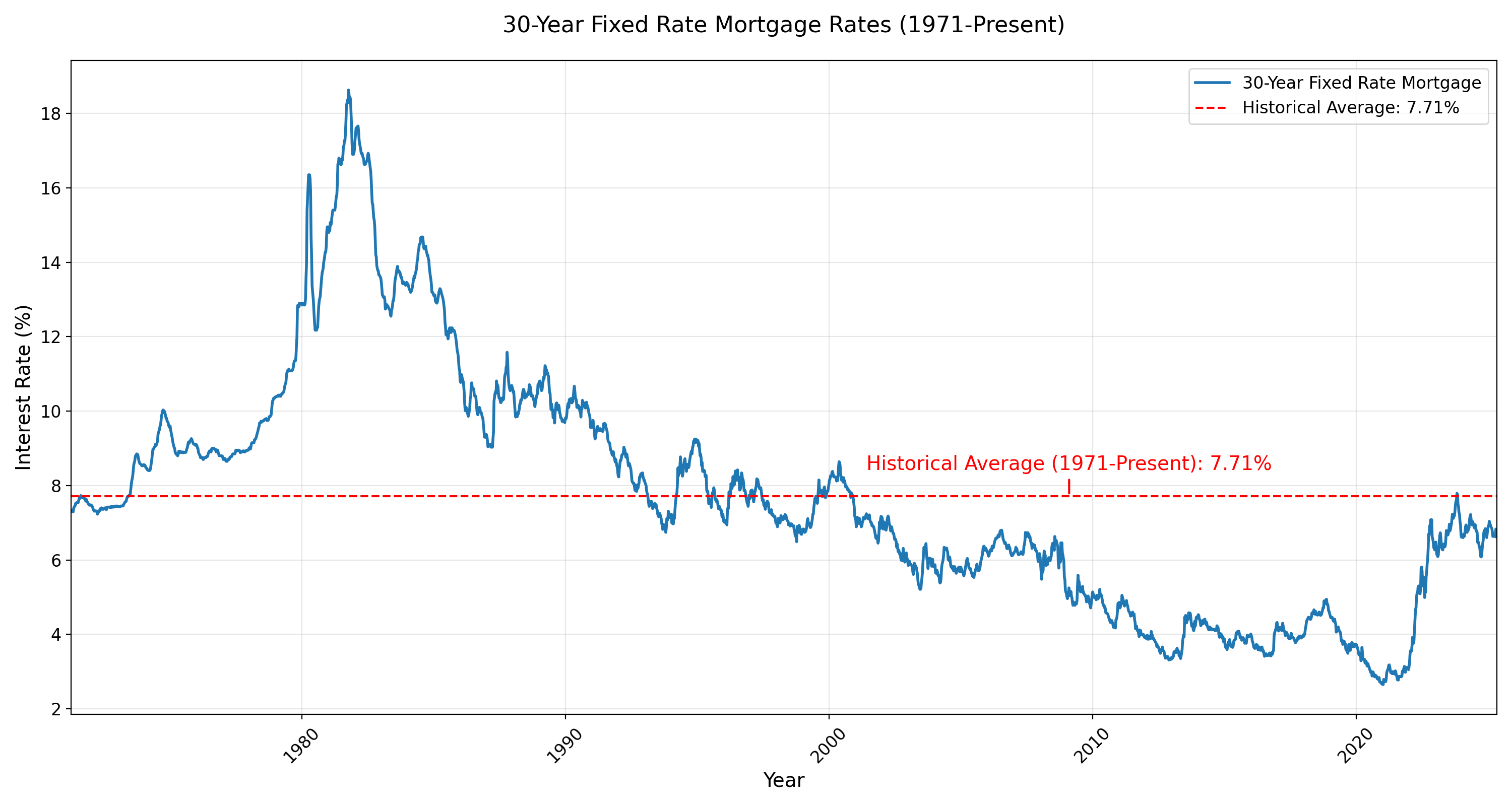
The graph isn’t based at 0%, but near 2%.
The graph is intentionally misleading.
In my youth, the 1960s, there was a saying for Savings & Loans [what Brits call Building Societies]: pay depositors 3%, lend at 6%, and hit the golf course at 3pm.
The spread was fairly high, but it wasn’t high enough to keep the S&Ls in business when they had to pay depositors more because of Vietnam War induced inflation. The S&Ls tried to save themselves buy lending on office buildings, but that flopped.
What we see from the graph that interest rates were roughly 4% from 2012 to the Covid scare, about 3% during Covid scare, and then shot up to 6% to 7%.
Unfortunately, that 3% set off a real estate boom that is only softening now.