Posted on 09/21/2024 3:06:23 PM PDT by grundle
Physical buttons are increasingly rare in modern cars. Most manufacturers are switching to touchscreens – which perform far worse in a test carried out by Vi Bilägare. The driver in the worst-performing car needs four times longer to perform simple tasks than in the best-performing car.
The screens in modern cars keep getting bigger. Design teams at most car manufacturers love to ditch physical buttons and switches, although they are far superior safety-wise.
That is the conclusion when Swedish car magazine Vi Bilägare performed a thurough test of the HMI system (Human-Machine Interface) in a total of twelve cars this summer.
Inspiration for the screen-heavy interiors in modern cars comes from smartphones and tablets. Designers want a ”clean” interior with minimal switchgear, and the financial department wants to lower the cost. Instead of developing, manufacturing and keeping physical buttons in stock for years to come, car manufacturers are keen on integrating more functions into a digital screen which can be updated over time.
So in what way have these screens affected safety? Vi Bilägare gathered eleven modern cars from different manufacturers at an airfield och measured the time needed for a driver to perform different simple tasks, such as changing the radio station or adjusting the climate control. At the same time, the car was driven at 110 km/h (68 mph). We also invited an ”old-school” car without a touchscreen, a 17-year-old Volvo V70, for comparison.
One important aspect of this test is that the drivers had time to get to know the cars and their infotainment systems before the test started.
No backlighting
Tesla was not the first to introduce a touchscreen, but the American carmaker has always offered bigger touchscreens than most manufacturers, containing more of the car’s features. Even the windshield wipers are controlled through the touchscreen.
BMW iX also offers a touchscreen, but not as big as Tesla’s, and also more physical buttons. But that’s no guarantee for a system which is easy to use. The BMW’s infotainment system has lots of features, but it also has one of the most complex and complicated user interfaces ever designed.
Another sin is committed by Volkswagen and Seat. In order to save money, the touch-sensitive climate controls below the screen in the ID.3 and Leon are not backlit which make them completely invisible at night. Voice control
The carmakers are keen to point out that many features now can be activated by voice. But the voice control systems are not always easy to use, they can’t control every function and they don’t always work as advertised, which is why the voice control systems were not tested in this experiment.
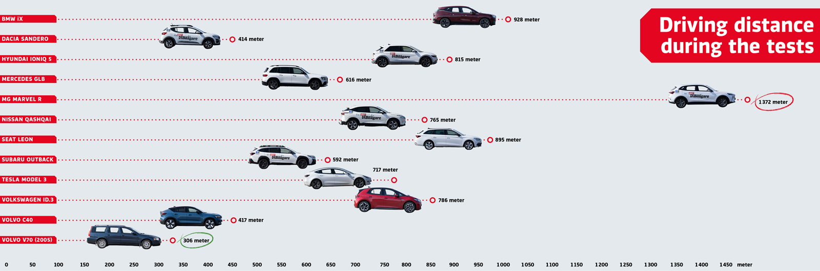
The results speak for themselves. The worst-performing car needs 1,400 meters to perform the same tasks for which the best-performing car only needs 300 meters.
Big differences
The easiest car to understand and operate, by a large margin, is the 2005 Volvo V70. The four tasks is handled within ten seconds flat, during which the car is driven 306 meters at 110 km/h.
At the other end of the scale, Chinese electric car MG Marvel R performs far worse. The driver needs 44.6 seconds before all the tasks are completed, during which the car has travelled 1,372 meters – more than four times the distance compared to the old Volvo.
BMW iX and Seat Leon perform better, but both are still too complicated. The driver needs almost a kilometer to perform the tasks. Lots can happen in traffic during that time.
Dacia Sandero and Volvo C40 perform well although they both have touchscreens. However, they are not overloaded with features. Volvo shows that a touchscreen doesn’t need to be complicated.
We have also measured the angle at which the driver has to look down to operate the controls. By photographing the same driver in all cars, we find that the driver has to lower the line of sight by 56 degrees to view the lower end of the screen. Compare that to only 20 degrees in the Mercedes GLB.
Which tests were performed?
Activate the heated seat, increase temperature by two degrees, and start the defroster.
Power on the radio and adjust the station to a specific channel (Sweden’s Program 1).
Reset the trip computer.
Lower the instrument lighting to the lowest level and turn off the center display.
Touch screens get so full of fingerprint smudge you have to keep wiping them down with Windex just to make everything visible. Especially in sunlight.
The software designers should all be fired. In my day a 3rd grader could come up with far more intuitive concepts. These modern people simply cannot understand simple concepts. And I am not simply talking about automobile products either.
Touch screens require sight. We used to be able to manage CDs, radio surfing, adjusting heat all while driving a manual transmission and pay attention to the road
It was less distracting than this demand for your sight attention. It’s so illogical to use sight controlled gadgets in a car
Stoopid
I can operate almost all the physical buttons and knobs in my car without looking at them. The only touchscreen stuff I do is set the destination on my phones GPS app and any stuff that I try to do on that while driving is extremely awkward.
I hate touch screens in cars. You have to LOOK at them. I can memorize where buttons and knobs are.
“in order to make sure pushbutton processes work, you have to be in the same room as the pushbutton.”
Or in the same car. Which is a really nice feature when you’re IN THE CAR.
And it’s probably easier for TPTB to take control of the car remotely and hijack your ass.
I prefer phyical knobs and buttons on radios and telephones.too.
Touch screens are no good for visually impaired.
Because digital technology is a demon and our rulers are evil.
“Maybe today’s kids demand power windows and the fancy touchscreens.”
Apples and oranges. Power windows became standard about 40 years ago and I’m glad they did. I detest huge, ridiculous-looking I-pads glued on top of the dash, though.
A 20 year old vehicle wins. Not sure how useful that is for current buyers. I seem to recall ages ago that having a tv screen in sight of the drivers eye was once considered illegal because of the distraction it would cause. Things change but not always for the better.
“I prefer phyical knobs and buttons on radios and telephones.too.”
Definitely phones. I miss BlackBerry with the physical tactile keyboard every day. Since it still can connect to Internet I do use it a lot for surfing.
I have to rent cars two or three times a year. Every new car seems to have a dial instead of a shifter.
I understand my shifter in my truck is probably just as “automated” as the dial. But it feels more “right.”
The reason has to be money,one bundle of wiring going to one plug to the screen....I loved my 71’ International harvester pick up. Nothing but mechanical processes for every aspect of the vehicle. points and condensor for ignition / fuel was moved via a vacuum rather than a pump. I could go on forever. What I try to stick to now are the 1st generation Honda Odysseys, I have had good luck with them and its not overwhelmingly computerized .
I want my 5-disc CD player back.
Give me a car that will only start with an actual key.
I have a rental car at the moment that has push buttons on a pannel for shifting. It is a real nuisance and has interlocks so you can’t move the car unless it decides all safety interlocks are met. So, you back up. Stop, you think but the car doesn’t so think, shift to drive you think, push down the accelerator and the car that never shifted runs into the thing behind you that was the reason why you stopped backing up. My stick shift never ever had a problem this way. I put it in the gear I want, ease out the clutch and go.
It is also about the design being done by a computer geek rather than a driver.
There is a pervasive fallicy that high-tech is always better. It simply isn’t true many times and other times offers only dubious advantage if technically true.
I have a BMW with the I-Drive. It has a tactile twist-and-push dial for controlling the infotainment, plus a few key buttons around it for things like “Radio”. You can remember sequences and not look at the display. I also hate the smudges on touchscreens.
Tesla’s are the worst - no buttons in sight. You have to look down at the touchscreen just to see speed. It’s too minimalist.
Disclaimer: Opinions posted on Free Republic are those of the individual posters and do not necessarily represent the opinion of Free Republic or its management. All materials posted herein are protected by copyright law and the exemption for fair use of copyrighted works.