Good, now this chart and others like it should be printed and handed out at Trump events. And eMailed and texted to ‘voters.’
Here are my best counter arguments:
1. Racist!
2. Trump orange, orange bad.
“The U.S. labor market remained strong in 2019, as the unemployment rate fell to 3.5 percent, the lowest rate since 1969. Both the employment–population ratio and the civilian labor force participation rate increased over the year. Levels of long-term joblessness and involuntary part-time employment continued to trend down.”
See how flat the red trend is during President Trump's term, and how steep it gets during Biden's term (green)?
Biden's rate of change may be slowing down, but overall prices are way up since he took office.
Here is the chart for overall inflation. It's clear in this chart that even housing, oil, and gasoline inflation were normal during the Trump administration, but these economic sectors were even harder hit by Biden's inflation.

Red line: Inflation trend during Trump presidency.
Green line: Inflation trend during Biden presidency.
This is the chart for "core inflation" that excludes food and energy.
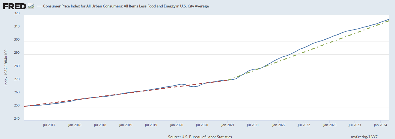
Red line: Inflation trend during Trump presidency.
Green line: Inflation trend during Biden presidency.
-PJ
This is misleading because it is based on what happened immediately after the shutdowns, when energy prices collapsed. It’s right before both parties voted 98-0 in the Senate (CARES) to ignite the fire of inflation. Trump couldn’t wait to sign that crap. Then they all did CARES II. So, while the Biden administration eventually made it worse, let’s not discount the fact that both parties started the ball rolling.
A great chart for comparison. Even Dims should be able to follow this.
I LOVE how leftist tools say that “..it takes at least 3 years for a President’s policies to have an effect…” when this is brought up.. (it’s ALL Trumps fault!..)
When I ask “how come 0bamas policies (Trump prosperity years) took over 8 years?”, they have no answer.