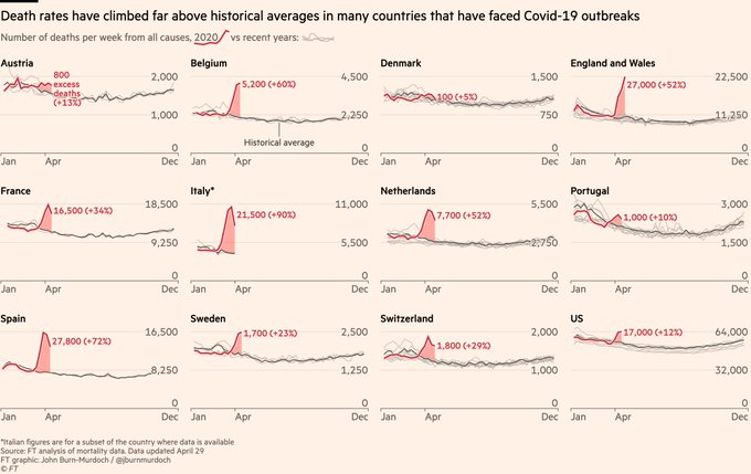
What accounts for the difference the past 2 months, all over the world?
Flu-bros need to explain the worldwide excess deaths from all causes. Tsunamis? Asteroids? What?
What accounts for the difference the past 2 months, all over the world?
Flu-bros need to explain the worldwide excess deaths from all causes. Tsunamis? Asteroids? What?
Link to above graphs and dozens more, updated from data daily.
https://twitter.com/jburnmurdoch
These are not models, projections or forecasts, they are just DATA.
BEST POST OF THE PANDEMIC!
“This is a disease of big cities,” says my lovely wife after viewing over the breakfast table. “Leave the rest of us alone!”
I still don’t know what a flu bro is. Is ut someone who thinks coronavirus is worse than the flu or is it someone who thinks the flu is worse than coronavirus?
What you’ve just done is the equivalent of charting hurricane deaths in Louisiana for five years leading up to Katrina.
Look at: https://www.drroyspencer.com/2020/04/correcting-recent-u-s-weekly-death-statistics-for-incomplete-reporting/
I see that term bandied about here constantly these days. Is it a good thing or a bad thing to be a "Flu-bro"?
Flu-bros need to explain the worldwide excess deaths from all causes. Tsunamis? Asteroids? What?
+++++
Don’t count on getting that question answered.
I would add a couple of points:
1. Dying of “something else” and testing positive for the virus is extremely common, particularly with older people and the frail. Loss of oxygen and immune system issues are virus driven. It is perfectly legitimate to add these victims to the count.
2. Counting deaths where there is no test or evidence of Covid19 is wrong. It is unethical. But percentage wise is it really common?
3. The idea that even the Democrat politicians want the death rates to climb is nonsense because they will ultimately be blamed for the deaths. They don’t need padded death number to hold on to their dictatorial power.
4. And padded death numbers helping with Federal Grants. Perhaps. I doubt it. But a bad PR trade for the Governors and Mayors in any case.
The deaths may include those who died of heart attacks at home because they were afraid to go to the hospital at the first sign of trouble.
I love these graphs. Real data.
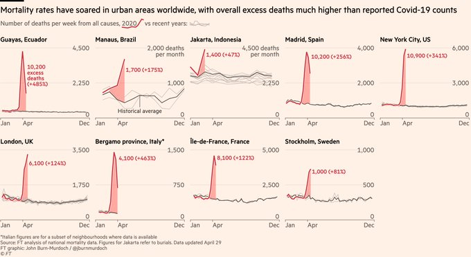
One conclusion. Stay out of the cities in the bottom graph. They are a big contributor to their countries in the top graph.
It is probably due to poverty. In America alone there now 30 million unemployed which means roughly 500 people have lost their jobs for every person that died supposedly from the coronavirus cold.
Long after this panic is gone people will be dying of poverty, depression, and hopelessness.
In excess of what?
Shelter in place?
Is there a placed to see better versions of these graphs and the underlying data?
Thanks
One claim is that people that are having a heart attack or other condition are afraid to go to the hospital, and die rather than what normally would have been a treatable condition.
I’m sure that accounts for a few of the increased in deaths. I’m guessing it is pretty low though. And the lack of people at the ER is also due to less folks out and about getting injured, and the fear of Covid-19 that is keeping the poor people out of the ER that treat it like a doctor’s office.
Hmm. Folks not calling 911 for a heart attack and die - that’s probably balanced out by the fewer number of car deaths and other accidents.