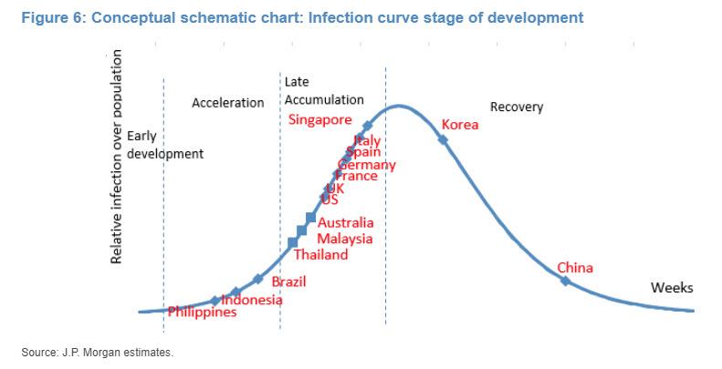
Here is a chart from JP Morgan's analysts giving our location in a nicely order queues. Which is kinda BS, because every country is going to have it's own trajectory based on many different factors. Btw, it blows the theory the virus has been circulating in the US for months, out of the water. Notice no date - says to me, they aren't too sure when the peaks will occur. There's a link to more reading, but not much, below the graph.
https://www.zerohedge.com/health/where-world-corona-curve-moment